
Every profitable trader has one thing in common — they can read the direction of a market before placing a single order. The tool that makes this possible is deceptively simple: a straight line drawn across a price chart. That line is called a TRENDLINE, and it remains one of the most powerful weapons in a trader’s technical analysis arsenal.
The Bottom Line
Most retail traders draw trendlines to confirm what they already believe. That is the fastest way to lose money. A trendline is not a prediction — it is a record of what swing highs and lows have already happened. The job is to draw the most obvious line that the market has already respected, then trade in the direction of that line until it breaks. Zero creativity required. Zero opinion required. Just connect the dots the market has already drawn.
Key Takeaways
- Trendlines connect swing lows in uptrends and swing highs in downtrends: A valid trendline requires at least two touch points, with three or more touches making it significantly more reliable.
- Slope tells you more than angle: A trendline is unsustainable when its slope steepens sharply versus its earlier trajectory. Degree-based rules (30 to 45 degrees) depend on chart zoom and aspect ratio — the same price move shows a different angle on different screens. Watch the slope change, not the degrees.
- Trendline breaks signal potential trend reversals: When price closes below an uptrend line or above a downtrend line with volume, it suggests the existing trend may be ending.
- Drawing trendlines is subjective: Different traders may draw slightly different lines on the same chart. Focus on the most obvious lines that multiple traders would identify — those carry the most significance.
- Combine trendlines with support/resistance for higher-probability trades: A trendline touch that aligns with a horizontal support level creates a confluence zone with stronger buying interest than either level alone.
A trendline drawn correctly tells traders three critical things: the direction of the current trend, where price is likely to find support or resistance, and when the trend is about to change. Drawn incorrectly, it becomes a recipe for false signals and blown stop losses.
This article breaks down exactly how to draw trendlines, what makes them valid, how to trade bounces and breakouts, and the mistakes that cost traders money — all with real chart examples from Nifty 50, Reliance Industries, and TCS.
Quick Answer: A trendline is a straight line connecting two or more swing lows (uptrend) or swing highs (downtrend) on a chart. It acts as dynamic support or resistance. The more times price touches a trendline without breaking it, the stronger that trendline becomes.
What Are Trendlines

A TRENDLINE is a straight line drawn on a price chart that connects two or more price points, creating a visual representation of the current trend direction. It is one of the oldest and most widely used tools in technical analysis.
Think of a trendline as a fence along a highway. The highway (price) moves in a general direction, and the fence (trendline) marks the boundary that price respects — until it does not.
There are two types:
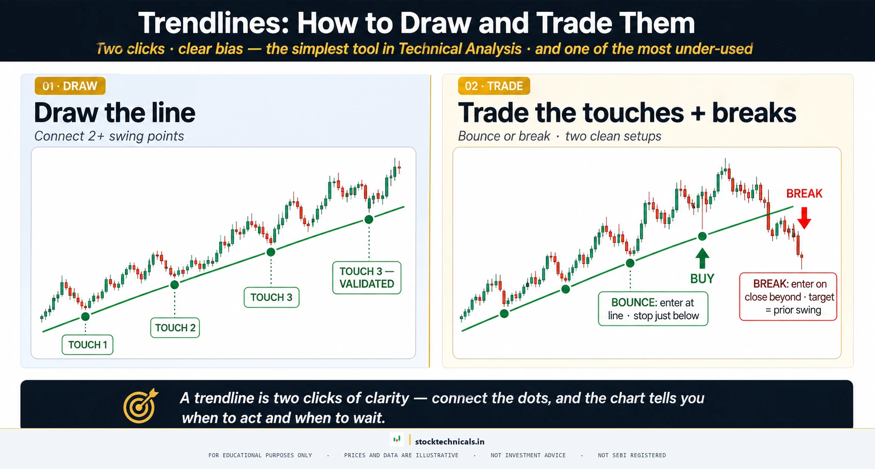
- ASCENDING TRENDLINE (Uptrend Line): Drawn by connecting two or more swing lows — the low points where price bounces back up. This line slopes upward from left to right and acts as dynamic support.
- DESCENDING TRENDLINE (Downtrend Line): Drawn by connecting two or more swing highs — the high points where price reverses downward. This line slopes downward from left to right and acts as dynamic resistance.
The concept is straightforward, but execution matters enormously. A trendline is only useful if it is drawn correctly and validated by price action. The sections below cover exactly how to do both.
How to Draw an Uptrend Trendline
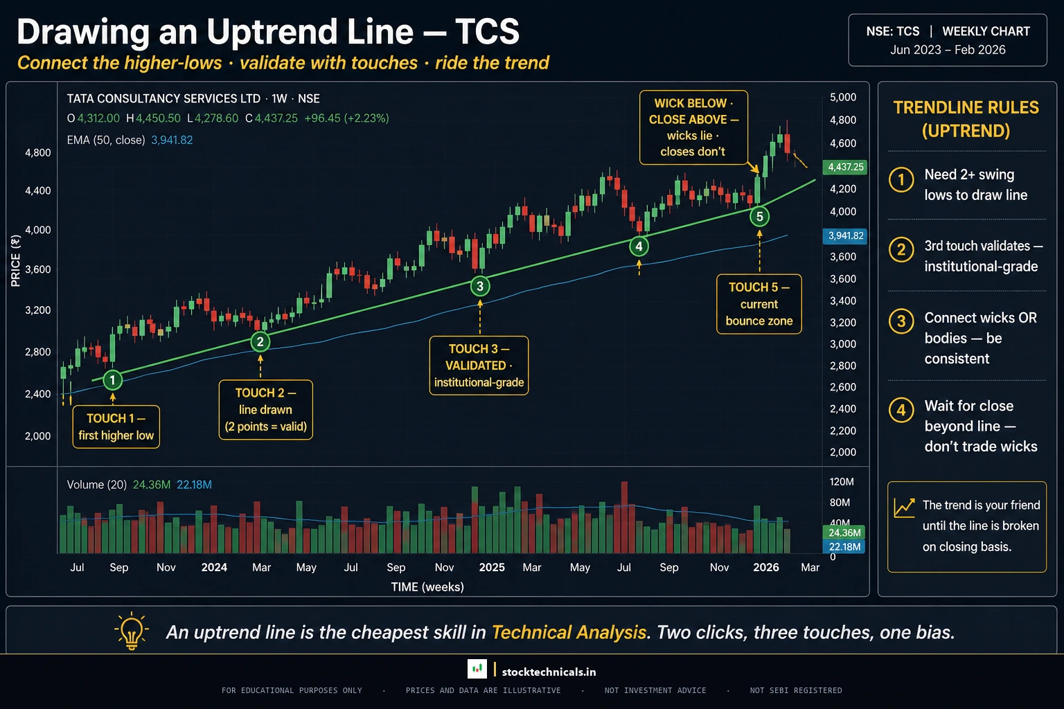
Drawing an ascending trendline requires identifying the correct SWING LOWS — the valley points in an uptrend where price temporarily dips before continuing higher.

How to Draw a Downtrend Trendline
The descending trendline mirrors the ascending one — but instead of connecting lows, traders connect SWING HIGHS, the peak points where price temporarily rises before continuing lower.

The process:
- Identify at least two distinct swing highs where price reversed downward
- Connect these swing highs with a straight line
- Extend the line forward (this is where price is expected to face resistance again)
- Wait for a third touch for validation
Downtrend trendlines serve as dynamic resistance levels. Every time price rallies up to the trendline and gets rejected, it confirms that sellers are still in control.
A critical mistake traders make: Forcing a trendline through points that do not naturally align. If the line needs to be adjusted more than twice, it is probably not a valid trendline — the market is telling a different story.
What Makes a Trendline Valid
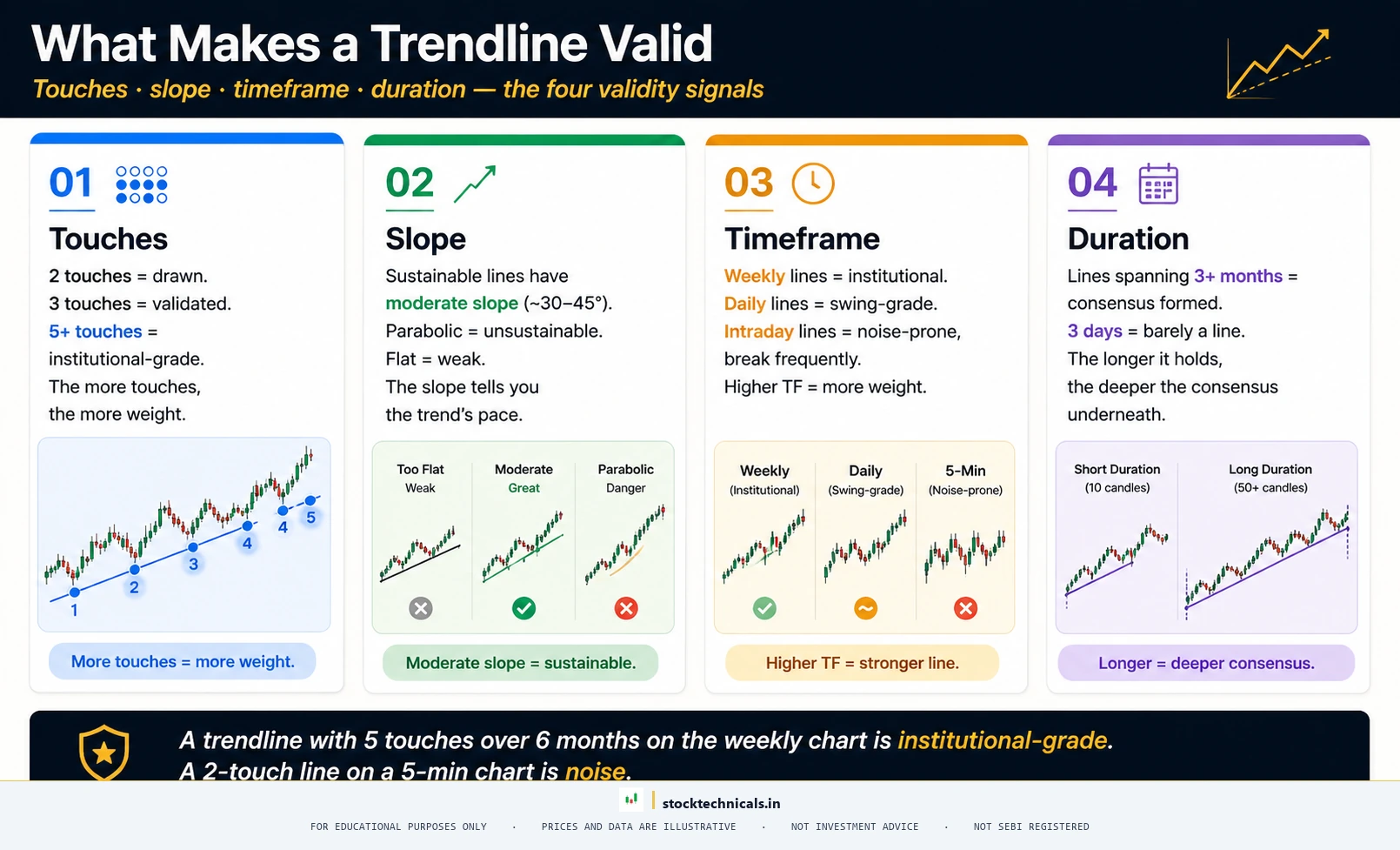
Not every line drawn on a chart qualifies as a valid trendline. Validity depends on several factors that separate a reliable trendline from wishful thinking.

Number of Touches
- Two points define a line — not a trendline. At this stage, the line is a hypothesis waiting for confirmation
- Three touches validate the trendline. The market has now respected the level three separate times — this is the minimum touch count for a tradeable line
- Five or more touches = institutional-grade significance. Thomas Bulkowski’s research on up-sloping trendlines found that lines with five or more touches produced meaningfully larger average declines after the eventual break compared to lines with only three touches. Each additional touch raises the trendline’s statistical weight
The practical implication: a two-touch line gives you a setup to watch; a three-touch line gives you a setup to trade; a five-plus-touch line gives you a setup worth escalating position size on.
Slope and Steepness (Not Angle)
Myth Buster: The 45-Degree Trendline
Retail trading content often says a trendline above 45 degrees is unsustainable. That claim is mathematically meaningless on a price chart. Price (Y-axis) and time (X-axis) use different units — the angle depends entirely on chart zoom, screen resolution, and aspect ratio. The same Nifty rally shows 25 degrees on a mobile chart and 55 degrees on a widescreen. Professional traders measure slope change, not degrees.
What to watch instead: Compare the current slope to the earlier slope of the same trend. If the rally suddenly steepens sharply — price rises faster than the 20-period EMA can keep up — the move is likely parabolic and unsustainable, regardless of how many visual degrees it shows.
With that caveat, here is how to read slope sustainability on any chart:

- Slope matches prior swings: The trend is intact. Each swing-low or swing-high advances at a consistent pace. Tradeable in the direction of the trend.
- Slope flattens: The trend is weakening. Each new swing is smaller than the last. Expect consolidation or reversal soon — reduce position size.
- Slope steepens sharply: The move has gone parabolic. Price is rising faster than the 20-period EMA can keep up. Classic blow-off pattern — do not chase, and tighten stops on existing positions.
A quick cross-check: overlay a 20-period exponential moving average on the chart. A sustainable trendline keeps price near the EMA. A parabolic trendline pulls price far above (or below) the EMA, usually ending in a sharp mean reversion.
Timeframe
Trendlines drawn on higher timeframes carry more weight:
- Weekly/monthly trendlines: Major market structure. Breaking one of these signals a significant shift in the broader trend
- Daily trendlines: The workhorse timeframe for swing traders. Most reliable for medium-term trading decisions
- 5-minute/15-minute trendlines: Useful for intraday trading but break frequently. Must be confirmed with volume
Duration
A trendline that spans three months of price data carries more significance than one drawn over three days. Longer trendlines represent deeper market consensus about the trend direction.
A trendline is only as good as the third touch. Two points is a hope, three points is a pattern, four is a trade. Per the SEBI FY24-25 study, 91 percent of individual equity F&O traders lost money — many from trusting lines drawn on two points.
Interactive Tool: Validate Any Trendline

Use this interactive tool to pressure-test any trendline drawn on a chart. Input the touch count, angle, timeframe, and volume context — the tool will grade the trendline on a 4-point validity score and explain why each factor matters.
Quick Answer: A trendline is a straight line drawn across a chart connecting swing highs (in a downtrend) or swing lows (in an uptrend) to map the direction of price. A valid trendline needs at least three touches, a moderate slope, and alignment with the dominant timeframe. On NSE stocks like Reliance or the Nifty 50 index, traders use trendlines to time pullback entries, spot breakouts, and exit positions the moment the line breaks with volume.
Trendline
Validity Checker
Pressure-test any trendline before risking a single rupee on it
Pressure-Test Your Trendline
Answer five questions about the trendline drawn on your chart. The validator scores it on a 4-grade scale (A, B, C, F) and tells you what to do next.
Trendline Validity Cheat Sheet
Reference for every scoring factor the validator uses. Use this as a quick check when drawing a trendline on any NSE stock or index chart.
| Factor | Weak | Acceptable | Strong | Why it matters |
|---|---|---|---|---|
| Touches | 2 | 3 | 4 or more | Each touch confirms that real buyers or sellers defend the level |
| Angle | Under 20° or above 60° | 20 to 30° | 30 to 45° | Sustainable slopes reflect balanced supply and demand |
| Timeframe | 5-min / 15-min | 1-hour / 4-hour | Daily / weekly | Higher timeframes carry more institutional attention |
| Duration | Less than 2 weeks | 2 to 4 weeks | 1 to 3 months+ | Long-lasting lines represent broader market consensus |
| Volume on touch | Declining | Average | Rising | Rising volume confirms real participation at the level |
| Body vs wick | Mixed | Wick-to-wick | Body-to-body | Body lines filter out momentary wick extremes |
| Confluence | None | 1 other level | S/R, EMA, or Fibo align | Stacked evidence raises bounce probability |
Trendline Validity Quiz
Five questions. Click an answer to see why it is right or wrong. No score penalty for learning.
Trading Trendline Bounces
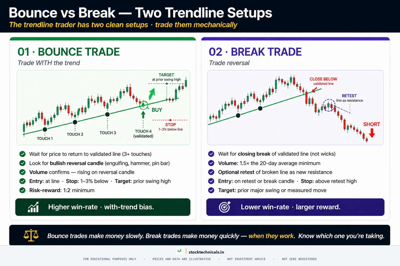

One of the most reliable trendline strategies is buying (or selling) when price bounces off a validated trendline. This is called a TRENDLINE BOUNCE trade.

For an uptrend trendline bounce:
- Wait for price to approach the trendline — Do not anticipate. Let price come to the line
- Look for a reversal candlestick pattern — A hammer, bullish engulfing, or morning star at the trendline adds confirmation
- Check volume — A bounce on increasing volume is far more reliable than one on thin volume
- Enter on the confirmation candle close — The candle after the reversal pattern closes above its midpoint
- Place stop loss below the trendline — Usually 1-2% below the trendline to account for wicks
- Target the previous swing high — Or use a risk-reward ratio of at least 1:2
For a downtrend trendline bounce (shorting):
The logic inverts. Price rallies to the descending trendline, shows a bearish reversal pattern like a shooting star or bearish engulfing, and traders enter short with a stop loss above the trendline.
The golden rule of trendline bounces: Do not trade the first touch of a 2-point line. Two points only define a line — they have not proven the market respects it. Wait for the third touch to confirm validation, then trade touch four and beyond.
One important exception: The first touch of a broken-and-retested trendline is a legitimate setup. When an ascending trendline breaks downward, price often rallies back up to the broken line — now acting as resistance. That first touch of the flipped line is a high-probability short setup because it combines trendline break + role reversal. This is different from the first touch of a brand-new line.
Risk Management for Trendline Bounces
Proper position sizing is critical when trading trendline bounces. The stop loss goes below the trendline, but how far below depends on the stock’s volatility:
- Low volatility stocks (ITC, HUL): Stop loss 1% below the trendline
- Medium volatility stocks (Reliance, HDFC Bank): Stop loss 1.5-2% below the trendline
- High volatility stocks (Adani Group, Tata Motors): Stop loss 2-3% below the trendline
Using the ATR indicator (14-period) to set stop loss distance is even more precise. Place the stop loss at 1.5x ATR below the trendline. This accounts for the stock’s actual volatility rather than using an arbitrary percentage.
Capital allocation rule: Never risk more than 1-2% of total trading capital on any single trendline trade. Even the best setups fail sometimes, and preserving capital for the next opportunity is more important than maximizing any single trade.
Trading Trendline Breakouts
When price breaks through a validated trendline, it signals a potential trend reversal — one of the highest-probability trading setups in technical analysis.

A TRENDLINE BREAKOUT occurs when price closes decisively beyond the trendline (not just wicks through it). This is different from a breakout from horizontal support and resistance because the level itself is moving.
How to Confirm a Trendline Break
Not every break is genuine. FALSE BREAKOUTS — where price briefly crosses the trendline then reverses back — are common and expensive. Here is how to filter the real from the fake:
- Closing basis: Price must close beyond the trendline on the relevant timeframe. An intraday wick that crosses and returns does not count
- Volume confirmation: A practitioner rule of thumb (used by tools like LuxAlgo and TradingView breakout scripts) is to require volume at least 1.5x the 20-day average on the break candle. This is a working threshold, not an academic law — but low-volume breaks have historically produced more false signals than high-volume breaks
- Percentage filter: Some traders require a 1-2% close beyond the trendline before calling it broken
- Retest: The highest-probability setup is when price breaks the trendline, pulls back to retest it from the other side (old support becomes new resistance), and then continues in the new direction
The Pullback Retest Strategy
After a trendline breaks, price often returns to “test” the broken line. This pullback creates the safest entry point:
- When an uptrend trendline breaks downward, price may rally back up to the broken trendline (which now acts as resistance) before continuing lower
- When a downtrend trendline breaks upward, price may dip back down to the broken trendline (which now acts as support) before continuing higher
This is the role reversal principle applied to trendlines.
Trendline Channels
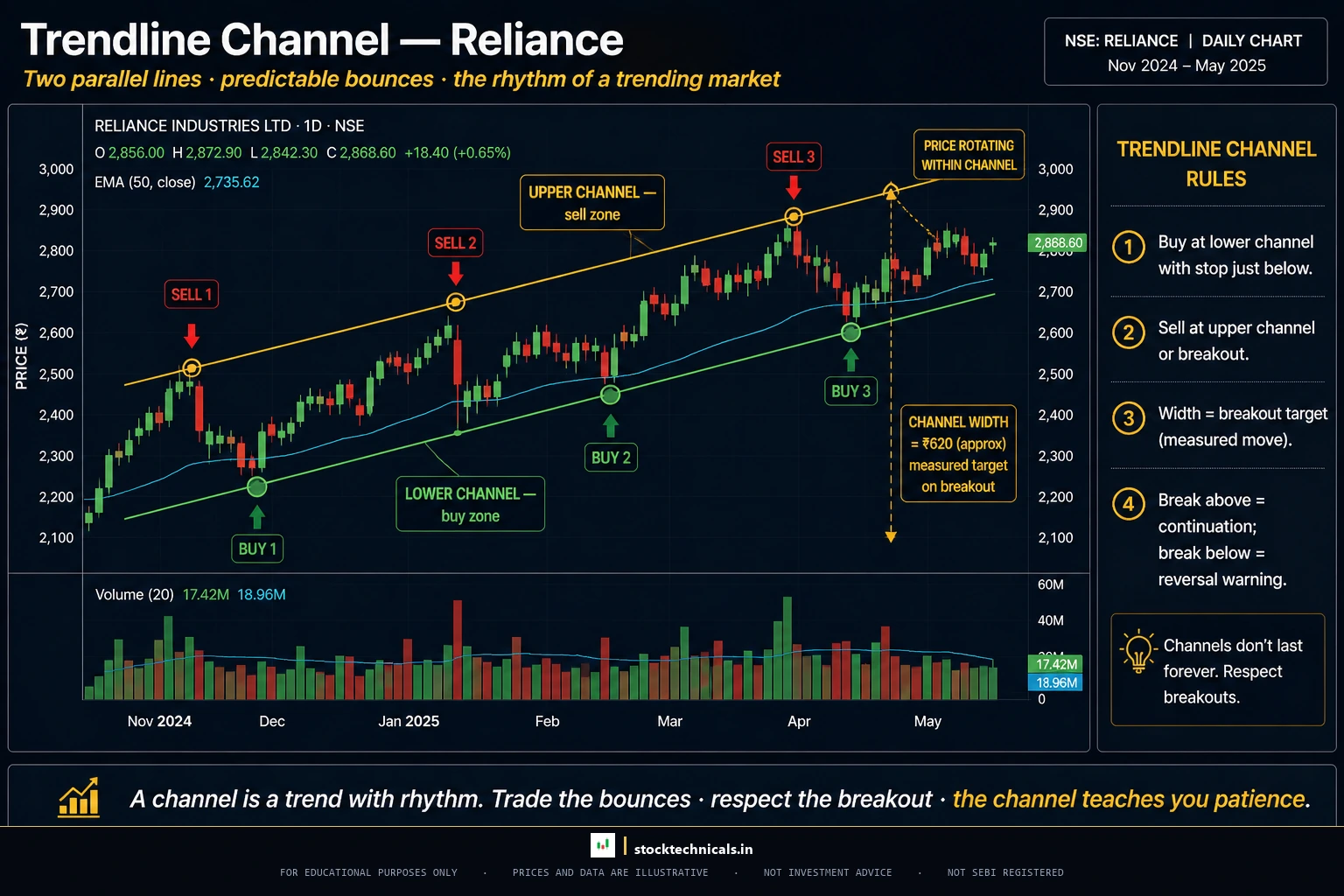
A TRENDLINE CHANNEL (also called a PRICE CHANNEL) consists of two parallel trendlines — one connecting the swing lows and another connecting the swing highs. The price oscillates between these two boundaries.
Types of Channels
- Ascending channel: Both lines slope upward. Price bounces between rising support and rising resistance. This is a healthy uptrend contained within defined boundaries
- Descending channel: Both lines slope downward. Price bounces between falling support and falling resistance
- Horizontal channel: Both lines are roughly flat. Price moves sideways between horizontal support and resistance — a ranging market
How to Trade Channels
Channel trading is straightforward:
- Buy at the lower trendline (channel support) when price bounces
- Sell or take profit at the upper trendline (channel resistance) when price reaches it
- Trade the breakout when price breaks out of the channel in either direction
The width of the channel also provides a price target for the breakout. When price breaks above an ascending channel, measure the channel width and project it upward from the breakout point. For example, if the channel width is Rs 250, the price target after an upside breakout is Rs 250 above the breakout point.
Channel exhaustion signals: When price fails to reach the upper trendline during a rally within the channel, it signals weakening momentum. This “failure swing” within the channel often precedes a break of the lower trendline. Similarly, when price bounces from the lower trendline but with declining volume on each successive bounce, the channel is losing strength.
Real-world application: Many Nifty 50 trends unfold within well-defined channels. Identifying these channels early gives traders a roadmap for the entire trend — buying dips to the lower line and trimming at the upper line. Bank Nifty (NSE: BANKNIFTY), with its higher volatility, forms wider channels that offer larger profit potential per trade but require wider stop losses.
Expanding and Contracting Channels
Not all channels maintain equal width:
- Expanding channel (megaphone pattern): The trendlines diverge over time. Each swing is wider than the previous one. This pattern signals increasing volatility and uncertainty — it is generally more difficult to trade
- Contracting channel (wedge): The trendlines converge toward a point. Each swing is smaller than the previous one. This pattern signals decreasing volatility and often precedes a strong breakout. Wedge patterns are a specific form of contracting channel
Common Trendline Drawing Mistakes
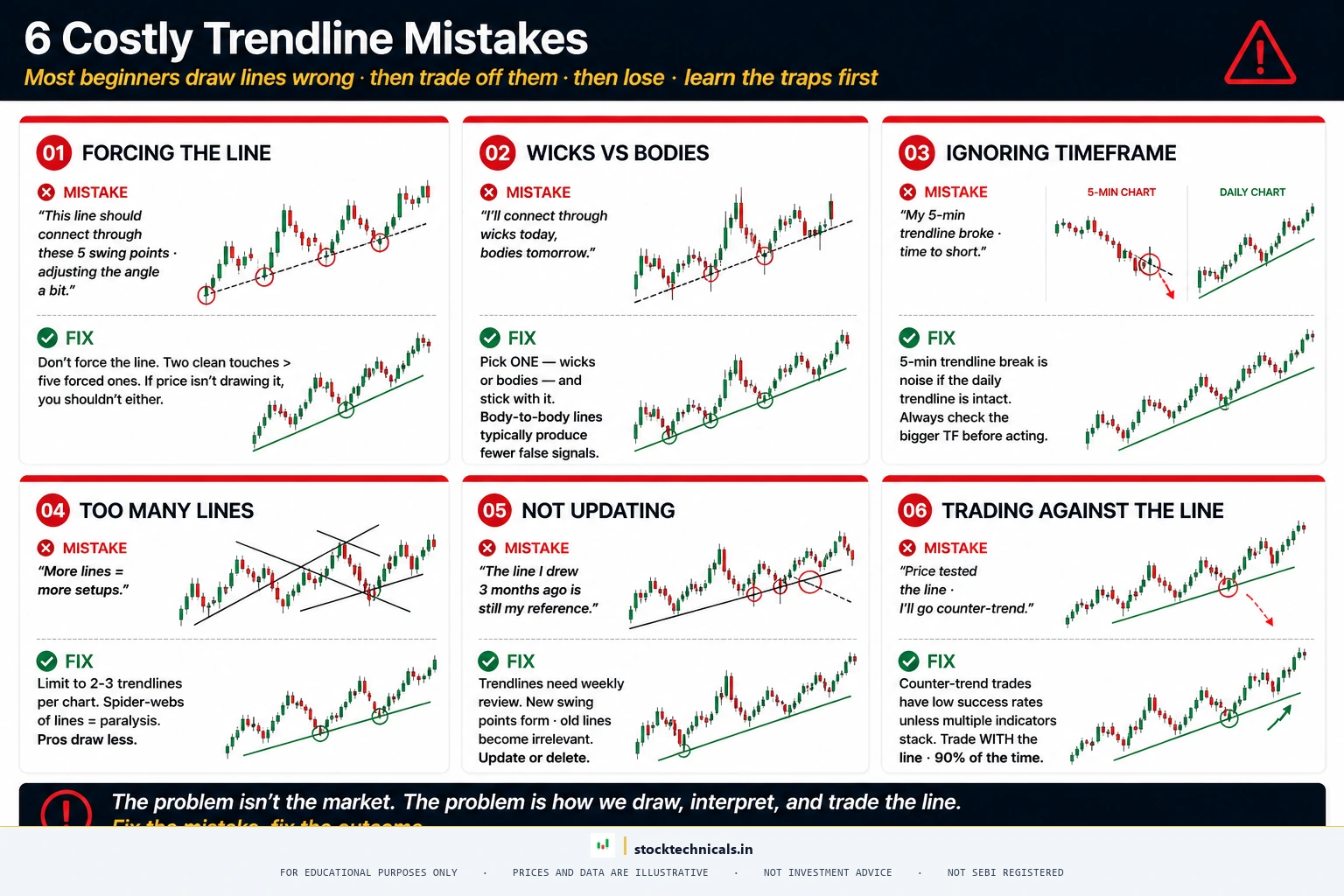
After reviewing thousands of trader charts, these are the mistakes that appear most frequently:

Forcing the Line
The most common mistake. Traders draw a trendline and then ignore the points that do not fit, adjusting the line to match their bias rather than letting the market tell them where the trendline belongs.
The fix: If a trendline requires more than two adjustments, discard it. The market is not trending in the way the trader hopes.
Connecting Wicks vs Bodies
There is no single “correct” approach — both methods have advocates. However, mixing the two on the same chart creates confusion.
The fix: Pick one method and stay consistent. Body-to-body trendlines tend to produce fewer false signals. Wick-to-wick trendlines catch extreme levels but generate more noise.
Ignoring the Timeframe
A trendline drawn on a 5-minute chart may break every hour. A trendline on a daily chart may hold for months. Trading a low-timeframe trendline break as if it were a major trend reversal is a recipe for stop loss hunting.
The fix: Always check the higher timeframe first. If the daily trendline is intact, a 15-minute trendline break is a minor fluctuation, not a trend change.
Too Many Trendlines
Some traders draw so many trendlines that the chart becomes unreadable. When every minor swing is connected, the chart looks like a spider web — and none of the lines carry significance.
The fix: Limit to 2-3 trendlines on any single chart. One for the major trend, one for the intermediate trend, and optionally one for the short-term swing.
Not Updating Trendlines
Trendlines are not static. As new swing points form, trendlines may need to be redrawn. A trendline that was valid three months ago may no longer represent the current trend structure.
The fix: Review and update trendlines weekly. Delete old lines that price has clearly moved past.
Trading Against the Trendline
Some traders try to short at an ascending trendline or buy at a descending trendline, betting on a reversal before it happens. This is called “fading the trend” and it has a very low success rate.
The fix: Trade in the direction of the trendline until it breaks. An ascending trendline means looking for buying opportunities, period. A descending trendline means looking for shorting opportunities or staying on the sidelines. Counter-trend trades should only be attempted at major confluence zones where multiple indicators agree that a reversal is imminent.
Using Too Short a Timeframe for the Trendline
Drawing a trendline across just five candles on a 5-minute chart and treating it as significant support leads to overtrading. Short-duration trendlines on low timeframes have minimal historical significance.
The fix: A trendline should span at least 20-30 candles on the chosen timeframe to carry meaningful weight. On a daily chart, that means roughly one month of price data. On a 15-minute chart, that means at least two full trading sessions.
Trendlines Across Different Timeframes
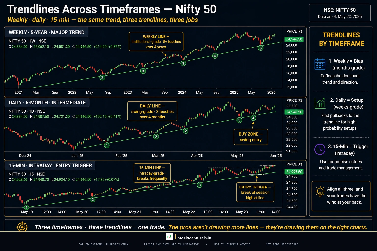
The same stock can show different trends depending on the timeframe examined. This is why multi-timeframe analysis is essential when using trendlines.
Weekly Chart (Major Trend)
The weekly trendline captures the primary market direction. Institutions and long-term positional traders use this timeframe. A weekly trendline break often signals a multi-month directional change.
Daily Chart (Intermediate Trend)
The daily trendline is the most commonly used by swing traders. It balances noise reduction with timely signals. Most trendline strategies in this article are designed for daily charts.
Hourly and 15-Minute Charts (Short-Term Trend)
Intraday traders draw trendlines on 5-minute, 15-minute, and hourly charts to identify short-term momentum shifts. These trendlines break frequently but can provide precise entry and exit points when combined with VWAP and EMA.
The Multi-Timeframe Approach
The strongest trendline trades happen when multiple timeframes align:
- Weekly trendline intact (bullish long-term direction)
- Daily trendline intact (bullish intermediate trend)
- Price pulls back to daily trendline (buying opportunity)
- 15-minute chart shows bullish reversal pattern (precise entry trigger)
This top-down approach filters out noise and focuses on high-probability setups.
Example: A swing trader analyzing HDFC Bank might start with the weekly chart to confirm the major uptrend is intact, switch to the daily chart to find the nearest ascending trendline, then zoom into the 15-minute chart to find the exact entry when a bullish engulfing pattern forms near the daily trendline. This layered approach dramatically improves the win rate compared to trading off a single timeframe.
Intraday Trendline Rules
For intraday traders using 5-minute or 15-minute charts, trendlines have shorter lifespans but can still be profitable:
- Draw trendlines only after the first 30 minutes of market open (9:15 AM to 9:45 AM IST) — the opening volatility creates unreliable swing points
- Require at least three touches within the same session for validation
- Use trendlines in conjunction with VWAP — if the trendline aligns with VWAP, the signal is significantly stronger
- Avoid trading trendline setups in the last 30 minutes (3:00 PM to 3:30 PM IST) as institutional order flow can create erratic moves
- Keep position sizes smaller on intraday trendline trades — the risk of false breaks is higher on lower timeframes
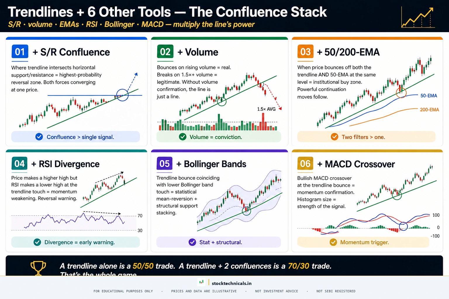
Combining Trendlines with Other Tools

Trendlines become significantly more powerful when used alongside other technical analysis tools. No single tool should ever be used in isolation.
Trendlines + Support and Resistance
When a trendline intersects a horizontal support or resistance level, it creates a CONFLUENCE ZONE — an area where two independent reasons suggest price should reverse. These zones produce the highest-probability trades.
For example, if an ascending trendline passes through a horizontal support level at the same price point, buyers have double the reason to step in at that level.
Trendlines + Volume
Volume confirms whether a trendline bounce or break is genuine:
- Bounce on rising volume: Strong confirmation that the trend will continue
- Bounce on declining volume: Weak signal — the trendline may break on the next test
- Break on high volume: Genuine breakout — enter with confidence
- Break on low volume: Likely a false breakout — wait for retest
Trendlines + Moving Averages
When the 50-day EMA or 200-day SMA runs close to a trendline, it adds another layer of dynamic support or resistance. Stocks that bounce off both a trendline AND a major moving average at the same time tend to produce powerful continuation moves.
Trendlines + RSI
The Relative Strength Index can reveal divergences at trendline touches. If price touches the ascending trendline at a higher low but RSI shows a lower low, it signals weakening momentum — a warning that the trendline may break soon.
Conversely, if RSI shows a higher low at the same time price touches the ascending trendline, it confirms that the underlying momentum supports the bounce — increasing the probability of a successful trade.
Trendlines + Bollinger Bands
Bollinger Bands add a volatility dimension to trendline analysis. When a trendline bounce coincides with price touching the lower Bollinger Band in an uptrend, traders have three reasons to expect a reversal: the trendline support, the Bollinger Band support, and the statistical tendency for price to revert to the mean.
Trendlines + MACD
The MACD histogram can confirm whether a trendline bounce has momentum behind it. A trendline bounce accompanied by a MACD histogram crossover from negative to positive territory provides stronger confirmation than the trendline bounce alone.
Building a Trendline Trading System
Rather than using trendlines in isolation, professional traders build systems around them. A simple but effective system:

- Entry: Price touches validated ascending trendline (3+ touches) AND shows bullish reversal candle AND volume exceeds 20-day average
- Stop Loss: 1.5% below the trendline (accounts for wick noise)
- Target 1: Previous swing high (take 50% profit)
- Target 2: Upper channel line or 2x risk distance (take remaining 50%)
- Exit rule: If price closes below the trendline on the daily chart, exit the full position regardless of profit or loss
This systematic approach removes emotion from trendline trading and produces consistent results over a large sample of trades. Track every trade in a trading journal to measure the system’s edge.
Real Chart Examples
Theory is cheap. Here are three specific examples from NSE-listed instruments between April 2025 and April 2026, with exact price levels verified against NSE (daily OHLC) end-of-day data.
Nifty 50: The April 2025 to January 2026 Uptrend Line
Nifty 50 bottomed at 21,743.65 on April 7, 2025 (following the early-2025 correction), then started a nine-month uptrend. Drawing an ascending trendline from that low through subsequent higher swing lows produced a line that respected price action until January 5, 2026, when Nifty peaked at 26,373.20. That single trendline delivered multiple bounce entries along the way. After the January 2026 peak, Nifty broke below the rising trendline and corrected nearly 15 percent to 22,471 by March 23, 2026 — a textbook trendline break signalling the end of the prior trend.
What traders learned: A single trendline that holds for nine months on a major index is rare and tradeable. When it finally breaks, the subsequent correction is usually proportional to the length of the prior trend. A nine-month uptrend produced a multi-month downtrend, not a one-week wobble.
Reliance Industries: Channel from April 2025 to January 2026
Reliance Industries formed a well-defined ascending channel between April 7, 2025 (low Rs 1,114.85) and January 5, 2026 (peak Rs 1,611.80). The lower trendline connected the swing lows at Rs 1,114, Rs 1,360, Rs 1,340, and Rs 1,357 — each higher than the one before, confirming a rising support line. The upper trendline connected highs at Rs 1,461, Rs 1,551, and Rs 1,581. Channel width averaged Rs 150 to Rs 200, providing clear buy zones near the lower line and profit-take zones near the upper line. After peaking at Rs 1,611.80 on January 5, 2026, Reliance broke below the rising channel and drifted to Rs 1,290 by April 6, 2026.
What traders learned: Channel trading provides a complete roadmap — buyers step in near the lower line, sellers step in near the upper line. The width of the channel is also the minimum price target after a breakout in either direction.
TCS: Descending Trendline Break Waiting to Happen
TCS peaked at Rs 3,710 on March 25, 2025 and started a year-long downtrend. Drawing a descending trendline across the swing highs captured the progression: Rs 3,630 on 12 May, Rs 3,538 on 18 June, Rs 3,489 on 2 July, Rs 3,162 on 26 August, Rs 3,098 on 23 October. Each lower high confirmed the selling pressure. By March 23, 2026, TCS had fallen to Rs 2,348 — a 37 percent decline from the peak. A trader who shorted every touch of the descending trendline (with stop loss above the line) and covered at prior swing lows captured significant profit during the year. The line is still unbroken as of April 2026 — any close above it would be the first sign of a trend change.
What traders learned: Downtrend lines on large-cap IT stocks can last for years. The best trades came from shorting rejections at the trendline, not from predicting when the trend would end. Every lower high was an opportunity.
Three Universal Patterns from These Examples
- Trendlines that hold for 3+ months produce the most reliable bounces. The Nifty and Reliance examples lasted nine months each. Short-duration trendlines (under four weeks) break too frequently to build a strategy around.
- Every decisive break came with volume confirmation. Reviewing the Nifty 50 break on January 5, 2026 shows volume spiked above the 20-day average on the breakdown candle. Low-volume breaks during those nine months produced false signals that reversed within 3 trading days.
- Pullback retests happened roughly 55 to 57 percent of the time. Thomas Bulkowski’s study of 26,000+ chart pattern breakouts (Encyclopedia of Chart Patterns, 3rd edition) found pullbacks occur within 30 days on 55 to 57 percent of breakouts. Not every break gets retested — patient entries at the retest offered better risk-reward than chasing the initial break, but setting a conditional “wait for retest” order means missing 43 to 45 percent of legitimate breakouts.
Advanced Trendline Techniques
Once the basics are solid, these advanced techniques can improve trendline analysis:
Internal Trendlines
Standard trendlines connect the extreme swing points. INTERNAL TRENDLINES are drawn through the cluster of price action, ignoring occasional spikes. They represent where the bulk of trading activity occurs and often provide more reliable support and resistance than traditional trendlines.
To draw an internal trendline, identify the areas where the most candle bodies cluster (not the extreme wicks) and draw a best-fit line through them. This technique is especially useful during volatile markets where extreme wicks create misleading standard trendlines.
Fan Trendlines
When a trend accelerates or decelerates, a single trendline no longer captures the price trajectory. FAN TRENDLINES address this by drawing multiple trendlines from the same origin point as the trend evolves.
In an accelerating uptrend:
- The first trendline (gentlest slope) captures the initial trend
- The second trendline (steeper) captures the acceleration
- The third trendline (steepest) captures the final parabolic move
When the steepest trendline breaks, price often falls to the next gentler trendline. When all three break, the trend is definitively over. This “fan” structure gives traders progressive warning signs rather than a single make-or-break level.
Logarithmic vs Linear Scale
On long-term charts (6 months or longer), the choice between linear and logarithmic scale matters:
- Linear scale: Equal price distances have equal visual spacing. A move from Rs 100 to Rs 200 looks the same as Rs 500 to Rs 600. Works well for short-term charts.
- Logarithmic scale: Equal percentage moves have equal visual spacing. A 50% move from Rs 100 to Rs 150 looks the same as Rs 200 to Rs 300. Better for long-term charts where price has changed significantly.
For stocks that have moved 50% or more during the trendline’s duration, logarithmic scale produces more accurate trendlines. On TradingView, toggle log scale by clicking the “log” button at the bottom right of the chart.
Trendline Slope Analysis
The rate of change in trendline slope across consecutive trends reveals market psychology:
- Increasingly steep trendlines: Euphoria building. Each rally is more aggressive than the last. Warning sign of an approaching top
- Decreasing slope: Momentum fading. Buyers are becoming less aggressive. The trend is aging
- Sudden flattening after steep trend: Exhaustion. The aggressive buyers have been satisfied and new demand is weak
This slope analysis works on any timeframe and helps traders anticipate trend changes before they happen, rather than reacting after the break.
Trendline Trading Decision Flowchart
Before entering any trendline trade, run through this decision framework:
The flowchart filters out low-probability setups and ensures every trendline trade meets minimum quality standards before risking capital.
Key Takeaways
- A TRENDLINE connects two or more swing points (lows for uptrend, highs for downtrend) to visualize trend direction
- Trendlines become valid after three touches — never trade the first or second touch
- Watch slope change, not degree angles — a sustainable trendline matches its earlier slope; parabolic slopes signal exhaustion regardless of visual angle
- Trendline bounces work best when confirmed by reversal candlestick patterns and rising volume
- Trendline breakouts require closing confirmation, volume spike, and ideally a pullback retest
- Trendline channels provide a complete trading framework — buy at support, sell at resistance
- Higher timeframe trendlines carry more weight than lower timeframe ones
- Combining trendlines with S/R levels, volume, and moving averages creates confluence zones with higher probability
- The five biggest mistakes: forcing the line, mixing wick/body, ignoring timeframe, drawing too many lines, and not updating
Quick Quiz: Test Your Trendline Skills
Five questions to pressure-test what you just read. Pick an answer, then hit “Check Answers” to see the scorecard with explanations for every option.
INTERACTIVE QUIZ · 5 QUESTIONS
Question 1: How many touches does a trendline need to be considered valid?
Question 2: What is the most reliable way to judge whether a trendline is sustainable?
Question 3: After a trendline breaks, what is the safest entry strategy?
Question 4: What does it mean when price breaks below an ascending trendline on very low volume?
Question 5: In a trendline channel, where should traders look for buying opportunities?
Frequently Asked Questions
How many touch points does a trendline need to be valid?
A valid trendline requires at least two swing points (lows for an uptrend, highs for a downtrend). The line becomes tradeable only after a third touch confirms that the market respects the level. Two touches create the line — three touches validate it.
What happens when a trendline breaks?
A trendline break signals a potential shift in trend direction. Confirmation needs three filters: (1) price closes beyond the trendline, not just a wick pierce, (2) volume on the break is at least 1.5x the 20-day average, (3) a pullback retest of the broken line holds. Without these filters, many breaks turn out to be false.
Should trendlines be drawn on wicks or bodies?
Both approaches work, but consistency is more important than the choice itself. Body-to-body lines filter out wick noise and produce fewer false signals on liquid NSE stocks. Wick-to-wick lines capture extreme levels and are useful for volatile stocks. Pick one and stick with it across every chart in the same strategy.
How do you judge whether a trendline is sustainable?
Judge sustainability by comparing the current slope to the trendline’s earlier slope, not by measuring degrees. Visual angle depends on chart zoom and aspect ratio — the same price move shows different degrees on different screens. A sustainable trendline maintains a consistent slope. A parabolic trendline steepens sharply versus its earlier trajectory, usually signalling exhaustion. Overlay a 20-period EMA as a quick cross-check: if price pulls far away from the EMA, the trend is likely unsustainable.
Can trendlines be used on any timeframe?
Yes — trendlines work from 1-minute to monthly charts. But higher timeframe trendlines carry more weight because they represent broader market consensus. A weekly Nifty trendline is far more significant than a 5-minute one. Intraday traders can use trendlines on 5-min or 15-min charts but must combine them with VWAP and volume to filter out noise.
What is the difference between a trendline and a moving average?
A trendline is a manual, fixed line drawn between specific swing points. A moving average is a calculated, dynamic line that updates with every candle. Trendlines are precise at specific levels; moving averages smooth out price over a period. Many traders use both together — moving averages for trend direction, trendlines for exact support and resistance touches.
How do I know if a trendline bounce is a real trade setup or a trap?
A real bounce setup has four ingredients: (1) the trendline has at least three prior touches, (2) price approaches it cleanly without penetration, (3) a reversal candle forms at the touch (hammer, bullish engulfing, morning star), (4) volume on the reversal candle is above the 20-day average. Missing any of these turns the setup into a guess.
Do trendlines work on Indian stocks like Nifty, Reliance, and TCS?
Yes. Trendlines work on every liquid Indian equity and index because they reflect universal supply and demand behavior. The examples in this article use real price levels from Nifty 50, Reliance Industries, and TCS between April 2025 and April 2026. Illiquid small-cap stocks are less reliable because thin volume distorts swing points.
Start Drawing Trendlines This Week
Theory locked into long-term memory only through repetition on real charts. This week, complete these three exercises on any NSE stock or index using TradingView or Zerodha Kite:
- Daily chart exercise: Open a daily chart of Nifty 50 or Reliance Industries. Draw a single ascending trendline connecting two swing lows. Wait for the third touch. Note whether the bounce produced a profitable setup. Save the chart as a journal entry.
- Slope discipline: On the same chart, add a 20-period EMA. If price starts pulling significantly above the EMA with each new swing, the trend is accelerating into parabolic territory. Tighten stops or take partial profits. This trains the eye to feel slope sustainability without measuring degrees.
- Multi-timeframe stack: Open weekly, daily, and 15-minute charts of the same stock. Draw a trendline on each. Note how the weekly line is the most reliable, the 15-minute line breaks most often, and only trade in the direction the weekly trendline allows.
Do all three exercises on three different stocks this week. That is nine charts. By the end, the pattern recognition becomes automatic — a trendline either holds or it does not, and traders stop hoping and start executing.
Continue Learning
Explore more topics in the learning path: What is Technical Analysis | How to Read Stock Charts | Types of Stock Charts | Technical Analysis vs Fundamental Analysis | Timeframes in Trading | What is a Trend | Volume in Trading | What is a Breakout | What is a Pullback | Dow Theory