
Published January 3, 2026 · Last refreshed April 27, 2026. Prices and data are compiled with reasonable care — always confirm against your broker before trading.
Every price chart tells the same underlying story — where a stock opened, how far it moved, and where it closed. But the way that story gets displayed changes what traders notice first, what patterns become visible, and what signals get buried under noise.
Choosing the wrong chart type does not cause losses directly. But it does cause traders to miss things — a reversal forming on candlesticks that a line chart hides, a trend continuation visible on Renko that candlestick noise obscures, or a support and resistance level that only a Point and Figure chart makes obvious.
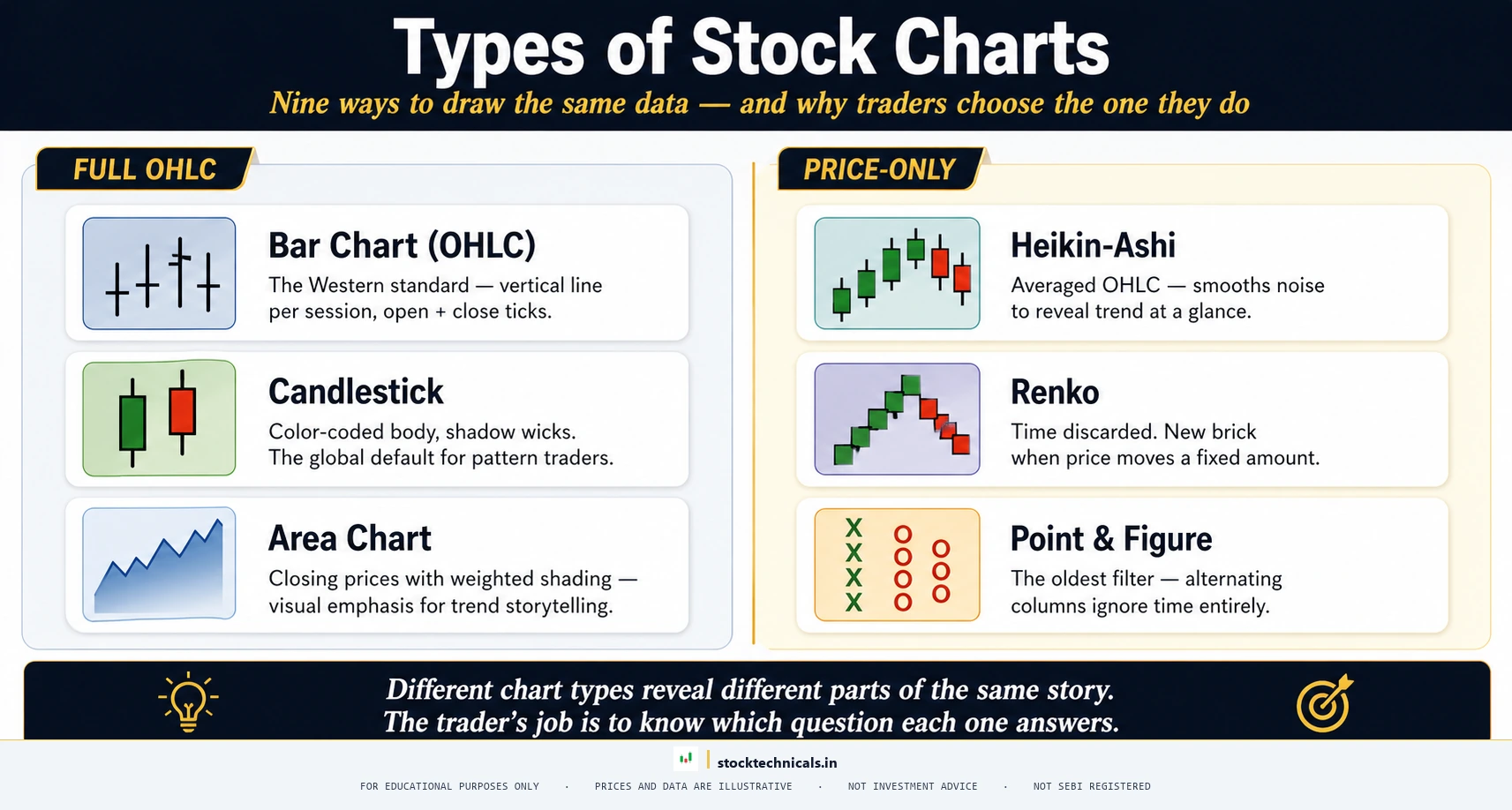
This article walks through all nine types of stock charts used in technical analysis, explains what each type shows and hides, and provides a decision framework so traders can match the right chart to the right trading style. Every example uses real price data from NSE-listed stocks.
For traders who are still building the basics of how to read stock charts, start there first. This article builds directly on that foundation. And for those weighing whether technical analysis or fundamental analysis is the right path — both approaches use charts, and understanding chart types is relevant regardless of which school of analysis a trader follows.
What Stock Charts Show and Why Chart Type Matters
At the most basic level, a stock chart plots price on the vertical axis and time on the horizontal axis — or in some chart types, price movement in place of time altogether. The amount of price information each chart type displays varies dramatically, and so does the timeframe that best suits each.

Close-only charts (Line and Area) plot just one data point per time period — the closing price. This keeps the view clean but throws away three-quarters of the price information for that period. The opening price, the highest point reached during the session, and the lowest point are all invisible.
OHLC charts (Bar and Candlestick) plot four data points per time period — Open, High, Low, and Close. This is the full picture. Traders can see where the session started, how far buyers pushed price upward, how far sellers dragged it down, and where the tug-of-war ended. The relationship between these four numbers reveals the sentiment behind the move, not just the move itself — which is exactly why candlestick anatomy is the first thing every beginner learns.
Price-only charts (Renko, Point and Figure, Kagi) take a completely different approach. They ignore time altogether. A new element appears on the chart only when price moves by a predefined amount. This strips out the small, meaningless fluctuations — what traders call NOISE (the random, low-significance price movements that do not reflect real changes in supply or demand) — and leaves only the significant moves.
Understanding this distinction — close-only versus OHLC versus price-only — is the foundation for choosing the right chart. Each approach answers a different question:
- Close-only: “Where is the trend heading?”
- OHLC: “What happened within each session, and who controlled it?”
- Price-only: “Where are the significant support and resistance levels, stripped of noise?”
The rest of this article covers each chart type in detail, with real data from RELIANCE INDUSTRIES (NSE: RELIANCE), TCS (NSE: TCS), HDFC BANK (NSE: HDFCBANK), INFOSYS (NSE: INFY), and NIFTY 50 to show exactly how the same market data looks different depending on the chart type selected.
Line Charts — The Simplest View of Price
A LINE CHART (a chart that connects only the closing prices of each time period with a continuous line) is the most basic stock chart type. One data point per candle, one line across the screen.
How Line Charts Work
The line chart takes the closing price from each time period — whether that period is one minute, one day, or one week — and connects those prices with a straight line. Open, High, and Low data for each period are discarded entirely.
On the NIFTY 50 weekly line chart above, connecting each Friday close across calendar 2025, the index moves from a swing low near 21,743 in early April 2025 to a swing high of 26,310 in late November before pulling back to about 25,665 by mid-January 2026. The general direction — whether the market is trending up, down, or sideways — becomes immediately visible. What is not visible is how volatile each individual day was, where the day opened relative to where it closed, or whether sellers pushed price significantly lower during the session before buyers recovered.
When to Use Line Charts
Line charts work best in three specific situations:
- Long-term trend identification. When traders need a quick read on whether a stock is in an uptrend, downtrend, or sideways range, a line chart delivers that answer faster than any other chart type. The clean, uncluttered view makes trendlines easy to draw.
- Comparing multiple stocks on the same screen. Overlaying RELIANCE INDUSTRIES and TCS on the same chart is cleaner with lines than with candlesticks. The visual does not become a cluttered mess of colored bodies and wicks.
- Presentations and reports. Line charts are the most universally understood chart format. Even the NSE India website defaults to line charts for index performance displays. Non-traders — fund managers presenting to boards, analysts writing reports — rely on line charts because the audience does not need to know what a wick or body means.
Strengths and Weaknesses
Strengths: Cleanest visual, fastest trend read, works well for timeframes of weekly or monthly, excellent for overlay comparisons.
Weaknesses: Hides intraday volatility, cannot show candlestick patterns, useless for intraday breakout trading, and provides no information about buyer-seller dynamics within each session.
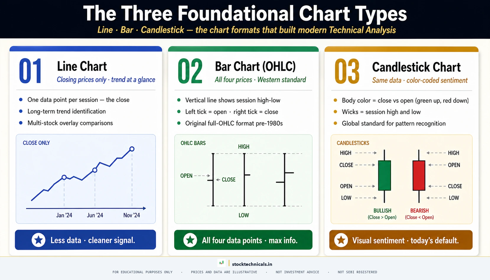
Bar Charts (OHLC) — The Western Standard
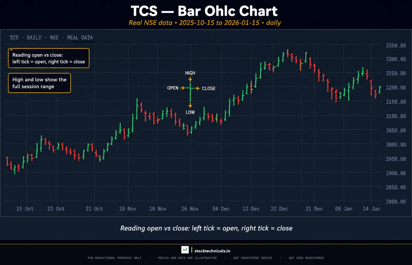
Chart window: Oct 2025–Jan 2026 · Source: NSE (daily OHLC)
A BAR CHART (also called an OHLC CHART, short for Open-High-Low-Close, which displays all four price data points for each period as a vertical line with horizontal ticks) was the dominant chart type in Western financial markets for decades before candlestick charts took over.
Anatomy of a Bar
Each bar on an OHLC chart consists of three elements:
- Vertical line: The full range between the session’s high and low. On TCS (NSE: TCS), the daily bar for 9 December 2025 shows a vertical line stretching from a low of ₹3,181.20 to a high of ₹3,233.70 — a range of roughly ₹52.
- Left horizontal tick: The opening price. On that same TCS bar, the left tick sits at ₹3,230.00.
- Right horizontal tick: The closing price. The right tick sits at ₹3,208.30.
If the right tick (close) is above the left tick (open), the session was bullish — price went up. If the right tick is below the left tick, the session was bearish — price went down.
Reading Open, High, Low, Close
The relationship between these four prices tells traders something specific:
- Long vertical line, tiny spread between open and close: High volatility within the session, but neither side won decisively. Indecision.
- Short vertical line with close near the high: Buyers controlled the session from start to finish. Strength.
- Long upper shadow (price went high then fell back): Sellers rejected the higher prices. Potential resistance.
These are the same dynamics that candlestick patterns reveal — but on a bar chart, the trader must mentally compare the position of the left and right ticks to determine whether the bar was bullish or bearish. There is no color coding to make it instant.
When Bar Charts Make Sense
Bar charts still appear in three contexts:
- Commodity and forex markets. Some Western commodity traders and forex traders trained in the 1980s-1990s still prefer bar charts. The institutional trading desks at CME Group and ICE historically used bar charts as the default.
- Range analysis. The vertical line on a bar chart makes the High-Low range more visually prominent than on a candlestick chart, where the body dominates the visual. Traders focused on volatility and range sometimes prefer this emphasis.
- Legacy platforms. Older charting software and some broker terminals default to bar charts. On platforms like TradingView, switching to candlesticks takes one click — but traders on legacy systems may not have that option.
For most traders starting out today, there is no practical reason to choose bar charts over candlestick charts. Candlesticks display the same OHLC data with the addition of color coding, which makes pattern recognition faster.
Candlestick Charts — Why Traders Swear by Them
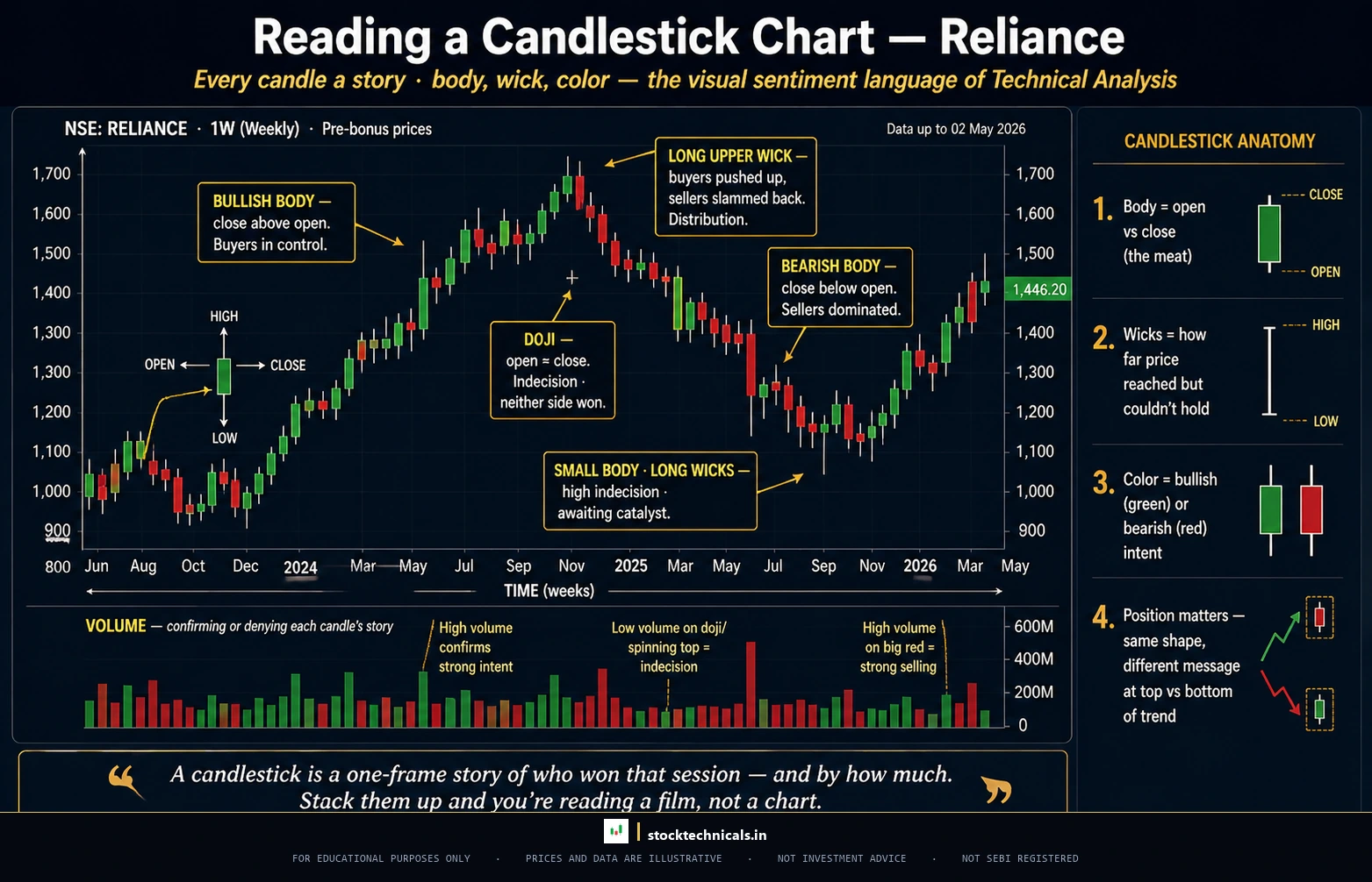
A CANDLESTICK CHART (a chart that displays Open, High, Low, and Close data for each period using a colored rectangular body with lines — called wicks or shadows — extending above and below) is the global standard for stock and derivatives trading. The overwhelming majority of trading education, pattern libraries, and professional analysis is built around candlestick charts.
Anatomy of a Candlestick
Each candlestick has three components:
- Body: The rectangular area between the open and close prices. On HDFC BANK (NSE: HDFCBANK), a daily candlestick might show a body stretching from an open of ₹880 to a close of ₹920 — a ₹40 body representing a strong bullish session.
- Upper wick (shadow): The thin line extending above the body, showing the highest price reached during the session. If the high was ₹935, the upper wick extends ₹15 above the body.
- Lower wick (shadow): The thin line extending below the body, showing the lowest price reached. If the low was ₹870, the lower wick extends ₹10 below the body.
For a deeper breakdown of every component, the Anatomy of a Candlestick article covers this in full detail.
Color Coding and What It Means
This is what separates candlesticks from bar charts: the body is filled with color.
- Green (or white) body: Close is higher than open. Bullish session. Buyers won.
- Red (or black) body: Close is lower than open. Bearish session. Sellers won.
On a bar chart, determining whether a session was bullish or bearish requires comparing the position of two tiny horizontal ticks. On a candlestick chart, the answer is instant — green means up, red means down. This speed matters when scanning dozens of stocks or monitoring multiple timeframes.
Why Candlesticks Became the Global Standard
Candlestick charts originated in 18th-century Japan, where rice traders used them to track commodity prices. Steve Nison introduced them to Western markets in the early 1990s, and within a decade, candlestick charts had replaced bar charts as the default on virtually every trading platform worldwide.
Three factors drove this dominance:
- Visual speed. Color-coded bodies let traders process bullish or bearish sentiment in milliseconds. In fast-moving markets — especially during NSE’s 9:15 AM opening or F&O expiry sessions — that speed translates to faster decisions.
- Pattern library. Hundreds of documented candlestick patterns — hammer, engulfing, morning star, doji — provide a structured framework for reading price action. No equivalent pattern library exists for bar charts.
- Universal education. Because candlestick charts dominate, all major educational resources — from Zerodha Varsity to Investopedia to this site — teach candlestick analysis. Traders learning from any source will encounter candlestick terminology, which means using a different chart type creates a translation barrier.
For anyone starting technical analysis, candlestick charts are the right starting point. Not because the other types are inferior — but because the ecosystem of education, patterns, and tools is built around candlesticks.
Area Charts — Adding Visual Weight to Trends
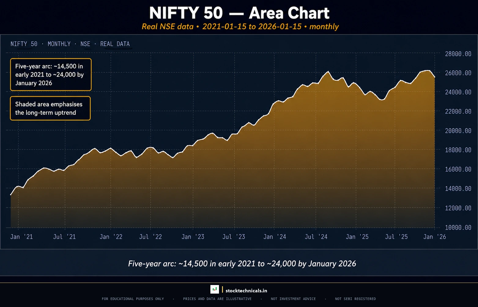
Chart window: Jan 2021–Jan 2026 · Source: NSE (daily OHLC)
An AREA CHART (a line chart with the space below the line filled with a solid color or gradient) is functionally identical to a line chart. The only difference is visual weight. The filled area beneath the closing price line makes trends appear more prominent and makes it easier to compare the “size” of a rally or decline visually.
Area charts are the default on many financial news websites and portfolio tracking apps. They work well for the same situations where line charts work — long-term trend views and multi-stock overlays — with the added benefit of slightly stronger visual impact.
The limitation is the same as the line chart: area charts show only closing prices. No OHLC data, no session-level dynamics, and none of the candlestick patterns that reveal buyer-seller psychology. For active trading decisions, area charts are not sufficient — they are a big-picture tool, not an execution tool.
Heikin-Ashi Charts — Smoothing Out the Noise
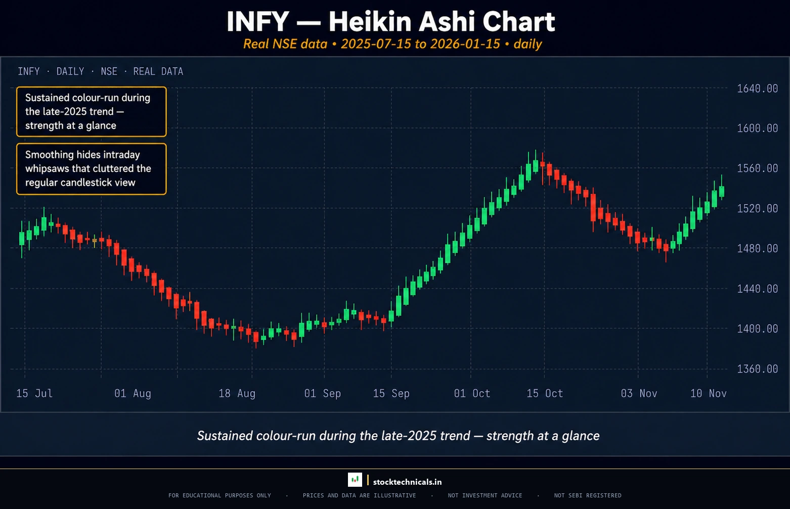
A HEIKIN-ASHI CHART (a modified candlestick chart that uses averaged OHLC values instead of actual prices, creating smoother-looking candles that emphasize trend direction over individual session details) looks like a regular candlestick chart at first glance. The candles have bodies and wicks, they come in green and red. But the values are calculated differently — and that difference changes what the chart reveals.
How the Modified Formula Works
Regular candlestick charts plot the actual Open, High, Low, and Close of each session. Heikin-Ashi charts use modified values:
- Heikin-Ashi Close = Average of actual Open, High, Low, Close
- Heikin-Ashi Open = Average of the previous Heikin-Ashi candle’s Open and Close
- Heikin-Ashi High = Maximum of actual High, Heikin-Ashi Open, Heikin-Ashi Close
- Heikin-Ashi Low = Minimum of actual Low, Heikin-Ashi Open, Heikin-Ashi Close
The result: Heikin-Ashi candles smooth out random fluctuations and make trends visually cleaner. On a regular candlestick chart of INFOSYS (NSE: INFY) over the second half of 2025 — trading between roughly ₹1,420 and ₹1,610 — the chart shows an alternating mix of green and red candles, making the trend direction ambiguous at certain points. On a Heikin-Ashi chart of the same data, long stretches of consecutive green or red candles appear, making the trend obvious.
Reading Heikin-Ashi Candles
The interpretation rules differ from regular candlesticks:
- Consecutive green candles with no lower wicks: Strong uptrend. Stay in the position.
- Consecutive red candles with no upper wicks: Strong downtrend. Stay short or stay out.
- Small-bodied candles with both upper and lower wicks: Indecision. Possible trend reversal ahead.
- Color change from green to red (or vice versa): Potential trend change. Time to evaluate the position.
These rules make Heikin-Ashi charts popular among swing traders who want a clear “hold or exit” signal without the noise of individual bearish candles within an overall bullish trend.
The Critical Limitation Traders Must Know
Heikin-Ashi charts do NOT show actual prices. Because every value is averaged, the open, high, low, and close displayed on a Heikin-Ashi candle are NOT the real market prices. This creates three specific problems:
- Stop-loss orders cannot be placed based on Heikin-Ashi levels. If a Heikin-Ashi chart shows a low of ₹1,720, the actual market low for that session might be ₹1,695 or ₹1,745. Placing a stop at ₹1,720 means the order may trigger at the wrong price or fail to protect when it should.
- Exact entry prices are invisible. Traders cannot use Heikin-Ashi to determine where to enter a trade with precision. The chart is useful for deciding whether to trade (trend direction), not where to trade (exact price level).
- Candlestick patterns do not apply. A hammer on a Heikin-Ashi chart is NOT a real hammer because the values are averaged. The entire library of candlestick patterns applies only to regular candlestick charts.
The professional approach: use Heikin-Ashi on a higher timeframe to confirm trend direction, then switch to regular candlestick charts on a lower timeframe for entry and exit decisions. This is a practical application of multi-timeframe analysis.
Renko Charts — Pure Price, No Time
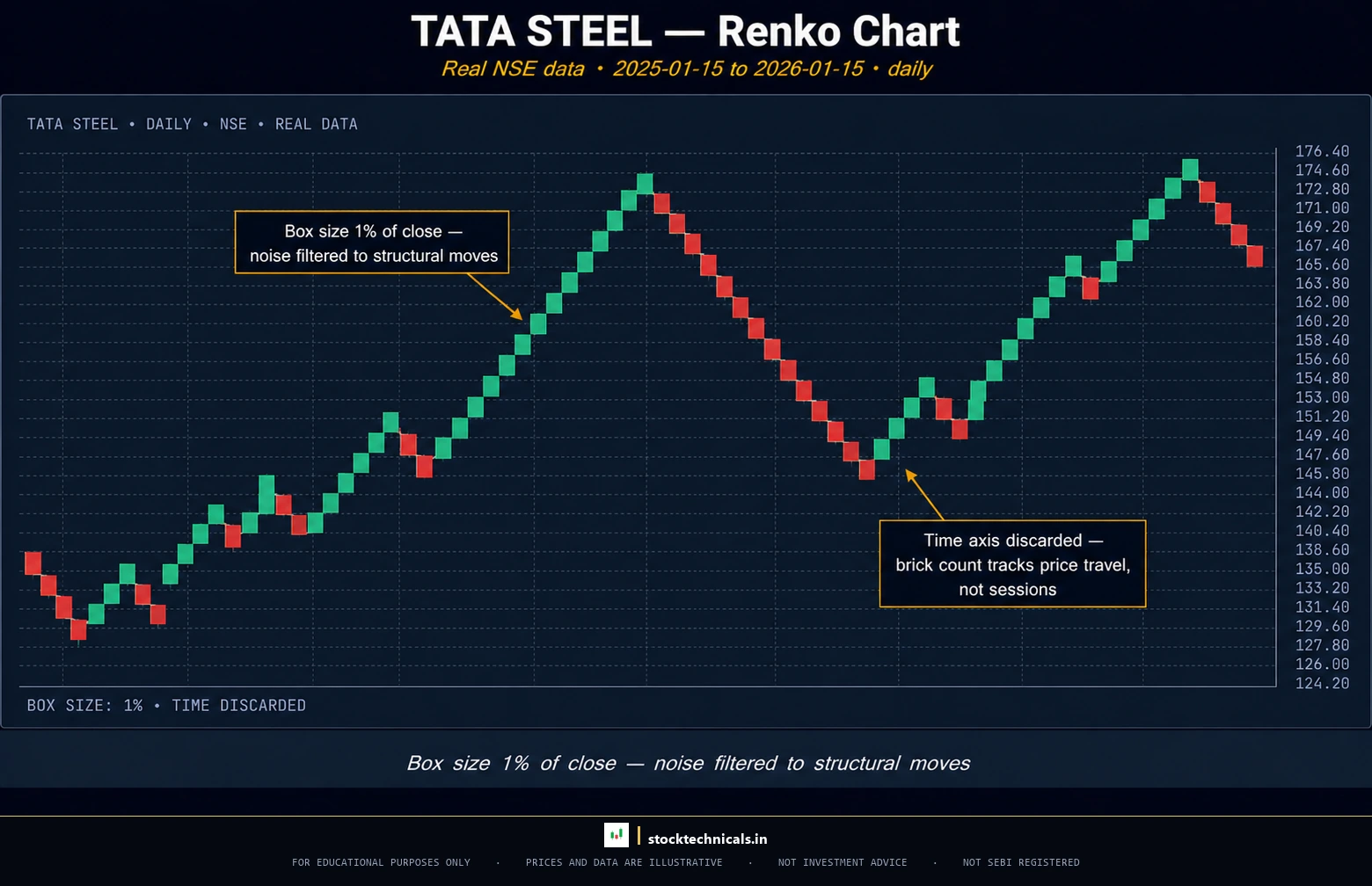
Chart window: Jan 2025–Jan 2026 · Source: NSE (daily OHLC)
A RENKO CHART (a chart built from uniform bricks of a fixed price size, where a new brick appears only when price moves by that predetermined amount, ignoring time entirely) strips trading charts down to their most essential element: significant price movement.
The name “Renko” comes from the Japanese word “renga,” meaning brick. Each element on a Renko chart is a rectangular brick — green for upward movement, red for downward movement — and all bricks are exactly the same size.
How Bricks Are Built
The trader selects a brick size — say ₹5 for TATA STEEL (NSE: TATASTEEL), which traded between roughly ₹126 and ₹176 across calendar 2025. Here is how bricks form:
- If the last brick closed at ₹135, a new green brick appears only when price reaches ₹140 (₹135 + ₹5 brick size).
- A new red brick appears only when price drops to ₹130 (₹135 – ₹5 brick size).
- If price fluctuates between ₹131 and ₹139 for three days, nothing happens on the Renko chart. No new bricks. Those three days of noise are invisible.
This is the fundamental difference. On a candlestick chart, every time period gets a candle — whether price moved ₹50 or ₹0.50. On a Renko chart, a new brick appears only when price moves enough to matter. Time is irrelevant.
Choosing the Right Brick Size
Brick size determines the chart’s sensitivity:
- Smaller bricks (₹2-3 on Tata Steel): More bricks, more reversals visible, more responsive to short-term moves — but also more noise.
- Larger bricks (₹8-10 on Tata Steel): Fewer bricks, only major trends and reversals appear, cleaner signal — but slower to react.
A common approach: set the brick size to the stock’s ATR (Average True Range — a measure of how much a stock typically moves in one session). For a stock with an ATR of ₹5, a brick size of ₹5 means each brick represents roughly one day’s worth of “normal” movement.
Best Use Cases for Renko
Renko charts excel in three specific scenarios:
- Trend identification for swing and positional trades. Swing traders who hold positions for days to weeks benefit from Renko’s clean trend signals. When bricks are all one color, the trend is clear. When a reversal brick appears, the trader evaluates whether to exit.
- Support and resistance levels. Because Renko removes noise, support and resistance levels on a Renko chart tend to be the significant ones. Minor levels that would clutter a candlestick chart are filtered out.
- Avoiding overtrading. Renko charts physically cannot generate signals during low-volatility, sideways periods because no new bricks form. Traders who struggle with overtrading in choppy markets find that Renko imposes discipline by giving them nothing to act on.
The limitation: like Heikin-Ashi, Renko charts are decision tools — not execution tools. Exact entry and stop-loss levels should come from a candlestick chart on TradingView, with Renko providing the directional bias.
Point and Figure Charts — The Oldest Trend Filter
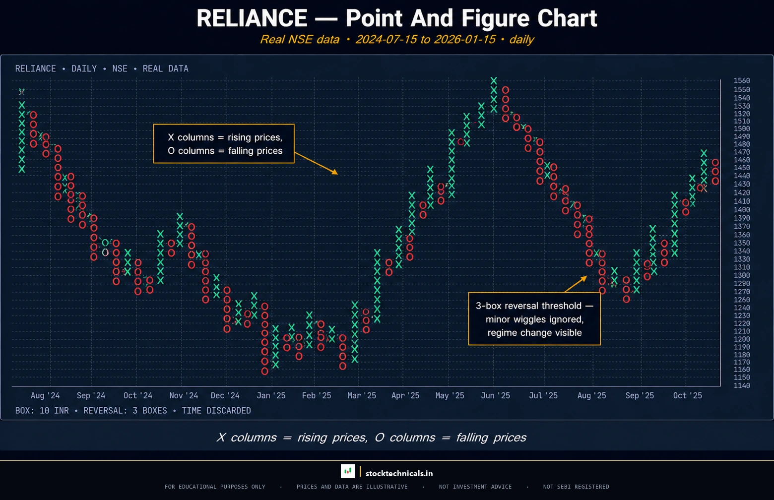
A POINT AND FIGURE CHART (abbreviated P&F, a chart that uses columns of X’s for rising prices and O’s for falling prices, ignoring time and filtering out moves smaller than a predefined box size) dates back to the late 1800s. It predates both candlestick charts (in Western use) and bar charts, making it one of the oldest technical analysis tools still in active use.
X Columns and O Columns
The chart consists of two elements:
- X columns: Rising prices. Each X represents an upward price movement equal to the box size. A column of five X’s means price rose by five box sizes consecutively.
- O columns: Falling prices. Each O represents a downward price movement equal to the box size.
The chart alternates between X columns and O columns. A new column starts only when price reverses by the reversal amount — typically three box sizes.
For RELIANCE INDUSTRIES (NSE: RELIANCE), trading between roughly ₹1,160 and ₹1,610 over the past 18 months, a P&F chart with a ₹10 box size and three-box reversal would:
- Add X’s as long as RELIANCE keeps rising by ₹10 increments
- Switch to a new O column only when RELIANCE drops by ₹30 (three boxes of ₹10) from the highest X
- Add O’s as RELIANCE falls by ₹10 increments
- Switch back to X’s only on a ₹30 reversal upward
Box Size and Reversal Amount
These two parameters control the chart’s sensitivity:
- Box size: The minimum price movement that registers as one X or O. Smaller box size = more detail. Larger box size = less noise.
- Reversal amount: How much price must move against the current column to start a new column. The standard is three boxes, but traders adjust this based on the stock’s volatility and their trading timeframe.
P&F charts are particularly useful for identifying long-term support and resistance levels and generating clear buy/sell signals through specific P&F patterns (double top breakout, triple bottom breakdown). However, the learning curve is steeper than any other chart type, the visual format is unfamiliar to most traders, and P&F patterns are not covered in most mainstream trading education.
For positional traders who hold trades for weeks to months, P&F charts can serve as a valuable secondary tool alongside candlestick charts. For intraday and swing traders, the relevance is limited.
Kagi and Three-Line Break — Niche but Powerful
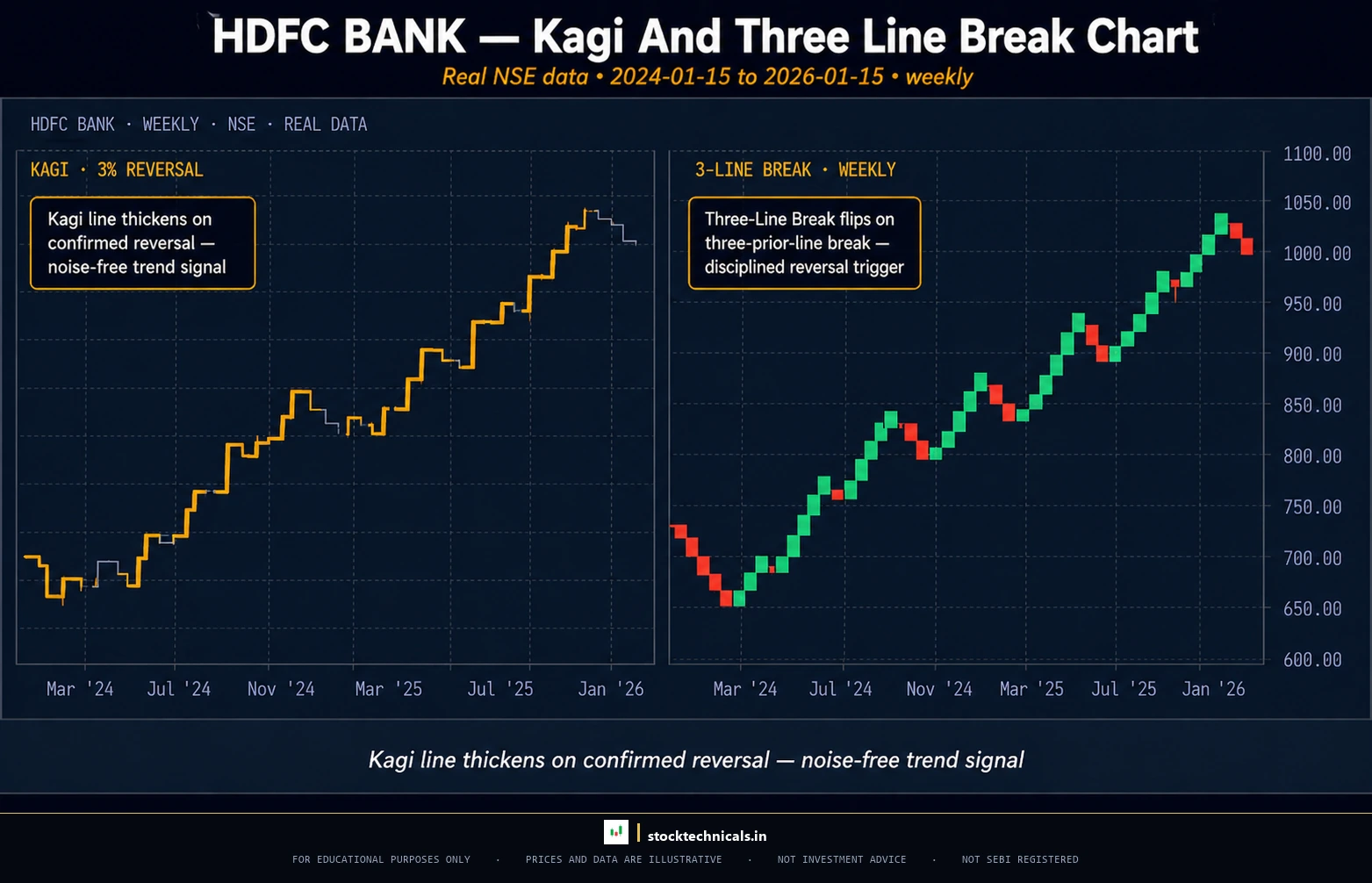
Two additional chart types deserve mention for completeness, though their practical use among retail traders in NSE/BSE markets is limited.
KAGI CHARTS (Japanese-origin charts that use alternating thick and thin lines to represent price movement, where line thickness changes at prior swing highs and lows) are built purely on price direction. A thick line (called a “yang” line) indicates bullish movement, while a thin line (“yin” line) indicates bearish movement. The line thickness changes when price breaks above a prior swing high (thick) or below a prior swing low (thin). Like Renko and P&F, Kagi charts ignore time.
THREE-LINE BREAK CHARTS (charts where a new line appears only when the closing price exceeds the high or low of the prior three lines) are reversal-detection tools. The chart plots a series of vertical bars. A new bar in the opposite direction appears only when price closes beyond the range of the previous three bars. This creates a chart that stays in the current trend until a meaningful reversal occurs.
Both chart types are available on TradingView under the chart type selector. They serve the same general purpose as Renko — filtering noise to reveal trend — but with different construction methods. Traders interested in noise-filtered trend analysis should experiment with all three (Renko, Kagi, Three-Line Break) to find which visual representation makes the most intuitive sense.
Head-to-Head Comparison — Every Chart Type Ranked
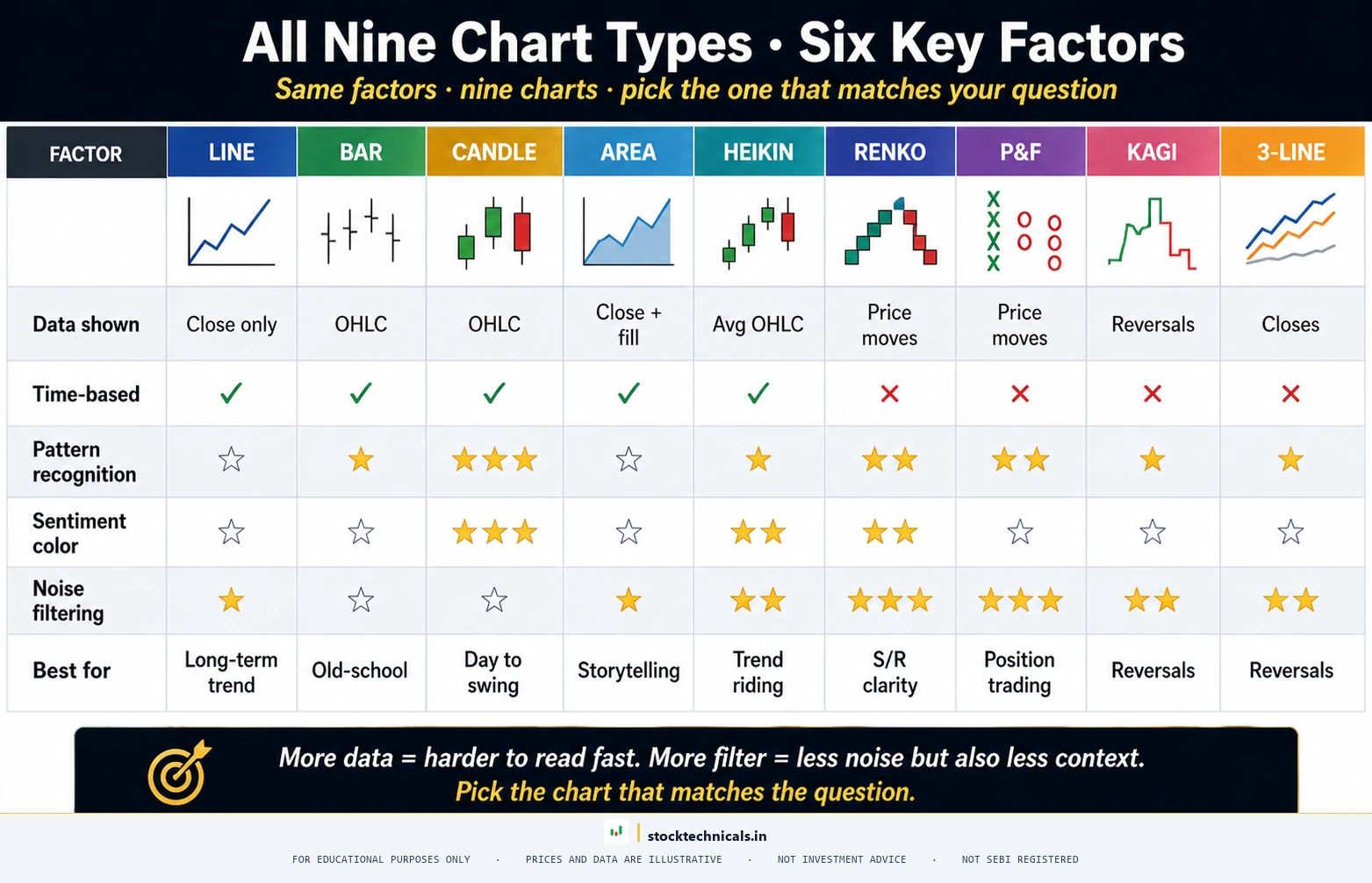
Here is every chart type compared across six dimensions:
| Chart Type | Data Shown | Time-Based? | Noise Level | Best For | Difficulty |
|---|---|---|---|---|---|
| Line | Close only | Yes | Low | Long-term trends, beginners, overlays | Easiest |
| Area | Close only (filled) | Yes | Low | Visual trend weight, portfolio dashboards | Easiest |
| Bar (OHLC) | Open, High, Low, Close | Yes | Medium | Western technical analysis, range analysis | Medium |
| Candlestick | Open, High, Low, Close | Yes | Medium | Pattern recognition, all trading styles | Medium |
| Heikin-Ashi | Modified OHLC (averaged) | Yes | Low-Medium | Trend following, swing trading | Medium |
| Renko | Price movement only | No | Very Low | Trend trading, noise removal | Hard |
| Point and Figure | Price movement (X/O) | No | Very Low | Long-term trends, S&R levels | Hard |
| Kagi | Price reversals | No | Low | Trend strength assessment | Hard |
| Three-Line Break | Closing price reversals | No | Low | Reversal detection | Hard |
Key observations from this table:
- Only two chart types — Bar and Candlestick — show all four OHLC data points. These are the only types suitable for exact entry and exit decisions, which is why every bullish and bearish candlestick pattern library is built around them.
- The price-only charts (Renko, P&F, Kagi, Three-Line Break) all filter noise aggressively. They are directional tools — they answer “which way?” but not “at what exact price?” Pair them with a candlestick chart to spot exact support and resistance levels.
- Difficulty increases with sophistication. Line and Area charts require zero technical knowledge to read. Renko, P&F, and Kagi require understanding their construction rules before the chart becomes readable — and even then, they cannot replace the insight from reading volume alongside price.
Think of chart types on a spectrum. On one end sits the Line chart — maximum simplicity, minimum detail. In the middle sits the Candlestick chart — full detail, some noise. On the other end sits Renko — maximum noise filtering, no time dimension. The “right” position on this spectrum depends entirely on the type of trading being done and what information the trader needs.
Interactive Tool
Answer a few questions to get a personalized recommendation
Can You Identify the Chart Type?
Look at the visual description below and pick the correct chart type. 5 rounds.
Which Chart Type Matches Your Trading Style
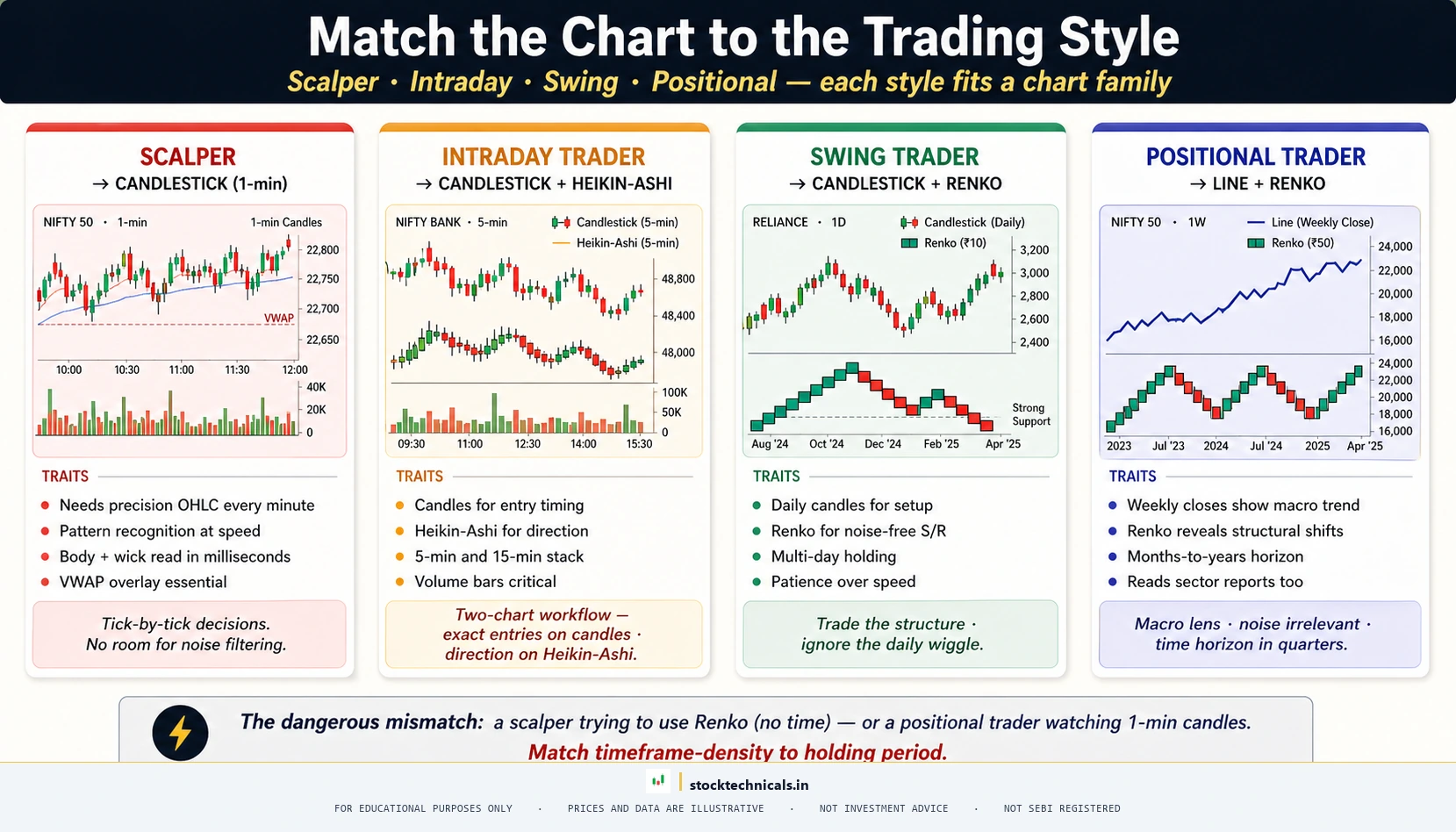
By Trading Style
Scalping (holding seconds to minutes): Candlestick charts only. Scalpers need exact price data, real-time body and wick information, and the ability to read candlestick patterns on one-minute or five-minute timeframes. No other chart type provides this level of real-time precision. Pair with volume bars for confirmation.
Intraday trading (holding minutes to hours): Candlestick charts as the primary view, with an optional Heikin-Ashi on a higher timeframe for trend confirmation. An intraday trader watching RELIANCE INDUSTRIES (NSE: RELIANCE) on a five-minute candlestick chart might keep a 15-minute Heikin-Ashi chart open on a second panel to confirm the dominant trend direction. Learn more about intraday approaches in the types of trading article.
Swing trading (holding days to weeks): Candlestick charts for entries and exits, Heikin-Ashi for trend confirmation on the daily timeframe, and optionally Renko for identifying the cleanest support and resistance levels. Swing traders benefit most from combining multiple chart types.
Positional trading (holding weeks to months): Line charts for the long-term trend view, candlestick charts for timing entries, and Renko or P&F charts for filtering noise on weekly data. The positional trader’s primary question is directional — “Is this stock in an uptrend or downtrend?” — and the noise-filtered chart types answer that question most cleanly.
The Multi-Chart Professional Workflow
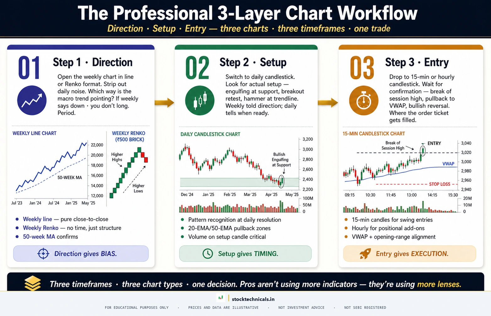
Most professional traders do not commit to a single chart type. The practical workflow looks like this:
- Weekly Line or Renko chart — determine the big-picture trend direction
- Daily Candlestick chart — identify setups, patterns, and breakout opportunities
- Intraday Candlestick chart — time the entry and place exact stop-loss levels
This three-layer approach uses the strength of each chart type where it matters most. The line or Renko chart answers “which direction?”, the daily candlestick answers “is there a setup?”, and the intraday candlestick answers “when exactly do we enter?”
On TradingView, this means having two or three chart panels open simultaneously — which the platform supports natively on its paid plans. For a step-by-step guide on setting this up, see How to Set Up Your First Chart on TradingView.
Interactive Tool
Answer a few questions to get a personalized recommendation
Which Chart Type Fits Your Trading?
Answer 3 questions. Get a personalized chart type recommendation.
1. What is your primary trading style?
How to Switch Chart Types on TradingView
TradingView supports all nine chart types discussed in this article. Here is how to switch between them:

- Open any chart on TradingView. The default is usually a candlestick chart.
- Look at the top-left of the chart area. Next to the ticker name, there is a small icon showing the current chart type (it looks like a tiny candlestick).
- Click that icon. A dropdown appears showing all available chart types: Bars, Candles, Hollow Candles, Heikin Ashi, Line, Area, Baseline, Renko, Kagi, Point and Figure, Line Break, and Range.
- Select the desired chart type. The chart redraws instantly with the same underlying data.
For Renko, Point and Figure, and Kagi charts, TradingView also allows adjusting the brick size, box size, and reversal amount through the chart type settings. The platform calculates default values based on the stock’s recent volatility, but traders should adjust these based on their trading timeframe.
On Zerodha Kite, the chart type selector sits inside the Display menu at the top of the charting window. Kite supports all nine chart types discussed in this article — Candlestick, Bar, Line, Area, Heikin-Ashi, Renko, Point and Figure, Kagi, and Line Break — along with Range Bars, Hollow Candles, Coloured Bars, and Volume Candles. To switch, click Display and choose the chart type from the dropdown. For Renko and Point and Figure, Kite also exposes brick size and box size settings in the same menu. Traders who need access to non-standard chart types like Baseline or Step Line can switch to TradingView, but for the nine mainstream chart types covered here, Kite is fully sufficient.
The Bottom Line
Most traders spend zero time thinking about chart types and default to candlesticks because everyone else does. That works for 90% of cases. But the traders who understand WHY candlesticks work — and when they do not — have an edge. Line charts for macro view, candles for entries, Renko for trend confirmation. Three types. That is the entire framework.
Common Mistakes When Choosing a Chart Type
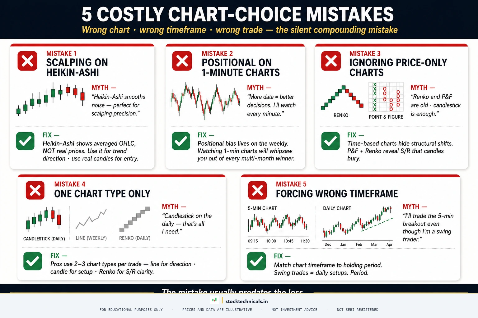
Mistake one: Using Heikin-Ashi for entries and stop-losses. Heikin-Ashi charts show modified prices, not actual market prices. Placing a stop-loss based on a Heikin-Ashi low means the order sits at a price that may not correspond to any actual support level. Use Heikin-Ashi for trend direction only, then switch to regular candlestick charts for execution.
Mistake two: Jumping between chart types without a system. Some traders switch chart types based on whatever confirms their existing bias. If the candlestick chart looks bearish, they switch to Heikin-Ashi hoping for a bullish signal. This is not analysis — it is confirmation-seeking. Pick a chart type hierarchy (trend chart type, setup chart type, execution chart type) and stick with it.
Mistake three: Using Renko or P&F for intraday trading. These charts ignore time. In intraday trading, time is a critical variable — the first 30 minutes of the NSE session behave differently from the lunch hour, which behaves differently from the closing 15 minutes. Stripping out the time dimension loses this context entirely. Renko and P&F are for daily and weekly analysis, not for intraday execution.
Mistake four: Overthinking the chart type decision. This is the most common mistake. Traders spend weeks researching which chart type is “best” when the answer for 90% of cases is straightforward: start with candlestick charts, learn to read them properly, and add a secondary chart type (Heikin-Ashi or Renko) later once the basics are solid.
Mistake five: Ignoring volume. No chart type — not even the most sophisticated noise-filtered variety — replaces the need for volume analysis. A breakout on a candlestick chart without confirming volume is unreliable. A trend on a Renko chart without volume context is incomplete. The chart type shows where price went. Volume shows whether the move had conviction.
Real Talk: No chart pattern, indicator, or strategy works 100% of the time. The SEBI study showing 93% of F&O traders lose money is not a scare tactic — it is a filter. Most of that 93% traded without a stop-loss, sized positions too large, or chased signals without understanding context. Risk no more than 1-2% of capital per trade. Keep a trading journal. The market rewards patience and discipline — not speed or boldness.
Your 30-Day Chart Study Plan
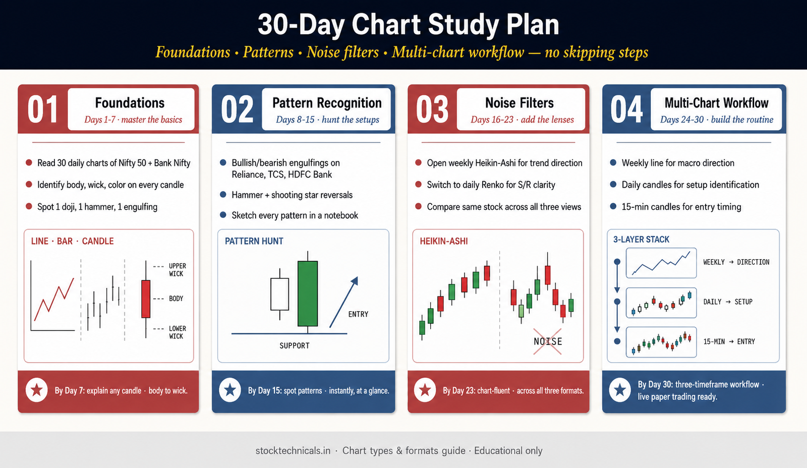
Chart types are not learned by reading articles. They are learned by looking at hundreds of charts until the patterns become instinctive. Here is a four-week plan that builds chart-reading skill on top of what this article just covered — every week links to the exact articles that open up the next level.
Week 1 — Master Candlestick Anatomy
Start with a single candle. Before pattern libraries, before indicators, before anything else — a trader has to read one candle fluently. Spend Week 1 with what candlestick charts are and the anatomy of a single candlestick. Open Zerodha Kite or TradingView on a Nifty 50 daily chart, scroll through the last 90 sessions, and describe aloud what each candle is telling you. Body size, wick length, color — what does the session look like? Who won? By Day 7, the mental translation should feel automatic.
Week 2 — Candlestick Patterns and Their Names
Once single candles make sense, patterns come easily because they are just combinations. Work through the bullish candlestick patterns, bearish candlestick patterns, and the four indecision forms of doji candles. Then get specific with the most traded formations — hammer and hanging man, engulfing patterns, and morning star and evening star. Spot each pattern on historical Reliance, TCS, or HDFC Bank charts before the next week starts.
Week 3 — Context: Trend, Support, Resistance, and Volume
A pattern means nothing without context. A bullish engulfing at support is a high-probability setup. The same pattern in the middle of nowhere is a coin flip. Week 3 layers the context tools on top: identifying trends, drawing trendlines, reading volume for conviction, and spotting breakouts that actually hold. Add Dow Theory for the historical foundation — it ties everything together.
Week 4 — Multiple Chart Types and Indicator Confirmation
Now the chart types from this article pay off. On a Nifty 50 weekly, switch between Candlestick, Heikin-Ashi, and Renko to see how each one shows the same trend differently. Layer in one or two indicators for confirmation — start with EMA basics, then add RSI and MACD once the EMA feels natural. Watch for moving average crossovers and note how they interact with the patterns from Week 2. If Zerodha Kite is not already open, set up a TradingView chart and follow along there too. By the end of Week 4, reading a chart should feel like reading a sentence.
After Week 4 — Where to Go Next
At this point the foundation is solid. The natural next layers are flags and pennants (continuation patterns), head and shoulders (reversal patterns), and false breakout recognition (the filter that saves most losses). Then it is time to pick a trading style — scalping, intraday, swing, or positional — and build a repeatable process around it across the right timeframes.
Practice With Real Charts This Week
Reading this article is not the win. Sitting in front of a real chart and applying what just landed is. Here are five exercises — doable in one evening on a free Zerodha Kite account or TradingView free plan — that lock in what this article taught.
- Same data, four views. Open a Reliance daily chart. Switch it to Line, then Area, then Bar, then Candlestick. Note which chart hid information the others showed. Write one sentence for each chart type on what it reveals best.
- Heikin-Ashi trend test. On a weekly Nifty 50 chart, switch to Heikin-Ashi. Count how many consecutive green candles appeared during the last uptrend before the first red candle. That count is the trend signal Heikin-Ashi provides.
- Renko brick size experiment. Open Tata Steel on Zerodha Kite. Switch the chart to Renko and try three brick sizes — small, medium, large. Note how each changes the number of trend reversals visible. Pick the one that matches the way you would actually trade.
- Pattern hunt on candlesticks. On an HDFC Bank daily chart over the last 90 sessions, find one bullish engulfing, one doji, and one hammer. Mark them on the chart. Did each pattern actually lead to the move it is supposed to predict? Be honest about the answer.
- Three-layer workflow drill. Pick any NSE F&O stock. Open three chart panels: weekly Line (big trend), daily Candlestick (setup), and 15-minute Candlestick (entry timing). Do not place a trade. Just practice reading all three panels in under 60 seconds. That is the professional workflow compressed into one habit.
Paper-trade whatever setups the exercises reveal. Do not put real capital at risk until the paper-trade win rate stabilizes above 40% across at least 30 entries. And always — always — write down the support and resistance level that defined the entry, so the exit rule has a reference point.
The Chart Rule That Overrides Every Chart Type
No chart type — Candlestick, Heikin-Ashi, Renko, Point and Figure, or anything else — prevents losses. Only a stop-loss does. Pick any chart type on the spectrum, but never trade without a defined exit level on every single position. The chart shows where price went. The stop-loss decides whether the trader is still in the game tomorrow.
Test Your Knowledge
Test What Stuck
Q1: A line chart plots which price data point?
Q2: What makes Heikin-Ashi different from regular candlestick charts?
Q3: Renko charts are built based on:
Q4: On a bar (OHLC) chart, where is the opening price marked?
Q5: Which chart type is BEST for filtering market noise in swing trading?
Frequently Asked Questions
What are the main types of stock charts?
The nine types of stock charts are Line, Area, Bar (OHLC), Candlestick, Heikin-Ashi, Renko, Point and Figure, Kagi, and Three-Line Break. The three most commonly used are Line, Bar, and Candlestick. Candlestick charts dominate modern trading because they show all four price data points with color-coded bodies that reveal session sentiment instantly.
Which chart type is best for intraday trading?
Candlestick charts are the best choice for intraday trading. They display real-time OHLC data, support pattern recognition on short timeframes, and work with volume overlays. Some intraday traders keep a Heikin-Ashi chart on a higher timeframe for trend confirmation, but execution decisions should come from regular candlestick charts.
What is the difference between a bar chart and a candlestick chart?
Both show the same four data points — Open, High, Low, and Close. A bar chart uses a vertical line with horizontal ticks. A candlestick chart uses a colored rectangular body with wicks. The color coding on candlestick charts makes it faster to identify bullish versus bearish sessions, which is why they replaced bar charts as the global standard.
Are Heikin-Ashi charts better than regular candlestick charts?
They serve a different purpose. Heikin-Ashi charts use modified OHLC values that smooth out price action, making trends easier to see. However, the prices shown are NOT actual market prices. Traders cannot place accurate stop-loss orders using Heikin-Ashi levels. The best approach uses both — Heikin-Ashi for trend direction, candlestick for execution.
What are Renko charts and when should traders use them?
Renko charts are built from uniform bricks of a fixed price size. A new brick appears only when price moves by that amount, regardless of time. This removes all time-based noise. Renko charts are best for swing and positional traders who need clean trend signals and clear support and resistance levels.
How do Point and Figure charts work?
Point and Figure charts use columns of X’s (rising prices) and O’s (falling prices). A new element appears only when price moves by a predefined box size. The chart switches columns only on a reversal of typically three box sizes. P&F charts ignore time and are useful for identifying long-term support and resistance levels.
Which chart type do professional traders use most?
Most professionals use candlestick charts as their primary type. However, they typically combine multiple chart types — line or Renko for big-picture trend, daily candlestick for setups, and intraday candlestick for execution. The hierarchy depends on trading style and timeframe.
Can traders use multiple chart types at the same time?
Yes, and this is the professional approach. Platforms like TradingView support multiple panels where traders can view the same stock as a candlestick chart and a Heikin-Ashi or Renko chart simultaneously. Using one type for trend direction and another for entry timing combines the strengths of both.
How do I change the chart type on TradingView?
Click the chart type icon in the top-left of the chart area next to the ticker name. A dropdown shows all available types. Click the desired type and the chart redraws instantly. For Renko and P&F, adjust the brick or box size in the settings for optimal results.
What chart type should beginners start with?
Candlestick charts. Not because they are the simplest, but because nearly all trading education teaches candlestick analysis. Starting with candlestick charts means every resource a beginner encounters will match what appears on their screen. After building comfort, traders can add Heikin-Ashi or Renko as secondary tools.
Pick one chart type and master it before touching any other. Candlesticks are the standard for a reason. Per the SEBI FY24-25 study, 91 percent of individual equity F&O traders lost money — most of them from misreading charts they didn’t actually understand.
Continue Learning
Build on these concepts with the complete learning path: What is Technical Analysis · How to Read Stock Charts · Types of Stock Charts · TA vs Fundamental Analysis · Timeframes in Trading · Candlestick Charts · Candlestick Anatomy · Bullish Candlestick Patterns · Bearish Candlestick Patterns · Doji Candles
No setup works without a stop-loss.
Protect your capital. Everything else follows.