Quick Answer: A stock chart plots price movement over time, showing open, high, low, and close for each trading period. Reading a chart means identifying the trend direction first, marking support and resistance levels second, and confirming with volume third — in that exact order. On a daily chart of HDFC BANK (NSE: HDFCBANK), a trader can spot a ₹840 support level where buyers have stepped in repeatedly, then plan entries near that zone with a defined stop-loss below it. This article walks through every element of a chart, from the first glance to a complete trade setup.
Every price on a trading screen is a fragment of a larger story. When HDFC BANK flashes ₹852.40 on a broker terminal, that number alone reveals nothing. Was it ₹870 last week and falling? Was it ₹820 yesterday and surging? Is the entire banking sector collapsing or rallying?
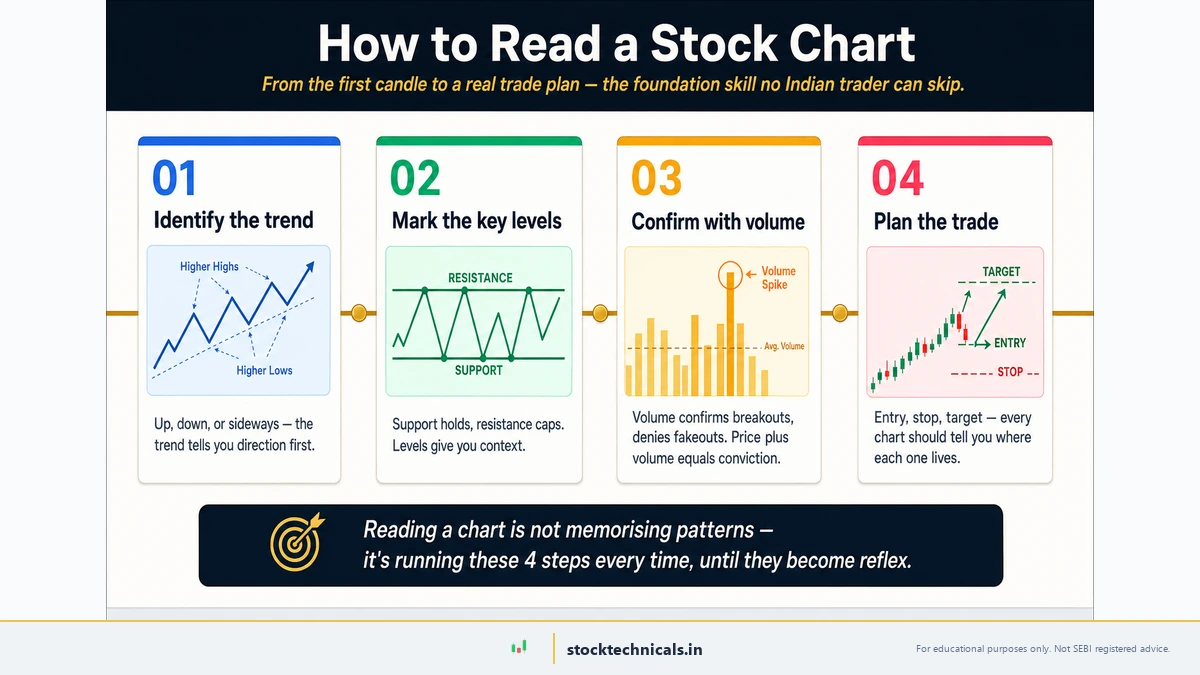
Quick Answer: Reading a stock chart means identifying the trend direction first, marking support and resistance levels second, and confirming with volume third — in that exact order. Each bar or candle shows the open, high, low, and close for one trading period, and the sequence of those bars reveals whether buyers or sellers are in control. On a daily chart of HDFC Bank or Reliance on NSE, this three-step read turns a screen of numbers into a clear trade idea.
Published January 2, 2026 · Last refreshed April 27, 2026. Prices and data are compiled with reasonable care — always confirm against your broker before trading.
A stock chart answers every one of those questions — instantly. It arranges thousands of price fragments into a visual narrative where trends become obvious, danger zones become visible, and trading opportunities present themselves to anyone trained to read the picture.
The skill of reading charts separates informed traders from those who buy and sell based on tips, news headlines, or gut feeling. It is not a talent reserved for some gifted few. It is a craft — learnable, practicable, and improvable over time.
This article builds the complete chart-reading framework from the ground up. Here is what traders will walk away with:
- How to decode every element on a stock chart — price axis, time axis, candlesticks, and volume bars
- How to identify trends, support, and resistance — the three concepts behind 80% of trading decisions
- How to set up a free chart on TradingView in under five minutes
- A step-by-step walkthrough of reading a real HDFC Bank daily chart from open to close
- How to read charts specifically for F&O trading — with VWAP, EMA, and open interest overlays
One critical disclaimer before the first chart opens: reading charts does not guarantee profits. A 2023 SEBI study found that 93% of individual intraday traders in the futures and options segment lost money over a three-year period. Chart reading is a tool — a powerful one — but it works only inside a framework that includes risk management, position sizing, and emotional discipline. No setup works without a stop-loss.
With that reality check in place, let us open the first chart.
What Is a Stock Chart?
Before interpreting patterns or adding indicators, traders must understand the six building blocks present on every chart:
- Price bars (or candlesticks): The coloured shapes representing price movement for each time period. These are the most information-dense element on the chart and deserve their own section below.
- Volume bars: The vertical bars at the bottom of the chart showing how many shares traded during each period. Taller bars mean heavier participation. Shorter bars mean thin activity.
- Price axis: Displayed on the right side, showing ₹ values. Most modern platforms like TradingView use auto-scaling to keep the visible price range relevant to the current window.
- Time axis: Displayed at the bottom, showing dates or times depending on the selected timeframe.
- Gridlines: Faint horizontal and vertical lines that help traders visually align price levels and time periods. These are cosmetic — they help the eye but carry no trading significance.
- Crosshair cursor: When a trader hovers over any point on the chart, the crosshair displays the exact price and time at that position. This is essential for precise level identification and is the first tool to use when drawing support or resistance levels.
These elements are consistent across every platform — whether traders use Zerodha Kite, Angel One, TradingView, or Groww. The layout might differ slightly, but the six building blocks remain identical.
Test Yourself — Identify the Chart Element
Click each numbered marker on the chart, then pick what it is
All 6 Elements Identified!
Three Chart Types Traders Actually Use
Key Takeaways
- Line charts show closing prices only — useful for big-picture screening, not for trading decisions
- Bar charts show all four data points (OHLC) but are harder to read visually
- Candlestick charts are the industry standard — use these for all active chart analysis
Stock prices can be displayed in three main formats. Each shows the same underlying data but emphasises different aspects. Choosing the right format is not a preference — it is a practical decision that affects how much information a trader can extract at a glance.
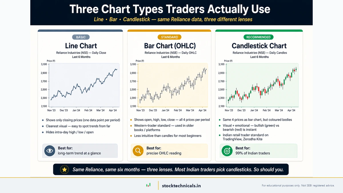
Line Chart
A LINE CHART (a chart that connects closing prices with a continuous line) is the simplest format. It plots only the closing price for each period, creating a smooth curve. Line charts are excellent for identifying the overall direction of a stock over months or years. They strip away all intra-day noise.
The tradeoff: they hide critical information. A stock might have swung ₹80 during a session — touching a high of ₹1,280 and a low of ₹1,200 — but the line chart shows only the ₹1,245 close. That massive intra-day range, which reveals volatility and sentiment, is invisible.
Best for: Long-term trend identification. Quick visual screening when scanning twenty stocks in five minutes.
Bar Chart (OHLC)
A BAR CHART (a chart where each period is represented by a vertical line showing the high-low range, with horizontal ticks for open and close) displays four data points per period: open, high, low, and close — collectively known as OHLC (the four price points recorded for each trading period). The vertical line spans the day's range. A left tick marks the open. A right tick marks the close.
Bar charts show all the data, but the thin lines and small ticks make pattern recognition harder. At a glance, it is difficult to tell whether buyers or sellers won the session.
Best for: Traders who want complete OHLC data without the visual emphasis of candlestick bodies. Rarely used by modern retail traders.
Candlestick Chart
A CANDLESTICK CHART (a chart where each period is represented by a coloured body showing the open-close range and wicks showing the high-low range) is the gold standard. It displays the same OHLC data as a bar chart but uses coloured bodies that make bullish and bearish sessions instantly distinguishable. Green (or white) bodies mean the close was above the open. Red (or black) bodies mean the close was below.
Best for: Everything. Day trading, swing trading, pattern recognition, and all forms of active chart analysis. This is what professional traders, institutional desks, and every charting platform default to.
| Feature | Line Chart | Bar Chart | Candlestick Chart |
|---|---|---|---|
| Data shown | Close only | OHLC | OHLC |
| Visual clarity | High (but incomplete) | Low | High |
| Pattern recognition | Weak | Moderate | Strong |
| Best timeframe | Weekly/Monthly | Any | Any |
| Industry standard | No | No | Yes |
For everything that follows in this article — and across most of technical analysis — candlestick charts are the default. They provide the richest visual information with the least cognitive effort.
To go deeper into candlestick interpretation: What Are Candlestick Charts? covers the history, psychology, and core patterns. For specific setups: Bullish Candlestick Patterns and Bearish Candlestick Patterns.
How to Spot Trends on a Chart
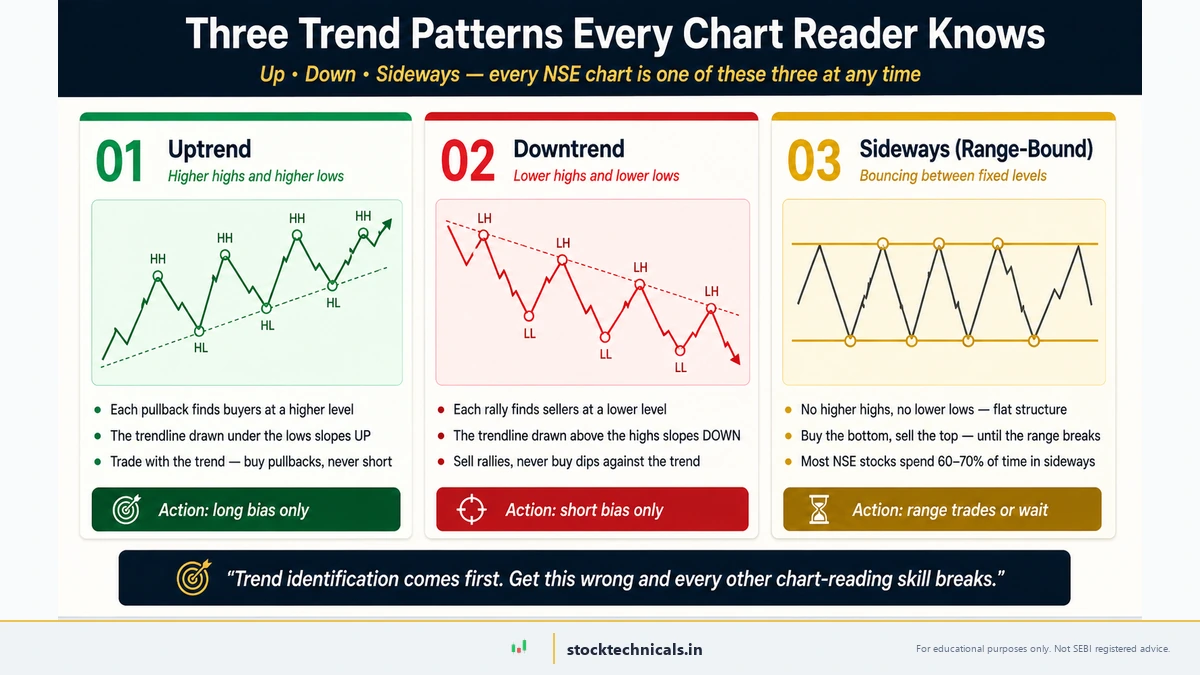
Key Takeaways
- An uptrend makes higher highs and higher lows — like a staircase going up
- A downtrend makes lower highs and lower lows — a staircase going down
- A sideways market makes roughly equal highs and lows — no direction
- Always identify the trend BEFORE analysing anything else on the chart
A TREND (the general direction in which price is moving over a defined period) is the single most important thing to identify on any chart. Trading with the trend improves the probability of success. Trading against it requires exceptional timing that most traders — including experienced ones — lack consistently.
Identifying a trend is straightforward once traders know what to look for.
Uptrend: Higher Highs and Higher Lows
In an uptrend, each swing high is higher than the previous swing high, and each swing low is higher than the previous swing low. Picture a staircase going up. Each step (the pullback low) is higher than the one before.
Market Example: TCS (NSE: TCS) during a rally phase moved from ₹3,100 to ₹3,500 over several weeks. Each time price pulled back — to ₹3,200, then to ₹3,280, then to ₹3,350 — the pullback low was higher than the previous one. Connecting those swing lows with a rising trendline gave traders a clear visual guide: as long as price stayed above that line, the uptrend was intact.
Downtrend: Lower Highs and Lower Lows
A downtrend is the mirror image. Each bounce (swing high) fails at a lower level than the previous one, and each decline (swing low) pushes further down. The staircase goes down.
The Nifty 50 index peaked at 26,277 in September 2024 and began making lower highs — a classic downtrend signal that warned traders before the broader correction unfolded toward the ₹22,000-23,000 range.
Sideways (Range-Bound)
When price oscillates between a horizontal support and resistance without making higher highs or lower lows, the market is in a range. Range-bound conditions require different strategies than trending conditions — buying near support and selling near resistance rather than following momentum.
Why trend identification comes first
Before analysing any indicator, candlestick pattern, or volume signal, the first question every trader should answer is: What is the trend? Everything else — entries, exits, position sizing — flows from this answer.
A bullish candlestick pattern in a strong downtrend has a much lower probability of success than the same pattern in an uptrend. A breakout above resistance in a trending market behaves very differently from the same breakout in a choppy range. Context matters more than the pattern itself.
Pro Tip: When unsure about the trend, zoom out. Switch to the weekly timeframe. If the direction is still unclear, the market is likely range-bound — and range-bound markets require patience, not aggressive entries.
Support and Resistance — The Two Levels That Matter Most
Key Takeaways
- Support is a price level where buying demand consistently prevents further decline
- Resistance is a price level where selling pressure consistently prevents further advance
- The more times a level is tested and holds, the stronger it becomes
- When support breaks, it often becomes resistance — and vice versa (role reversal)
If trend identification tells traders which direction to trade, support and resistance tell them where to enter and exit.
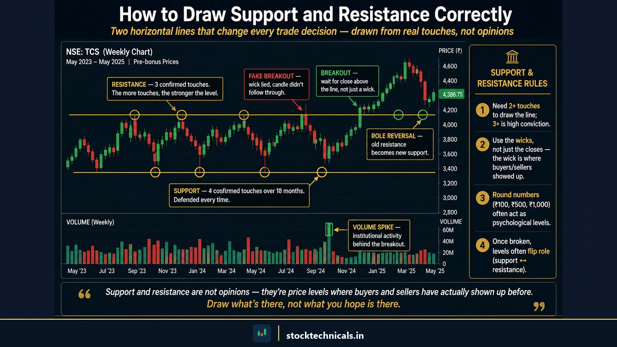
SUPPORT (a price level where buying demand is strong enough to prevent further decline) acts like a floor. When price drops to this level, buyers step in because they perceive value — or because their buy orders are clustered at that price. On a chart, support appears as a horizontal zone where price has bounced upward multiple times.
RESISTANCE (a price level where selling pressure is strong enough to prevent further advance) acts like a ceiling. When price rises to this level, sellers emerge — either taking profits or initiating short positions. On a chart, resistance appears as a horizontal zone where price has stalled and reversed downward multiple times.
How to draw support and resistance correctly
Market Example: Open a daily chart of HDFC Bank (NSE: HDFCBANK). In the current trading range, look for these signs:
- Price has bounced from the ₹840 area at least two to three times in recent weeks — that is a support zone
- Price has stalled near ₹870 on multiple attempts — that is a resistance zone
- Volume increased when price approached either level, confirming active participation at those zones
Draw a horizontal line at each level. These become reference points for planning entries (near support with a stop-loss below it) and exits (near resistance or just before it).
A common mistake: drawing support and resistance as exact price points. In practice, they are zones — bands of ₹5-15 where activity clusters. Price rarely bounces from the same rupee value twice. It bounces from the same area.
The role reversal principle
When price breaks through a resistance level, that former resistance often becomes new support. This is called ROLE REVERSAL (when a broken resistance level starts acting as support, or vice versa).
If Nifty 50 breaks above ₹23,000 resistance and then pulls back, the ₹23,000 level frequently acts as the new support floor. This gives traders a logical entry point after a breakout: wait for the pullback to the broken level, then enter with a stop-loss just below it.
What Volume Tells Traders That Price Cannot
Key Takeaways
- Volume confirms or contradicts price moves — high volume validates, low volume warns
- A breakout on low volume is often a false signal that traps traders
- Volume typically increases in the direction of the prevailing trend
- Always check volume before acting on any price signal
VOLUME (the total number of shares or contracts traded during a period) is the heartbeat of the market. Price shows direction. Volume shows conviction.
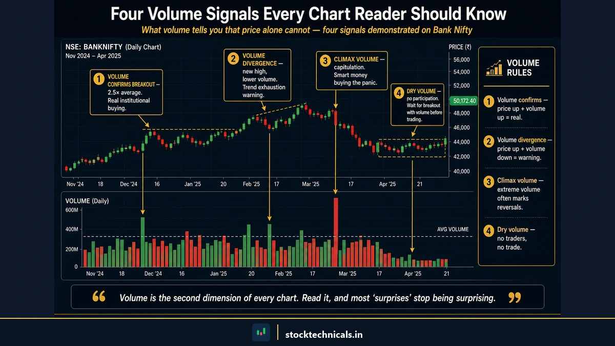
The volume bars sit at the bottom of the chart. Taller bars indicate more shares changed hands. Shorter bars indicate thin activity. Most platforms colour volume bars green when the candle closes higher and red when it closes lower.
Four volume signals every trader should know
Rising price + rising volume = strong uptrend. More participants are buying, and they are buying aggressively. This is the healthiest form of a rally and the most trustworthy signal that the move has institutional participation behind it.
Rising price + falling volume = weakening rally. Price is climbing, but fewer traders are participating with each push higher. This divergence warns that the move may be running out of fuel. Smart traders tighten their stop-losses when they see this pattern.
Price breakout + high volume = confirmed breakout. When price pushes through a resistance level on volume that is 1.5x to 2x the 20-day average, the breakout is likely genuine. Institutional money is driving the move.
Price breakout + low volume = suspect breakout. The market pushed past a level, but participation was thin. This often leads to a failed breakout and a reversal back below the level — trapping traders who entered too early.
Market Example: Reliance Industries (NSE: RELIANCE) trades in a range near ₹1,200 for several sessions. When price finally pushes above ₹1,220 on volume that is double the 20-day average, that volume spike confirms the move. If the same ₹1,220 break happened on below-average volume, experienced traders would wait for at least one more confirming session before acting.
Volume does not predict direction by itself, but it validates or invalidates price moves. Skipping the volume check is like signing a contract without reading it — the information was available, the trader just did not look.
How to Set Up a Free Chart on TradingView
Key Takeaways
- TradingView offers free professional-grade charts — no account needed for basic use
- Set the chart to candlestick view, daily timeframe, and dark theme for best readability
- Add volume as the first (and initially only) indicator
- Zerodha Kite is a solid alternative for traders who prefer broker-integrated charting
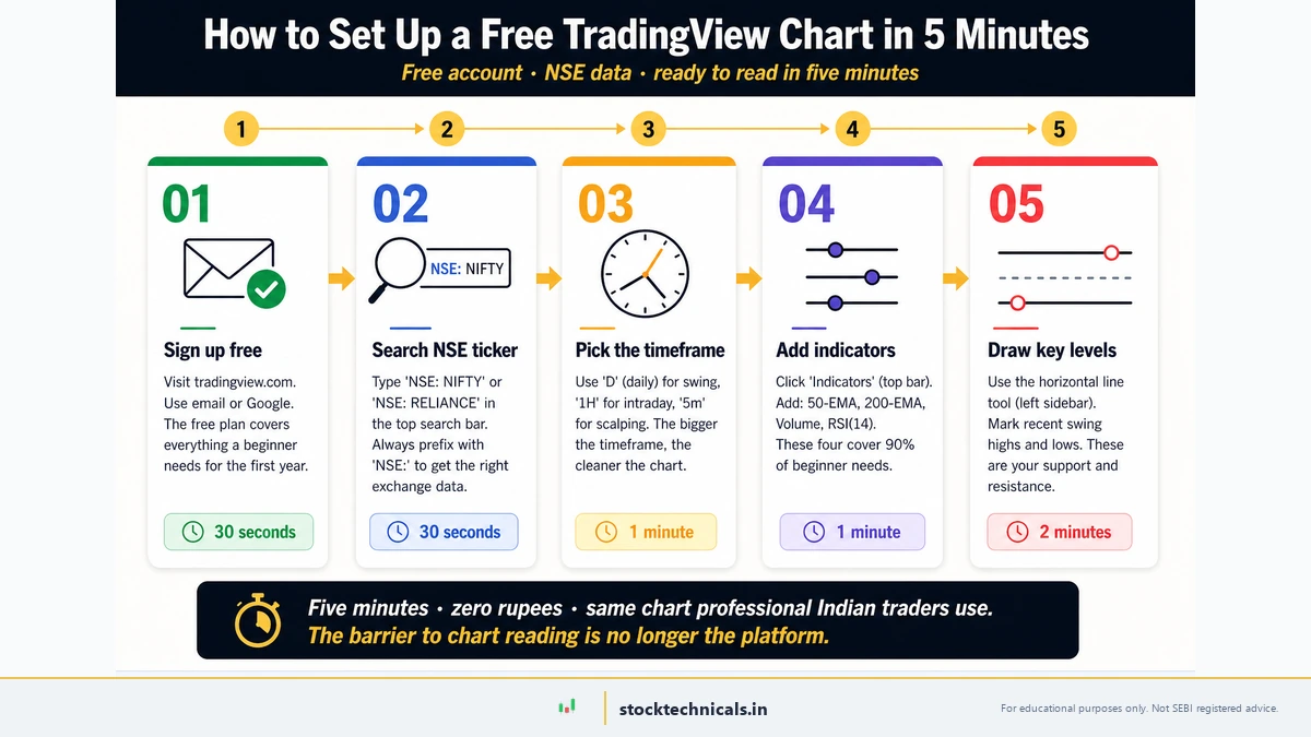
Chart reading requires a chart. The fastest way to get started is TradingView — a free, browser-based platform used by millions of traders worldwide, including professionals at institutional desks.
For a detailed walkthrough with screenshots, see the dedicated guide: How to Set Up Your First Chart on TradingView.
Here is the quick-start version:
- Open TradingView. Navigate to TradingView in any browser. No account is required for basic charting.
- Search for a stock. Click the search bar at the top and type the stock name or symbol. For NSE-listed stocks, search "NSE:RELIANCE" or "NSE:HDFCBANK". TradingView auto-completes with the exchange prefix.
- Select the daily timeframe. Click the timeframe selector (shows "D" for daily by default). For chart-reading beginners, the daily chart is the most balanced starting point — it filters out intraday noise while showing meaningful price action.
- Switch to candlestick chart type. Click the chart type icon and select "Candles" from the dropdown. This ensures all four data points — open, high, low, close — are visible on every bar.
- Enable volume. Click "Indicators" at the top, search for "Volume", and add it. The volume bars will appear below the price chart. This is the only indicator needed for now.
Do not add RSI, MACD, Bollinger Bands, or any other indicator at this stage. Master price, candlesticks, and volume first. Indicators come later — and they work better when traders already understand the chart they are overlaying indicators onto. For traders ready to explore indicators later: RSI Basics and MACD Basics cover the two most popular starting points.
Alternative platforms
While TradingView is the recommended platform, traders who already use a broker-integrated charting system can apply the same reading techniques:
- Zerodha Kite: Built-in charting with TradingView engine. Adequate for basic to intermediate analysis. Limited drawing tools compared to the full TradingView platform.
- Angel One SmartAPI: Basic charting with common technical indicators. Sufficient for casual analysis.
- Dhan: Clean interface with quick order placement from charts. Good for intraday traders who need fast execution alongside charting.
The charting principles in this article apply regardless of platform. Candlesticks look the same everywhere. Support is support whether it is drawn on TradingView or Zerodha Kite.
Reading a Real Chart from Open to Close
Key Takeaways
- Start with the trend, then mark support and resistance levels, then check volume — always in this order
- Never skip straight to indicator signals without first understanding the chart context
- The complete reading process takes under two minutes once the habit is formed
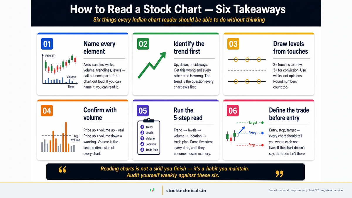
Theory is useful. Application is where chart reading becomes a real, tradeable skill. Here is a complete walkthrough of reading a daily chart of HDFC Bank (NSE: HDFCBANK) using every concept covered so far.
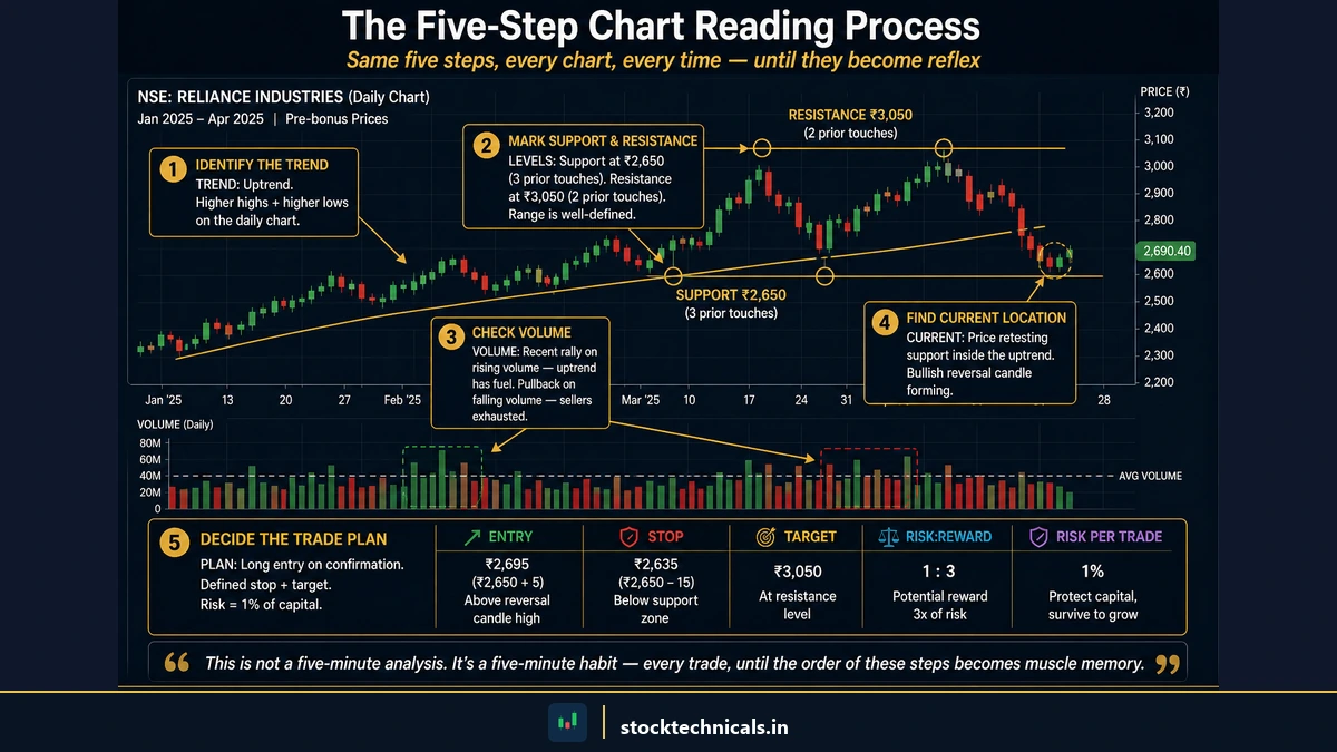
The Five-Step Reading Process
Step one: Zoom out and check the trend. Switch to the weekly timeframe and scan the chart for the past twelve months. HDFC Bank traded in the ₹1,500-1,700 range during 2023, then corrected significantly into the ₹850 range. On the weekly chart, the trend since those 2023 highs is clearly down. This is the big-picture context — it tells traders that any long trade on the daily chart is a counter-trend play and requires more conservative position sizing.
Step two: Switch to daily and mark support and resistance. On the daily chart, identify two or three horizontal levels where price reversed at least twice in recent weeks. HDFC Bank has shown buying interest near ₹840 (support) and selling pressure near ₹870 (resistance). Those two lines define the current trading range.
Step three: Check the current price position. Where is price right now relative to those levels? If HDFC Bank is at ₹852 — roughly in the middle of the ₹840-870 range — there is no immediate edge. A trader in the middle of a range has no natural stop-loss level nearby. But if price is testing ₹840 support with a long lower wick forming on the current candle, that is a potential buying opportunity with a defined stop-loss just below ₹835.
Step four: Read the recent candles. Look at the last five to ten daily candles. Are they mostly green with increasing body sizes (growing bullish momentum)? Mostly red with expanding bodies (accelerating selling)? Small-bodied candles with long wicks (indecision and uncertainty)? The recent candle cluster reveals the short-term sentiment — what buyers and sellers are doing right now.
Step five: Confirm with volume. If price is bouncing off ₹840 support with a strong green candle, check the volume bar. Is volume above the 20-day average? If yes, the bounce has institutional conviction — larger participants are buying at this level. If volume is below average, the bounce may be a weak, low-participation drift that could fail the next day.
Putting it together into a trade decision
The five steps above produce a decision framework, not a guaranteed signal. Here is how the framework translates into action:
- Trend: Weekly downtrend — proceed with caution on longs. Keep position sizes conservative.
- Levels: Support at ₹840, resistance at ₹870. The range is ₹30 wide.
- Position: Price at ₹843, near support — possible entry zone.
- Candles: Last two sessions show long lower wicks at ₹840 — sellers pushed price down but buyers recovered. This is rejection of the support level.
- Volume: Today's green candle came on volume 1.6x the 20-day average — strong.
Trade setup: Enter near ₹843. Stop-loss at ₹834 (below support). Target ₹868 (just below resistance). Risk: ₹9 per share. Reward: ₹25 per share. Risk-reward ratio: approximately 1:2.7.
That is chart reading applied. Not a prediction. Not a guarantee. A structured decision with defined risk.
Chart Reading for F&O Traders
Key Takeaways
- F&O traders use faster timeframes (5-minute, 15-minute) with additional overlays like VWAP and EMA
- Open interest data alongside price reveals whether smart money is building or exiting positions
- Premium decay in options means time pressure that equity traders do not face — faster chart reads are essential
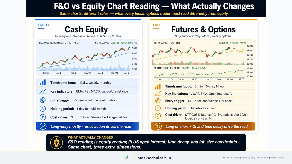
Everything covered so far applies to equity charts. Traders who operate in futures and options (F&O) need the same foundation — trend, support, resistance, volume — but with three additional layers.
Which Timeframe for Options Trading
Equity swing traders live on the daily chart. F&O intraday traders live on the 5-minute or 15-minute chart. The principles are identical — trend, support, resistance, volume — but the speed is different.
- 5-minute chart: Best for scalping and intraday options trades with same-day expiry. Each candle represents five minutes of price action. Moves are fast. Decisions must be faster.
- 15-minute chart: The sweet spot for intraday F&O traders who want enough data per candle to avoid noise but enough speed to catch intraday moves. This is where most successful intraday options traders operate.
- Daily chart: Used by swing and positional F&O traders carrying positions for two to ten days. Also used as the context timeframe before switching to 15-minute for entry timing.
For a detailed comparison of timeframes and which suits each trading style, the dedicated article covers all combinations.
VWAP and EMA on Charts
Two overlays transform a basic candlestick chart into an F&O decision tool:
VWAP (Volume Weighted Average Price — the average price a stock has traded at during the session, weighted by volume) shows where institutional traders are positioned. When price is above VWAP, buyers are in control of the session. When price is below VWAP, sellers dominate. Many institutional algorithms use VWAP as a benchmark, which makes it a self-fulfilling level on intraday charts.
EMA 20 (the 20-period Exponential Moving Average) provides a dynamic trend filter on the 15-minute chart. When price is above the EMA 20, the short-term trend is bullish. When below, it is bearish. The crossover of price and EMA 20 often marks the beginning of a new intraday move.
Market Example: On a Bank Nifty 15-minute chart, a trader sees price trading above VWAP at ₹48,500 with the EMA 20 trending upward below price. This alignment — price above both VWAP and EMA 20 — signals a bullish intraday bias. A trader buying a call option in this condition has the odds tilted in their favour compared to buying calls when price is below both indicators.
Reading Open Interest Alongside Price
OPEN INTEREST (the total number of outstanding derivative contracts that have not been settled) adds a dimension that equity charts cannot provide. Open interest analysis reveals whether money is flowing into a trend or flowing out.
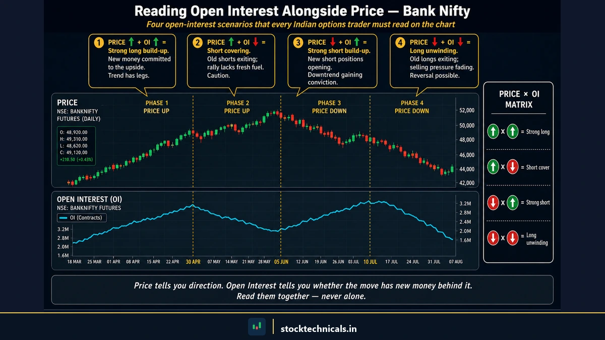
- Rising price + rising open interest = strong trend. New money is entering the market in the direction of the move. This is the most trustworthy F&O signal.
- Rising price + falling open interest = short covering rally. Shorts are closing positions, not new longs entering. The rally may be temporary.
- High open interest at a specific strike price: Acts as a magnet. Nifty often gravitates toward the strike with the highest OI as expiry approaches.
Key Differences from Equity Chart Reading
F&O chart reading shares the same core principles but adds three pressures that equity traders do not face:
- Time decay. Options lose value every day, even if the underlying does not move. This means an F&O trader cannot afford to "wait and see" as long as an equity trader can. Chart reads must be faster, and decisions must be more decisive.
- Expiry day dynamics. Volume spikes, volatility compresses, and open interest unwinds on expiry day. Charts behave differently on Thursday (weekly expiry) and the last Thursday of the month (monthly expiry). Patterns that work on a normal Tuesday may not work on expiry day.
- Premium sensitivity. A ₹5 move in Nifty might cause a ₹15 move in an at-the-money option. F&O traders need to read charts with an understanding of how the underlying price translates into option premium — which depends on Greeks like delta and theta.
These differences do not invalidate the chart-reading framework. They sharpen it. Trend, support, resistance, and volume remain the foundation. VWAP, EMA, and open interest are the overlays that make the framework work for derivatives.
Common Mistakes That Cost Real Money
Key Takeaways
- Most chart-reading errors come from skipping steps, not from misunderstanding concepts
- Overcomplicating charts with too many indicators hides the signal in noise
- The most expensive mistake is trading without a stop-loss — no chart skill compensates for this
Chart reading is a skill, and skills develop faster when traders know which pitfalls to avoid. These five mistakes cost real money — not hypothetical money, not paper-trading money, but capital from live trading accounts.
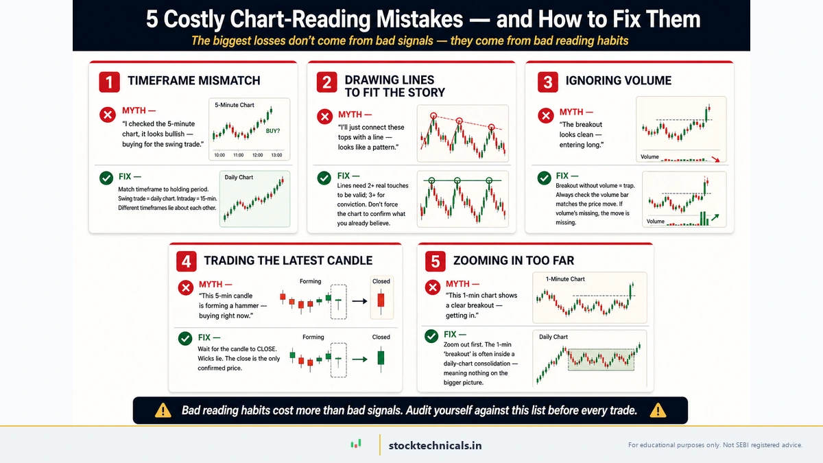
Trading without checking the trend first. The most expensive mistake. A perfect hammer candle at what looks like support means very little in a strong downtrend. The trend is the current — swimming against it requires extraordinary timing. Always identify the trend first. Everything else follows from that answer.
Ignoring volume on breakouts. A breakout above resistance looks exciting on price alone. Without checking volume, a trader cannot know if the move has institutional backing or is a low-participation drift that will reverse by tomorrow's open. Always glance at the volume bar before acting on a breakout.
Using the wrong timeframe for the trading style. A swing trader watching a 1-minute chart will see noise, feel panic, and make impulsive decisions that destroy capital. A positional trader on a 5-minute chart will overtrade and bleed away returns through brokerage and slippage. Match the chart timeframe to the intended holding period.
Drawing too many support and resistance levels. Support, resistance, trendlines, channels, Fibonacci levels — it is possible to draw so many lines that the chart becomes unreadable. When everything is important, nothing is important. Limit markings to the two or three most relevant levels at any time.
Reading charts without a stop-loss plan. The chart might show a beautiful setup — support holding, volume confirming, trend aligned. But without a defined stop-loss before the trade is entered, one gap-down open can erase weeks of gains. Chart reading identifies opportunities. Risk management protects capital. Both are non-negotiable. No setup works without a stop-loss.
Risk Reality: 93% of individual intraday traders lose money (SEBI 2023 study). Most of them can read charts. What separates the surviving 7% is not better chart reading — it is better risk management, disciplined position sizing, and the emotional control to follow rules even when it feels uncomfortable. Define the stop-loss before entering every trade. Accept the loss when it triggers. Move to the next setup.
Self-Assessment Quiz
Test the understanding of chart reading concepts covered in this article.
Test Your Knowledge
Q1: A candlestick has a long lower wick and a small green body near the top of the candle. What does this indicate?
Q2: Price breaks above a resistance level on volume that is 0.5x the 20-day average. What should traders conclude?
Q3: On a daily chart, price has been making lower highs and lower lows for three weeks. A bullish engulfing candle appears at a minor support level. What is the safest interpretation?
Q4: An F&O intraday trader sees price trading below VWAP and below the EMA 20 on a 15-minute chart. What does this alignment suggest?
Q5: A stock has bounced from ₹840 three times over the past four weeks, each time rising at least ₹20 before pulling back. What is the ₹840 level called?
Risk Mantra
Protect your capital. Everything else follows.
The Bottom Line About Reading Stock Charts
Reading a chart is not about predicting the next candle. It is about understanding the story of price: who is in control, where conviction lives, and where the stops cluster. The SEBI FY24-25 study confirms 91 percent of individual equity F&O traders lost money. Most of them read charts daily. The difference between the 9 percent who survive and the 91 percent who do not is not a better indicator or a sharper pattern — it is the discipline to wait for a setup that actually matches what the chart is saying.
Frequently Asked Questions
“The trend is your friend until it bends at the end.”
— Ed Seykota, Market Wizards
How do traders start reading stock charts as beginners?
Start with a daily candlestick chart of a liquid stock like HDFC Bank or Reliance Industries on TradingView. Focus on three things only: the trend direction, one support level, and one resistance level. Do not add indicators until those three skills become second nature. Attempting to learn everything at once leads to information overload and paralysis.
Which chart type is best for active trading?
Candlestick charts. They display all four price points (open, high, low, close) in a format that makes bullish and bearish sessions immediately visible through coloured bodies. Line charts are too simple for active trading — they hide intra-session volatility. Bar charts show the right data but are harder to read than candlesticks. Every professional trading desk uses candlestick charts as the default.
What timeframe should traders use to read charts?
Match the timeframe to the trading style. Intraday F&O traders use 5-minute to 15-minute charts. Swing traders use daily charts. Positional traders use weekly charts. When in doubt, start with the daily chart — it filters noise while showing meaningful price action. For a deeper dive, see the guide on timeframes in trading.
What do the bars at the bottom of a stock chart mean?
Those are volume bars. Each bar shows the total number of shares traded during that period. Taller bars mean heavier participation. Shorter bars mean thinner activity. Volume confirms price moves — a breakout on high volume is more reliable than one on low volume. For a complete guide, see Volume in Trading.
Can traders read stock charts on a mobile phone?
Yes. TradingView, Zerodha Kite, and most broker apps provide full charting on mobile. However, for detailed analysis with multiple drawing tools and side-by-side timeframe comparisons, a desktop or laptop screen is significantly more practical. Mobile charting works for quick checks, not for thorough pre-trade analysis.
Which app is best for reading stock charts?
TradingView is the industry standard. The free version offers professional-grade candlestick charts, drawing tools, and dozens of indicators — the same platform used by institutional analysts. For broker-integrated charting, Zerodha Kite uses TradingView's engine and connects directly to the trading account for order placement.
How long does it take to learn chart reading?
The basics — trend identification, support and resistance, and volume confirmation — can be understood in a single weekend of focused study. Developing the fluency to read charts automatically, where the analysis happens in seconds rather than minutes, takes three to six months of daily practice on real charts. There is no shortcut for screen time.
Do traders need to pay for chart software?
No. TradingView's free tier is sufficient for learning and even for most active trading. Paid plans add more saved chart layouts, server-side alerts, and multi-chart screens — useful for professionals, but optional for traders building the chart-reading skill. The chart itself looks identical on free and paid accounts.
What to Read Next
This article covered the complete chart-reading framework: what charts show, how to read candlesticks, volume confirmation, support and resistance, trend identification, and chart reading for F&O traders. The next step depends on where a trader wants to go deeper.
For chart type mastery: Types of Stock Charts: Line, Bar, and Candlestick — a detailed look into each format with real NSE examples showing when to use which type.
For candlestick pattern recognition: What Are Candlestick Charts? covers the history, psychology, and core patterns. Then move to Bullish Candlestick Patterns and Bearish Candlestick Patterns for specific setups with entry, stop-loss, and target rules.
For support and resistance mastery: Support and Resistance: The Complete Guide goes far deeper than this article's overview — including zone drawing techniques, multi-timeframe S/R, and role reversal strategies.
For indicator-based chart reading: Once comfortable with price action, explore RSI Basics, MACD Basics, and EMA Basics to add quantitative confirmation to visual chart reads.
No setup works without a stop-loss.
A chart without context is just a pretty picture. Read price, read volume, read the trend, then read the setup — in that order. Every profitable trader looks at the same charts; the difference is they know what to ignore.