
Quick Answer: A TIMEFRAME in trading is the time period each candlestick or bar represents on a price chart. A 5-minute chart draws one candle every five minutes. A daily chart draws one candle per trading day. The timeframe a trader chooses shapes everything — the number of signals, the noise level, the holding period, and the risk per trade. There is no single "best" timeframe. The right one depends on the trading style, available screen time, and risk tolerance.

Quick Answer: A timeframe is the duration each candlestick represents on a chart — 1-minute, 5-minute, 15-minute, hourly, daily, or weekly. Scalpers use 1-5 minute charts, intraday traders use 5-15 minute, swing traders use daily, and positional traders use weekly charts.
The Top-Down Workflow: From Weekly to Entry
The most reliable multi-timeframe workflow starts at the highest timeframe and works down. Here is the exact process professional traders on TradingView use every morning before market open:
Quick Answer: A timeframe is the time period each candle or bar represents on a chart — a 5-minute chart prints one candle every five minutes, a daily chart prints one per trading day. The timeframe shapes the number of signals, the noise level, the holding period, and the risk per trade. Swing traders on NSE typically use the daily chart as their decision timeframe, the weekly for trend context, and the 1-hour for precise entry — never the reverse.
- Step 1 — Weekly chart scan (Sunday night): Open the Nifty 50 weekly chart. Identify whether the index is in an uptrend (higher highs, higher lows), downtrend, or range. Note major support and resistance zones on this timeframe. These zones carry the most weight because they represent decisions by institutional traders managing crores of capital.
- Step 2 — Daily chart setup (before 9:15 AM): On the daily chart, check if the current candle is near any weekly level. Look for a pullback in the weekly trend direction. If the weekly trend is up and the daily chart shows a pullback to the 20 EMA, the setup is aligned. If the daily trend contradicts the weekly, step aside.
- Step 3 — 15-minute execution (during market hours): Once the daily chart gives a setup, drop to the 15-minute chart for the precise entry. Wait for a bullish candlestick pattern or a break above the previous 15-minute high. This is the trigger candle. Place the stop-loss below the 15-minute swing low.
This three-step process eliminates most losing trades because it forces alignment across timeframes. A long trade on the 15-minute chart that goes against the weekly trend is fighting the strongest current in the market. Professional traders never take that fight.
The critical discipline is never trading against the highest timeframe trend. If the weekly chart on Nifty 50 (NSE: NIFTY 50) is bearish (below the 20-week EMA, making lower lows), no amount of bullish signals on the 15-minute chart justify a long trade lasting more than a few hours. The weekly trend always wins eventually.
Practical Indicator Settings by Timeframe
Here is a concrete reference that traders can bookmark. These settings are used by professional technical analysts across Indian broking desks and are optimized for NSE stocks:
For intraday trading (5-minute and 15-minute charts): Use EMA 9 and EMA 21 for trend direction. The RSI period should stay at 14 but with overbought at 70 and oversold at 30. Bollinger Bands with period 20 and 2 standard deviations work well. VWAP is essential on these timeframes — institutional traders use it as the benchmark for the entire session. A stock trading above VWAP on the 5-minute chart has net buying pressure that day.
For swing trading (daily chart): The EMA 20 and EMA 50 are the primary trend indicators. RSI 14 remains standard. MACD with default settings (12, 26, 9) generates signals that last days to weeks rather than minutes. Supertrend with period 10 and multiplier 3 gives clean trend signals on daily charts without excessive noise.
For positional trading (weekly chart): EMA 20 on the weekly chart represents roughly 100 trading days — close to the widely-watched 100-day moving average. The EMA 50 on weekly represents almost a full year. When the Nifty 50 weekly closes below the 50-week EMA, institutional traders globally start reducing exposure. RSI divergences on the weekly chart are among the most reliable signals in technical analysis because they filter out all the daily noise.
A common mistake: copying someone else’s indicator settings without understanding the timeframe context. A YouTube video showing a profitable strategy with EMA 9/21 crossover on a 5-minute chart will not work on a daily chart. The crossover signals would be too slow — the price would already have moved 3-5% before the EMA 9 catches up on a daily timeframe.
The Nifty 50 December 2024 — January 2025 Divergence
This is not a hypothetical example. From December 5, 2024 to January 27, 2025, Nifty 50 provided a textbook case of timeframe divergence using real NSE data:
- Weekly chart: Nifty 50 was in a range between 22,500 and 24,900. The 20-week EMA sat near 23,800. The weekly trend was technically still bullish (higher lows since March 2023), but momentum was clearly fading. A weekly chart trader would label this as consolidation.
- Daily chart: Between December 5 (open: ₹24,539) and January 27 (low: ₹22,786), the daily chart showed a clear downtrend — lower highs on December 5, December 26, and January 6. The 20 EMA crossed below the 50 EMA on January 10. A daily chart trader was confidently shorting rallies.
- 15-minute chart: On January 28, the 15-minute chart showed a bullish reversal from 22,857 that rallied to 23,137 within the session — a 280-point intraday move. An intraday trader who entered this long trade made money, even though the daily trend was bearish.
- 5-minute chart: That same January 28 morning session had three separate 100+ point pullback-and-rally cycles on the 5-minute chart. A scalper traded all three, making money on each, without caring about the daily or weekly trend at all.
Four traders looking at the same index on the same day, using four different timeframes, would have taken four different — and potentially all profitable — positions. This is precisely why the question “is Nifty bullish or bearish?” has no single answer. It depends entirely on the timeframe.
The Timeframe Trap: Why Beginners Switch Too Often
One of the most destructive habits in trading is constantly switching timeframes. It goes something like this: a trader sees a bearish signal on the 5-minute chart and exits the long position at a loss. Then switches to the 15-minute chart and sees the trend is still bullish. Feels regret, re-enters. The 5-minute chart gives another sell signal. Panic. Switch to the daily chart for reassurance. The daily chart shows a pullback in an uptrend — was the exit wrong?
This is the TIMEFRAME TRAP (the cycle of constantly switching chart timeframes to find confirmation for what a trader already wants to believe). It destroys trading accounts because every timeframe switch resets the analysis and introduces new conflicting signals. The trader ends up making 10 trades where one disciplined trade would have sufficed.
How the Trap Plays Out on Nifty 50
Consider Nifty 50 during January 2025. The daily chart showed a downtrend from the December high of 24,857 to the January low near 22,786 — a drop of over 2,000 points. During this decline, the 15-minute chart showed dozens of intraday rallies. Each rally looked like a reversal on the short timeframe. Traders who switched from daily bearish to 15-minute bullish got caught buying dips in a sustained downtrend.
The fix is brutally simple: choose one primary timeframe and one confirmation timeframe before the market opens, and do not change them during the session. If a trader decides to be a 15-minute chart intraday trader using the daily chart for trend direction, that is the only combination used that day. No switching to the 5-minute chart because the 15-minute chart is not giving a signal. No switching to the hourly chart because the daily chart feels uncertain.
The One-Timeframe-Per-Session Rule
Successful traders at proprietary trading firms follow a strict rule: the analysis timeframe is decided during the pre-market routine, and it does not change once the session begins. The weekly trend direction is checked over the weekend. The daily setup is confirmed before 9:15 AM. The execution timeframe is locked. If no setup appears on the chosen execution timeframe that day, the trader does nothing. Zero trades is a valid outcome.
Track timeframe switches in a trading journal. If a trader is switching timeframes more than twice per session, the problem is not the timeframe — it is discipline. The timeframe trap is an emotional problem disguised as a technical one.
Key Takeaways
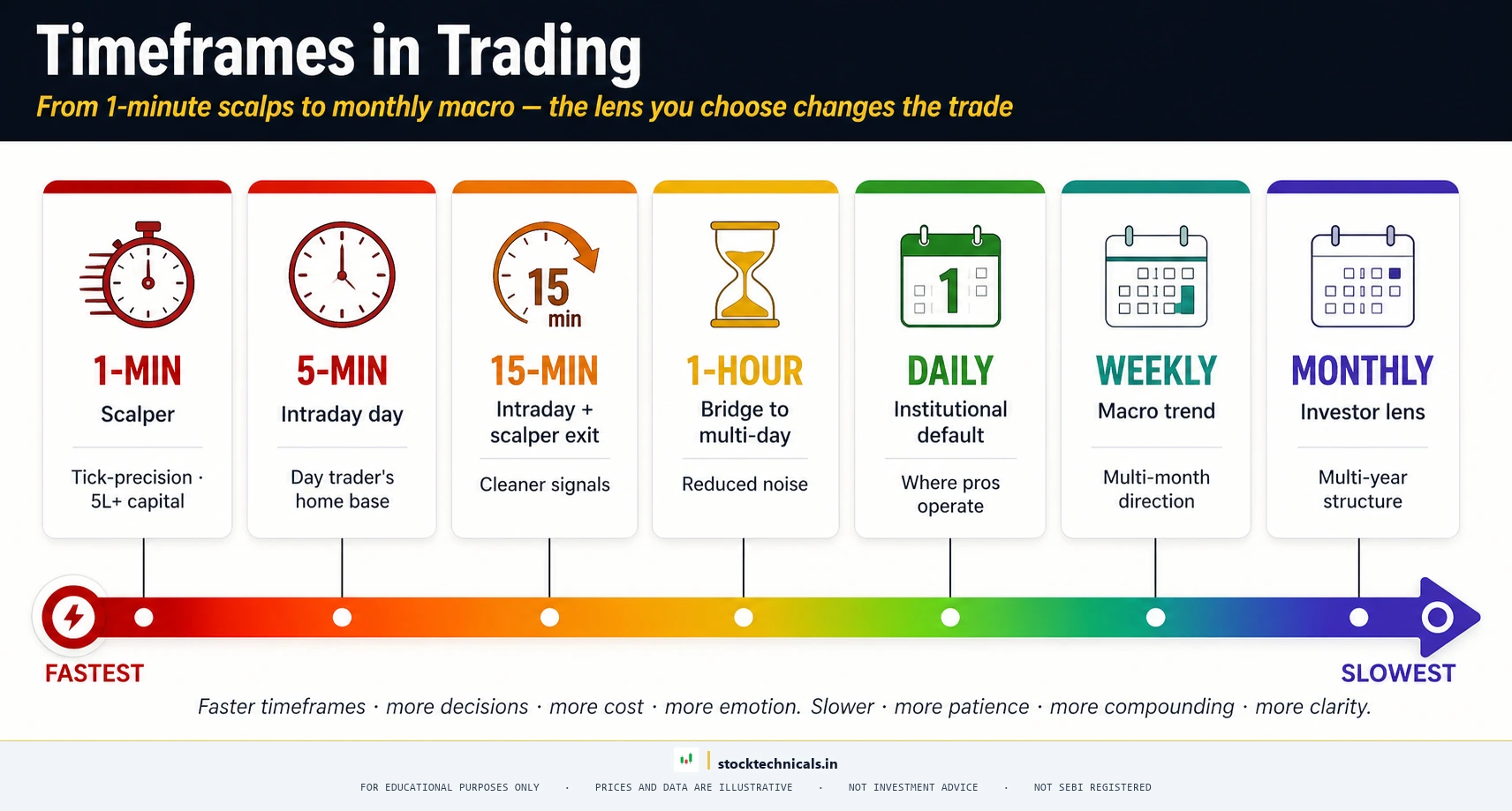
- A TIMEFRAME is the time interval each candlestick represents — 1-minute, 5-minute, 15-minute, 1-hour, daily, weekly, or monthly
- Shorter timeframes (1-min, 5-min) produce more signals but more noise — suited for scalping and intraday trading
- Longer timeframes (daily, weekly) produce fewer but cleaner signals — suited for swing and positional trading
- MULTI-TIMEFRAME ANALYSIS uses a higher timeframe for trend direction and a lower timeframe for entry timing — the most reliable method professional traders use
- The same stock looks completely different on a 5-minute chart versus a daily chart — same price data, different story
- Indicator settings like EMA 20 mean different things on different timeframes (20 candles = 100 minutes on 5-min, 20 days on daily, 20 weeks on weekly)
- Most beginners start on timeframes that are too short — the daily chart is the best starting point for learning
What is a Timeframe in Trading
Every charting platform — TradingView, Zerodha Kite, Angel One, Groww — offers the same set of standard timeframes. Here is what each one does and who uses it.
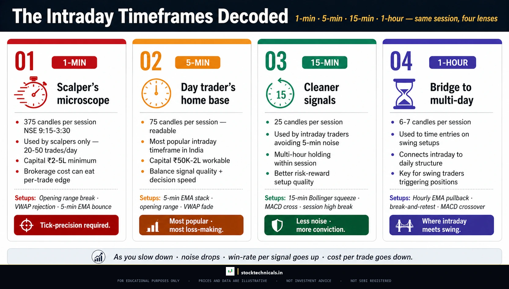
One-Minute Chart (1-Min)
Each candle = 1 minute. On a standard NSE trading day (9:15 AM to 3:30 PM = 375 minutes), a 1-minute chart generates 375 candles. This timeframe is the domain of scalpers — traders who hold positions for seconds to minutes, aiming for tiny price movements. On HDFC Bank at approximately ₹977, a 1-minute chart might show the price jumping between ₹976.50 and ₹978.00 in rapid, noisy movements.
Five-Minute Chart (5-Min)

Each candle = 5 minutes. A full NSE trading day produces 75 candles on a 5-minute chart. The 5-minute timeframe is the workhorse of intraday trading. It filters out the worst of the 1-minute noise while still providing enough granularity for precise entries and exits. Most intraday traders on Zerodha Kite or TradingView default to this timeframe.
Fifteen-Minute Chart (15-Min)
Each candle = 15 minutes. A full trading day produces 25 candles. The 15-minute chart is the sweet spot for traders who want intraday clarity without the anxiety of watching every tick. Support and resistance levels on the 15-minute chart hold better than on 5-minute charts, and breakouts are more reliable because each candle represents a more meaningful price consensus.

One-Hour Chart (1-Hour)
Each candle = 60 minutes. A trading day produces 6.25 candles (the last candle is only 15 minutes on NSE). The hourly chart bridges intraday and multi-day trading. Traders who hold positions for 1-3 days often use the 1-hour chart for entry timing.
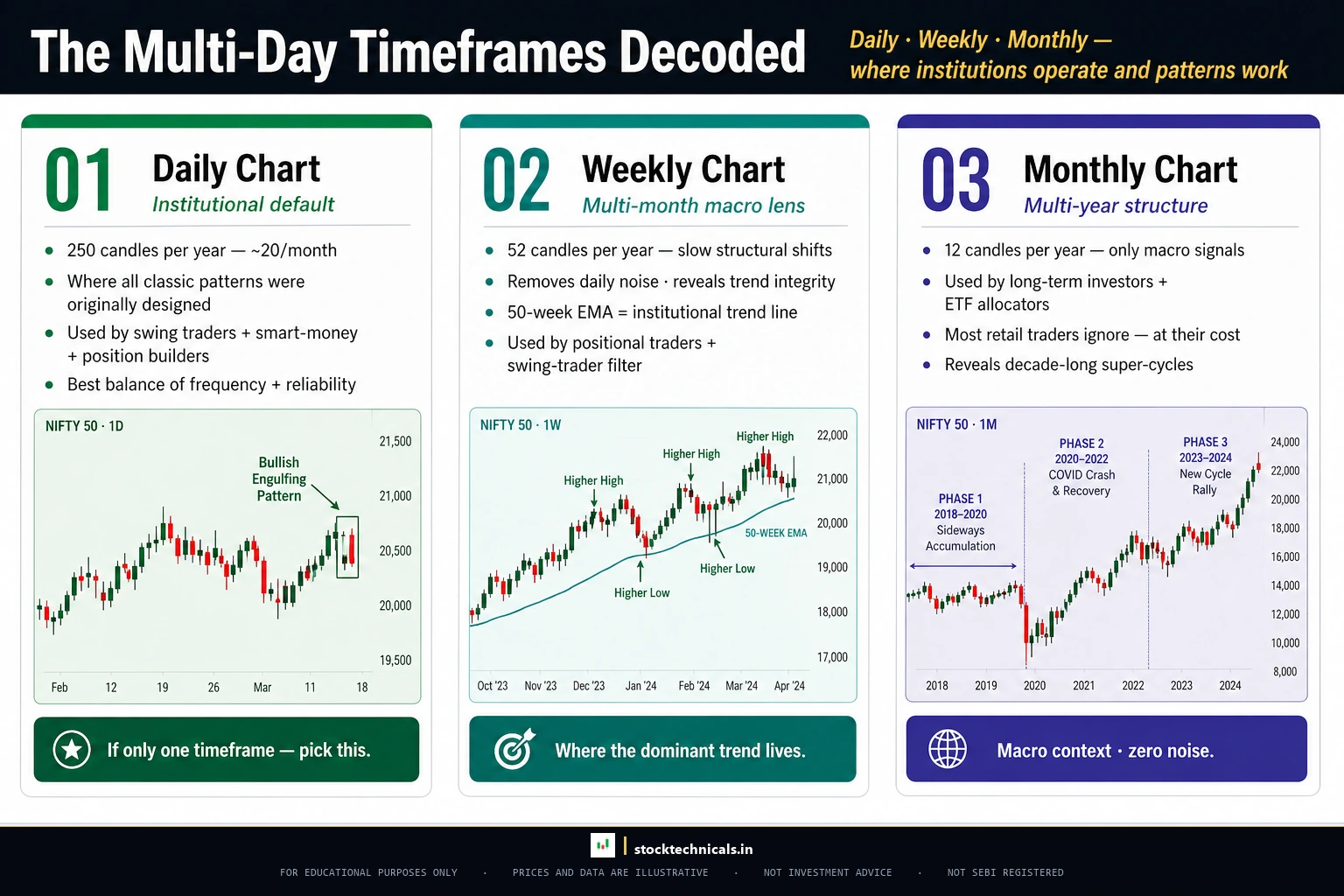
Daily Chart (1-Day)
Each candle = one full trading session. The daily chart is the most important timeframe in technical analysis. It is the reference timeframe that institutional traders, mutual fund managers, and SEBI-registered research analysts use for analysis. Every candlestick pattern was originally designed and tested on the daily chart.
Nifty 50 on the daily chart shows clean trends that are impossible to see on a 5-minute chart. The index moved from approximately 22,100 to 26,270 over the course of several months — a clear, tradeable trend that daily chart traders captured while intraday traders fought the noise inside every single session.

Weekly Chart (1-Week)
Each candle = one trading week. The weekly chart is for identifying the primary trend — the big direction that matters for months. TCS on the weekly chart reveals a long-term uptrend from approximately ₹3,457 to ₹4,549 that took months to develop.

Monthly Chart (1-Month)
Each candle = one calendar month. The monthly chart is the long-term investor’s view. Reliance Industries on the monthly chart reveals the massive rally from approximately ₹238 in 2016 to above ₹1,500 — a move that contained hundreds of daily chart fluctuations within a single, dominant uptrend.

Which Timeframe Matches Which Trading Style
The connection between timeframe and trading style is not optional — it is structural. Using the wrong timeframe for a trading style is like using a microscope to navigate a highway.
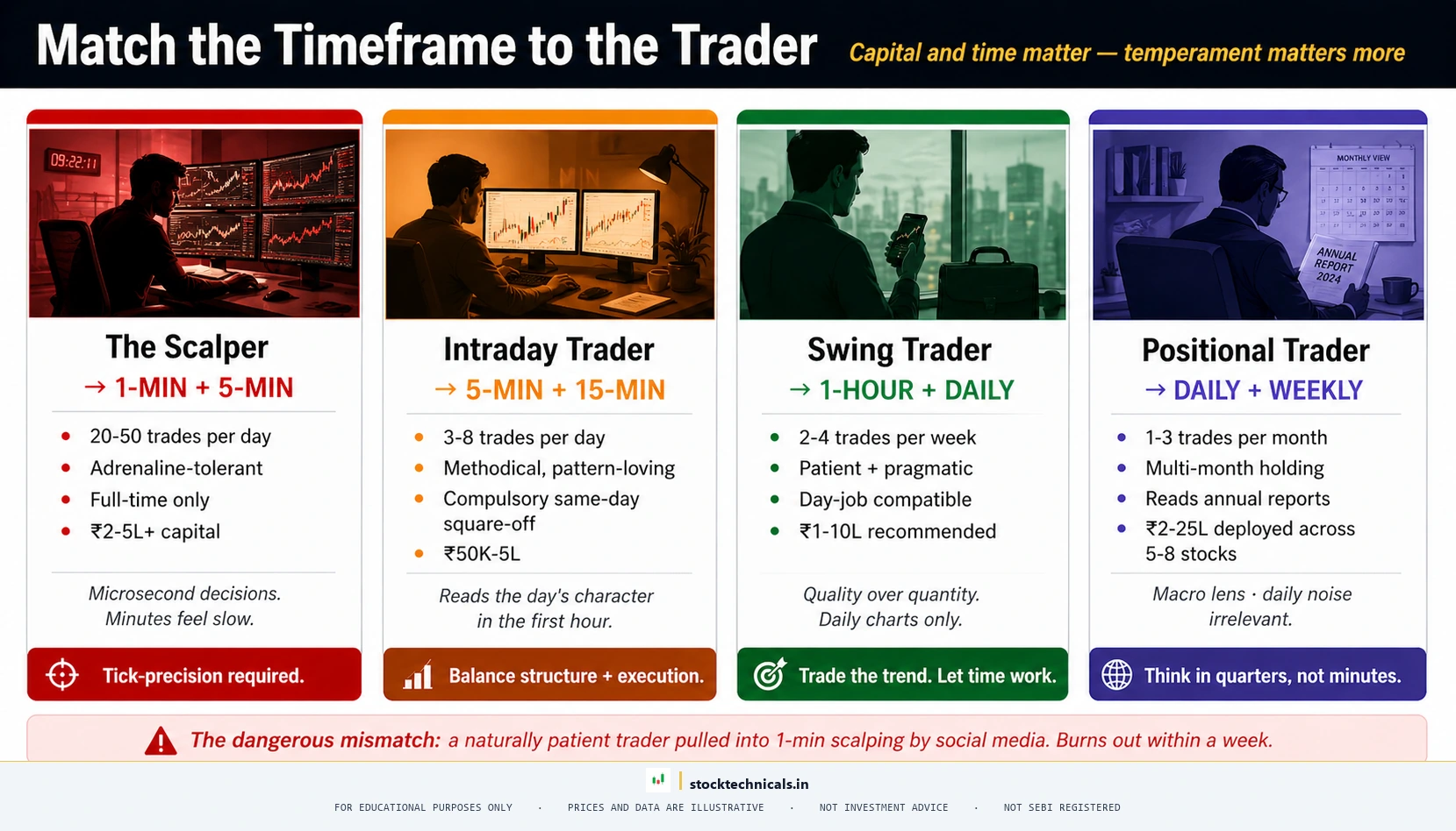
Scalping (holds: seconds to minutes) — 1-minute and 5-minute charts. Scalpers need the finest granularity to spot micro-level support and resistance and exploit tiny price gaps.
Intraday Trading (holds: minutes to hours, closed before 3:30 PM) — 5-minute and 15-minute charts. Read more in Types of Trading.
Swing Trading (holds: 5-30 days) — Daily chart primarily, with the 4-hour or 1-hour chart for fine-tuning entries. A swing trader identifies a pullback to a key level on the daily chart, then drops to the hourly chart to time the exact entry.
Positional Trading (holds: 1-6 months) — Weekly chart for trend direction, daily chart for entries and stop-loss placement.
Long-Term Investing (holds: years) — Monthly and weekly charts for structural levels.

| Trading Style | Primary Timeframe | Entry Timeframe | Typical Hold | Signals/Month |
|---|---|---|---|---|
| Scalping | 1-min | Tick / 1-min | Seconds-minutes | 200+ |
| Intraday | 5-min, 15-min | 5-min | Minutes-hours | 60-100 |
| Swing | Daily | 1-hour, 4-hour | 5-30 days | 8-15 |
| Positional | Weekly | Daily | 1-6 months | 2-4 |
| Investing | Monthly | Weekly | Years | 1-2 |
Interactive Tool: Timeframe Recommender
Answer four questions about your schedule, hold period, noise tolerance, and trade frequency. The recommender routes you to one of six trading styles and shows the primary, execution, and trend-context timeframes that fit.
Timeframe
Recommender Wizard
Find the timeframe that fits your schedule, temperament, and trading style
Answer Four Questions
The recommender matches your answers to one of six trading styles and shows the primary, execution, and trend-context timeframes professional traders use.
Timeframe Cheat Sheet
Reference table of every standard timeframe, the trading style it suits, and what to expect on NSE (9:15 AM to 3:30 PM = 375 minutes per session).
| Chart | Candles/Day | Best For | Hold | Screen Time |
|---|---|---|---|---|
| 1-Min | 375 | Scalping | Seconds | Constant |
| 5-Min | 75 | Intraday | Minutes | Active |
| 15-Min | 25 | Intraday Swing | Hours | Every 15–30 min |
| 1-Hour | ~6 | Short Swing | 1–3 days | 3–4 times/day |
| Daily | 1 | Swing | 5–30 days | 30 min after close |
| Weekly | 0.2 | Positional | 1–6 months | Once a week |
| Monthly | 0.05 | Investing | Years | Once a month |
Five-Question Timeframe Quiz
Test what you have learned. Each correct answer teaches one principle from the article.
Disclaimer: This tool is for educational purposes only and does not constitute investment advice. StockTechnicals.in is not SEBI registered as an investment advisor. Trading in securities markets involves substantial risk of loss. Past performance is not indicative of future results. Always consult a SEBI-registered advisor before making investment decisions.
How Timeframes Work in Stock Markets
Indian equity markets operate through NSE and BSE with specific timing that directly affects how timeframes work.
Normal trading hours: 9:15 AM to 3:30 PM IST — 375 minutes per session. This means a 1-minute chart produces 375 candles per day, a 5-minute chart produces 75, a 15-minute chart produces 25, and a 1-hour chart produces approximately 6 candles per day.
Gap openings are common. Because Indian markets close for approximately 18 hours overnight (3:30 PM to 9:15 AM), most trading days open with a gap. This gap is visible on the daily chart as a space between candles.
F&O expiry considerations: Options on NSE expire every Thursday (weekly) or on the last Thursday of the month (monthly). On expiry days, volume is concentrated in the final 2-3 hours, making shorter timeframes (1-min, 5-min) extremely volatile.
Multi-Timeframe Analysis — The Professional Edge
MULTI-TIMEFRAME ANALYSIS (MTA) is the practice of examining the same stock or index on two or more timeframes simultaneously to get both the big picture and the precise entry point. It is the single most valuable timeframe concept a trader can learn.
The principle is simple: never trade against the higher timeframe trend.
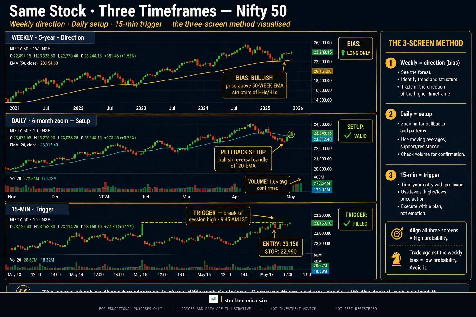
The Three-Screen Method
- Strategic timeframe (highest): Determines the primary trend direction. The trader does not trade this timeframe directly — it only answers "which direction?"
- Tactical timeframe (middle): Identifies the setup — a pullback in an uptrend, a rally in a downtrend, a consolidation near a breakout level.
- Execution timeframe (lowest): Provides the precise entry trigger — a candlestick pattern, a break of a trendline, a volume spike.
| Trading Style | Strategic (Trend) | Tactical (Setup) | Execution (Entry) |
|---|---|---|---|
| Intraday | Daily | 15-min | 5-min |
| Swing | Weekly | Daily | 1-hour |
| Positional | Monthly | Weekly | Daily |

Example: Nifty 50 Multi-Timeframe Trade
Step 1 — Weekly chart (strategic): Nifty 50 is in a clear uptrend above its 50-week EMA. Direction: LONG only.
Step 2 — Daily chart (tactical): The index has pulled back to the 50-day EMA near a previous support zone around 23,000-23,200. A potential entry zone is forming.
Step 3 — 15-minute chart (execution): A bullish engulfing pattern forming at the 23,100 level with above-average volume. Entry taken at 23,150 with a stop loss below 22,950 (200-point risk).

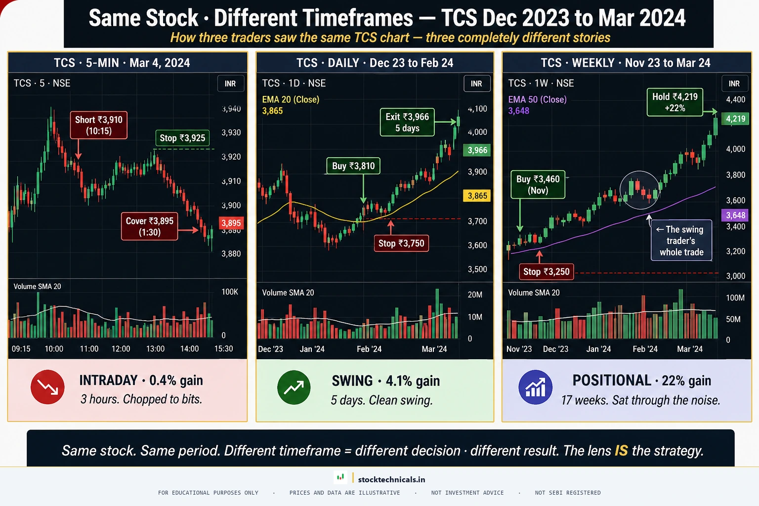
Same Stock, Different Timeframes — Example
One of the most common mistakes traders make is drawing conclusions from a single timeframe. The same stock can look bullish on one timeframe and bearish on another — at the exact same time.
On the daily chart: Nifty 50 has dropped 8% from its recent high. Clear downtrend. A daily chart trader would be looking for short trades.
On the weekly chart: The same index is sitting on a major support zone near its 50-week EMA. The weekly trend is still intact. A weekly chart trader might be preparing to buy this dip.
On the 15-minute chart: Within that daily downtrend, the 15-minute chart shows a clear intraday uptrend during the morning session. An intraday trader would have taken a long trade that morning.
Same stock. Same price data. Three different timeframes telling three different stories. This is precisely why multi-timeframe analysis matters.

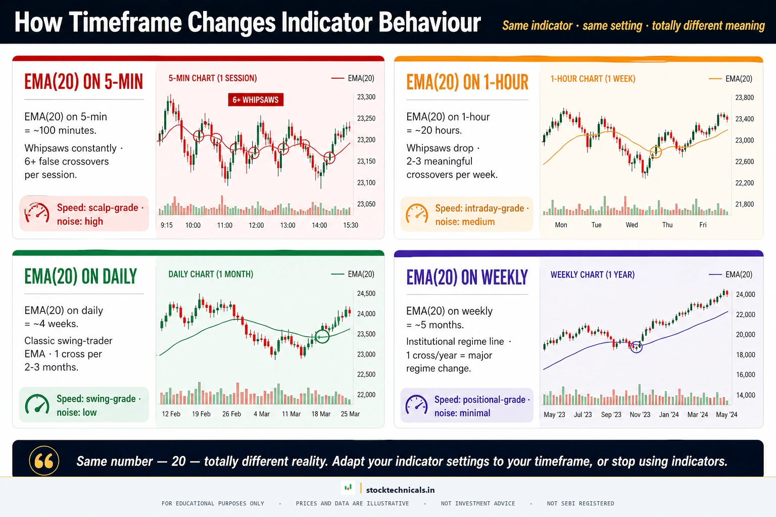
How Timeframe Changes Indicator Behaviour
A common misconception among beginners is that indicator settings are universal. They are not. An EMA (EXPONENTIAL MOVING AVERAGE) set to 20 periods behaves completely differently depending on the timeframe.
- EMA 20 on a 5-minute chart: Covers 100 minutes of price data. A crossover might last 30 minutes before reversing.
- EMA 20 on a daily chart: Covers 20 trading days. A crossover often leads to multi-week moves.
- EMA 20 on a weekly chart: Covers 20 weeks (roughly five months). A break below is a significant trend change event.
Key principle: Indicator settings should match the timeframe and trading style. The EMA 200 on a daily chart (roughly 10 months) is one of the most watched levels in technical analysis. The EMA 200 on a 5-minute chart (roughly 2.7 trading days) is barely useful.
| Indicator | 5-Min Chart | Daily Chart | Weekly Chart |
|---|---|---|---|
| EMA 20 | 100 min (~1.7 hrs) | 20 days (~1 month) | 20 weeks (~5 months) |
| EMA 50 | 250 min (~4.2 hrs) | 50 days (~2.5 months) | 50 weeks (~1 year) |
| EMA 200 | 1000 min (~2.7 days) | 200 days (~10 months) | 200 weeks (~4 years) |
| RSI 14 | 70 min (~1.2 hrs) | 14 days (~3 weeks) | 14 weeks (~3.5 months) |
How to Set Timeframes on TradingView
TradingView is the most popular charting platform used by Indian traders. For the full platform setup, read How to Set Up Your First Chart on TradingView.
Changing the timeframe: The timeframe toolbar sits at the top of every chart. Click the current timeframe (e.g., "1D") and select the desired period.
Keyboard shortcut: Type the number directly. Type "5" and press Enter for a 5-minute chart. Type "D" for daily. Type "W" for weekly.
Multi-chart layout: TradingView’s paid plans allow splitting the screen into 2, 4, or even 8 chart panels. A common setup: left panel with 15-minute chart, right panel with 5-minute chart, watchlist on the side.
Saving layouts: Once a multi-timeframe layout is set up, save it as a named layout (e.g., "Intraday Setup") so it loads instantly the next session.
Common Timeframe Mistakes That Cost Money
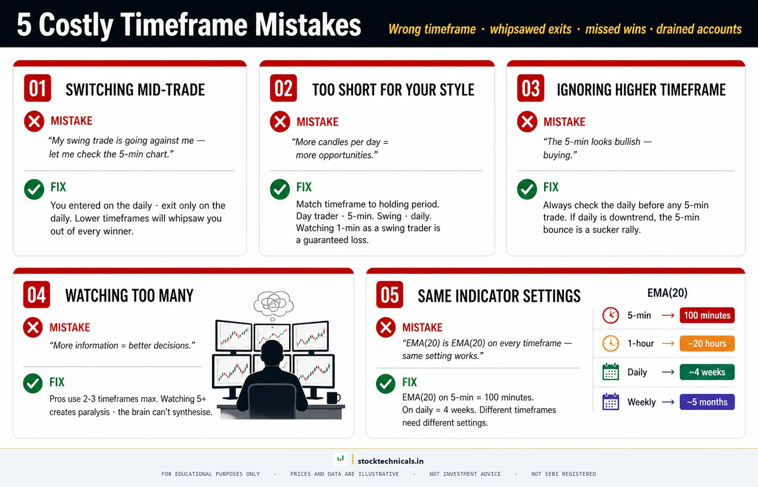
Mistake: Switching Timeframes After Entering a Trade
A trader enters a long position on the daily chart based on a pullback to support. The stock drops 2% the next day. Instead of waiting for the daily timeframe thesis to play out, the trader switches to the 5-minute chart and sees a "breakdown" — panic sell. Two days later, the daily chart pullback completes, and the stock rallies 8%.
Rule: The timeframe used for the entry decision is the timeframe used for the exit decision.
Mistake: Using Too Short a Timeframe
A swing trader who plans to hold for 5-15 days but watches the 1-minute chart throughout the day will be shaken out of every position. The 1-minute chart produces dozens of false signals every session that are completely irrelevant to a multi-day hold.
Mistake: Ignoring the Higher Timeframe
Taking a long trade on the 5-minute chart while the daily chart is in a clear downtrend is fighting the current. Short-term trades can work against the higher timeframe trend, but they have significantly lower success rates.
Mistake: Watching Too Many Timeframes
Five or six chart windows open — each showing something slightly different — creates confusion and indecision. Two to three timeframes is the maximum.
Mistake: Same Indicator Settings Across All Timeframes
EMA 20 on a 5-minute chart is not the same as EMA 20 on a daily chart. Traders who blindly apply the same settings across different timeframes are comparing numbers that measure completely different time horizons.

Timeframe Selection Checklist
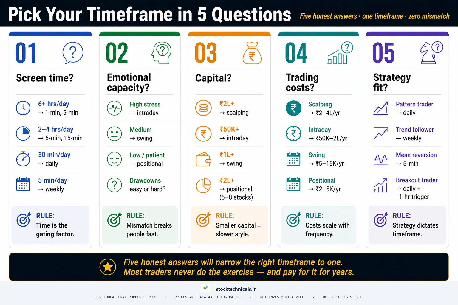
Before settling on a timeframe, every trader should answer these questions honestly:
- Available screen time. 1-min/5-min requires active monitoring during market hours. A daily chart requires 15-30 minutes after close.
- Emotional tolerance for noise. Shorter timeframes show every tick. Traders who feel anxiety should move to higher timeframes.
- Capital and risk management. Shorter timeframes = tighter stops + more trades. Longer timeframes = wider stops + fewer trades.
- Trading costs. Scalping: 20-40 trades/day = ₹400-800 brokerage. Swing: 4-8/month = ₹80-160 total.
- Strategy compatibility. VWAP is intraday only. MA crossovers work on any timeframe but produce fewer false signals on daily and weekly charts.


The bottom line: Most beginner traders lose money because they start on the 1-minute or 5-minute chart, get addicted to the action, and overtrade themselves into a hole. The daily chart is boring. It generates fewer signals. But the daily chart is where most profitable traders live — because it filters out 90% of the noise that causes bad decisions.
Start on the daily chart. Learn to read trends, support and resistance, and candlestick patterns on the daily timeframe first. Once those skills are solid, then consider moving to shorter timeframes if the trading style demands it. The 5-minute chart will always be there. The capital lost to impatience will not.
Test What Traders Learned
Q1: A 5-minute chart of Nifty 50 produces how many candles in a full NSE trading day?
Q2: EMA 20 on a daily chart covers approximately how many trading days?
Q3: In multi-timeframe analysis, the highest timeframe is used for:
Q4: A swing trader holding positions for 5-15 days should primarily use which timeframe?
Q5: What is the biggest timeframe-related mistake new traders make?
The Bottom Line About Trading Timeframes
Timeframe is not a style choice — it is a structural decision about how you live. The SEBI FY24-25 study confirms 91 percent of individual equity F&O traders lost money. Most of them were trading a timeframe they could not actually monitor. Pick the one that fits your life, not the one that looks exciting on YouTube.
Frequently Asked Questions
What is the best timeframe for intraday trading?
The 5-minute and 15-minute charts work best for intraday trading. The 5-minute chart gives precise entries and exits, while the 15-minute chart helps confirm the trend direction. Most professional intraday traders on NSE use the 15-minute chart as their primary timeframe with the 5-minute for execution.
Which timeframe is best for swing trading?
The daily chart is the ideal timeframe for swing trading. It filters out intraday noise while showing clear trends and support/resistance levels. Swing traders typically hold positions for 2 to 15 days, and the daily timeframe gives the clearest signals for these holding periods.
Can traders use multiple timeframes at the same time?
Yes. Multi-timeframe analysis is a professional technique where traders check the higher timeframe for trend direction, the middle timeframe for setup identification, and the lower timeframe for entry timing. A common combination is Daily + 1-Hour + 15-Minute for intraday, or Weekly + Daily + 4-Hour for swing trades.
Why do beginners lose money switching timeframes?
Switching timeframes mid-trade causes confusion because each timeframe tells a different story. A stock might look bullish on the 5-minute chart but bearish on the daily chart. Beginners who switch timeframes after entering a trade often exit too early or hold too long, both of which destroy their risk-reward ratio.
What timeframe do professional traders use?
Most professional traders use the daily chart as their primary analysis timeframe, regardless of their trading style. They then drop down to lower timeframes (15-minute or 1-hour) only for entry timing. The daily chart provides the most reliable signals because it captures the full day of trading activity and institutional participation.
What is the best timeframe for beginners?
The daily chart is the best starting point. It filters intraday noise, gives clear trend signals, and needs only 15 to 30 minutes of analysis per day. Once comfortable, explore 4-hour and weekly timeframes.
Why do signals conflict on different timeframes?
Each timeframe captures a different window of price action. A stock might be in a daily uptrend but showing a 15-minute pullback. Follow the higher timeframe trend and use lower timeframe signals only when they align.
How does timeframe selection affect stop loss?
Higher timeframes require wider stop losses because price swings are larger. A daily chart stop might be 3 to 5 percent from entry, while a 5-minute chart stop might be 0.3 to 0.5 percent. Adjust position size to keep rupee risk consistent.
Start on the Daily Chart This Week
Open TradingView or Zerodha Kite. Pull up the daily chart of Nifty 50. Add EMA 20 and EMA 50. Spend 15 minutes after market close identifying the current trend direction, the nearest support and resistance levels, and whether the index is trending or consolidating. Do this every day for two weeks before touching a shorter timeframe. The daily chart teaches more in two weeks than the 1-minute chart teaches in two months.
Keep learning. Keep practicing. The markets reward preparation.
No setup works without a stop-loss.
The timeframe is the hardest decision a trader makes. Pick the one that fits your life, not the one that looks exciting on YouTube. Per the SEBI FY24-25 study, 91 percent of individual equity F&O traders lost money — most of them from trading a timeframe they cannot actually monitor.
Continue Learning
- Previous: Technical Analysis vs Fundamental Analysis — understand when each approach wins
- Next: What is a Trend? — the foundation of every timeframe-based decision
- Related: Trendlines — draw reliable trend lines on any timeframe
- Related: Volume in Trading — confirm timeframe signals with volume
- Related: How to Set Up TradingView — configure multi-timeframe layouts
Protect your capital. Everything else follows.