Quick Answer: Draw support and resistance by identifying clusters of swing highs and lows where price has reversed multiple times. Use zones (not exact lines) — typically 0.5-1% wide. Start with higher timeframes (weekly, daily), mark obvious levels, then refine on lower timeframes. Zones with high volume are the most significant.
Key Takeaways

Chart data: Evergreen reference · Last reviewed April 17, 2026
- SUPPORT AND RESISTANCE LEVELS are price zones where buying or selling pressure has historically caused reversals — drawing them correctly is the foundation of every trading decision
- Start with a daily chart, identify at least three swing highs and three swing lows, then connect horizontal lines through clusters of price reactions
- Always draw zones (bands of 1-2% width), not exact price lines — markets respect areas, not single numbers
- A level gains validity with each touch — two touches create a tentative level, three or more touches confirm it as a high-probability zone
- Use multiple timeframes: weekly charts for major structural levels, daily for swing levels, and 15-minute or 5-minute for intraday precision
- Volume spikes at a support or resistance zone add conviction — a bounce on high volume is far more reliable than one on thin volume
- Old levels lose relevance over time — refresh the chart every 2-4 weeks and remove levels that price has ignored for months
Why Drawing Levels Matters More Than Memorizing Them

Chart data: Evergreen reference · Last reviewed April 17, 2026
Textbooks define support as “a price level where demand is strong enough to prevent further decline.” That definition is correct but useless in practice. It does not tell a trader where to place the horizontal line on a Reliance Industries (NSE: RELIANCE) chart at 2:45 PM on a Thursday.
Drawing levels is a practical skill. It requires pattern recognition, not memorization. The same stock can have completely different support and resistance levels depending on the timeframe, the recent price history, and how many times price has tested a particular area.
Here is what changes when a trader learns to draw levels properly:
- Entry precision improves. Instead of buying “somewhere around ₹1,500,” the entry becomes “buy at the ₹1,485-₹1,495 support zone with a stop below ₹1,475.”
- Stop losses become logical. A stop placed just below a well-drawn support zone has a reason behind it — not just a random 2% distance.
- Profit targets become clear. The next resistance zone above the entry is the natural place to book profits.
- Breakout and pullback setups become visible. Without drawn levels, breakouts and pullbacks are invisible.
The rest of this article is a step-by-step process. Follow it in order, and by the end, any chart will have clean, actionable support and resistance zones.
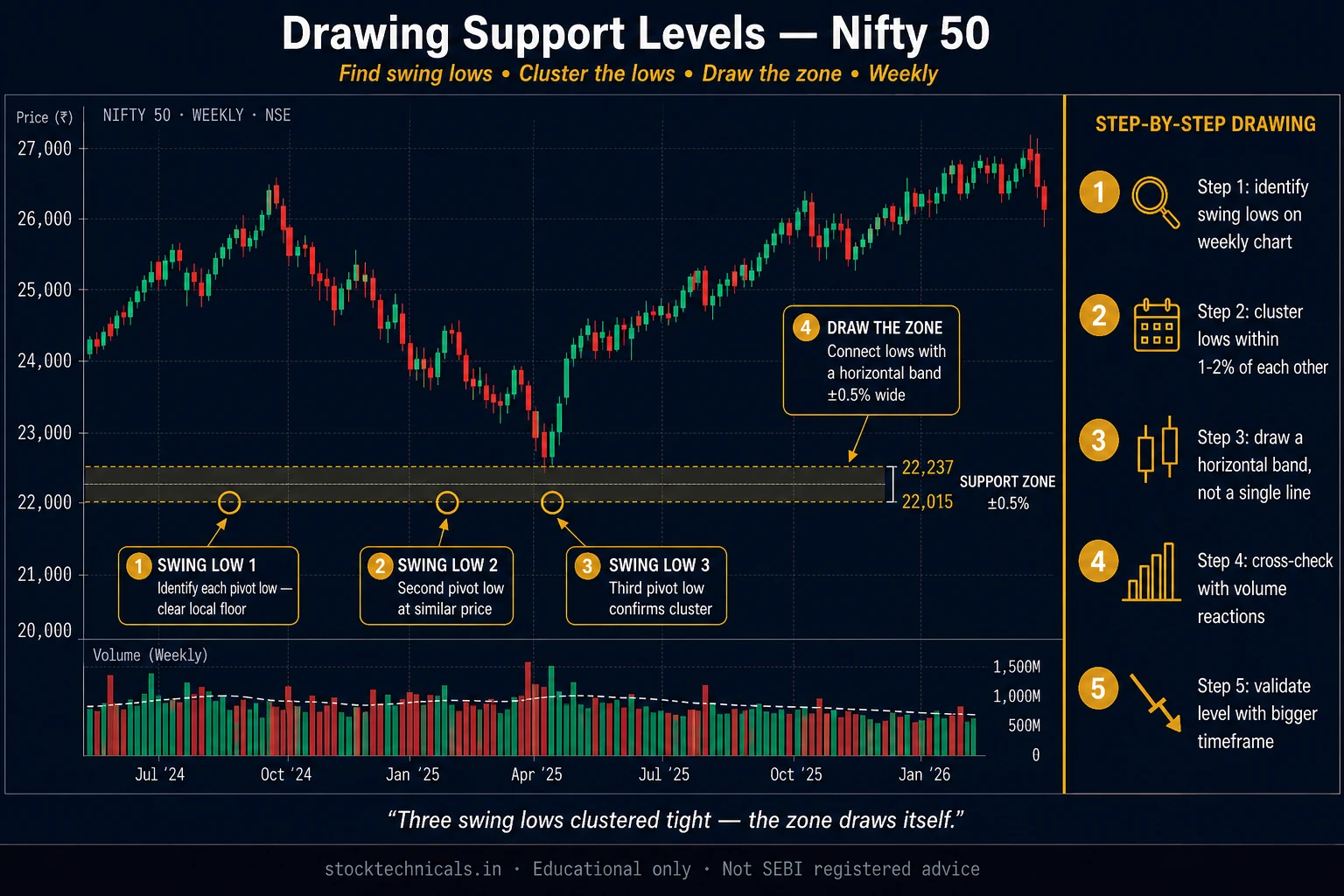
Step-by-Step: Drawing Support Levels
This process works on any stock, index, or derivative. The example below uses HDFC Bank on a daily chart.
Open the Daily Chart and Zoom to Six Months
Start with a daily timeframe. Not a 5-minute chart. Not a weekly chart. The daily timeframe provides the clearest view of meaningful swing points without the noise of intraday moves or the compression of weekly data.
Zoom the chart window to display roughly six months of price history. This gives enough context to identify recurring levels while keeping the chart readable.
On TradingView, use the date range selector at the bottom of the chart. On Zerodha Kite, pinch to zoom until approximately 120-130 candles are visible.
Identify Swing Lows (The Valleys)
A SWING LOW is a candle whose low is lower than the lows of the candles immediately before and after it. In plain language, it is a valley — a point where price dropped, then reversed upward.
Scan the chart from left to right. Mark every obvious swing low. Do not mark every minor dip — focus on swing lows that are clearly visible without squinting. If a trader has to zoom in to see it, it is not significant enough.
On a 6-month HDFC Bank chart, there will typically be 5-8 meaningful swing lows. Mark each one mentally or with a small annotation.
Draw Horizontal Lines Through Clusters
Now look for clusters. Two or more swing lows occurring at similar price levels (within 1-2% of each other) form a support zone. Draw a horizontal line through the approximate center of each cluster.
Key rules for this step:
- The line does not need to touch every swing low perfectly — it passes through the general area
- If two swing lows are at ₹1,485 and ₹1,492, draw the line at approximately ₹1,488
- Ignore isolated swing lows that have no neighbor within 2% — a single touch is not enough to establish support
- Use the horizontal line tool (not the trendline tool) since support levels are horizontal by definition
Widen the Line into a Zone
A single pixel-thin line on a chart is misleading. Markets do not reverse at exact prices. They reverse within zones — areas of 1-2% width where buying interest concentrates.
After drawing the horizontal line, convert it into a zone:
- On TradingView: Use the “Rectangle” drawing tool. Draw a thin horizontal rectangle centered on the support line, with a height equal to roughly 1-1.5% of the price level. Set the fill to a semi-transparent green.
- On Zerodha Kite: Draw two horizontal lines — one at the top of the zone, one at the bottom.
For HDFC Bank trading near ₹1,800, a 1.5% zone width translates to approximately ₹27. So a support at ₹1,750 becomes a zone from ₹1,737 to ₹1,763.
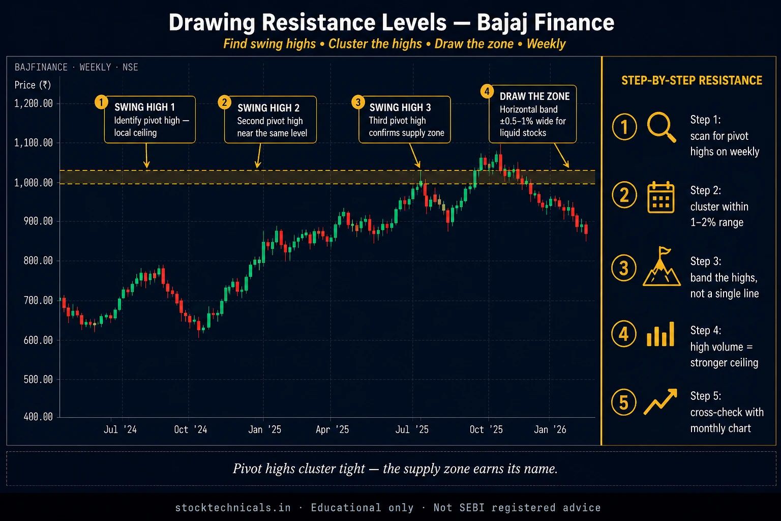
Step-by-Step: Drawing Resistance Levels

Chart data: Evergreen reference · Last reviewed April 17, 2026
The process is identical to drawing support, but in reverse.
Identify Swing Highs (The Peaks)
A SWING HIGH is a candle whose high is higher than the highs of the candles before and after it. It is a peak — a point where price rose, then reversed downward.
Scan the same 6-month chart and mark every significant swing high. Again, focus on peaks visible at the default zoom level. Minor intraday peaks that only show up on magnification are not worth drawing.
Connect the Clusters
Look for two or more swing highs at similar price levels. Draw horizontal lines through each cluster, then widen into zones the same way as with support.
On a Nifty 50 chart, resistance levels tend to form at psychologically round numbers — 22,000, 22,500, 23,000 — but not always. Let the swing highs dictate the levels, not the round numbers. If swing highs cluster at 22,340-22,380, draw the zone there, even though 22,500 seems like a “cleaner” number.
Label Each Level
Once all support and resistance zones are drawn, label them. This step is often skipped but makes a significant difference.
A simple labeling system:
- S1, S2, S3 for support levels (S1 = nearest support below current price)
- R1, R2, R3 for resistance levels (R1 = nearest resistance above current price)
This labeling instantly creates a trading roadmap. If price is at ₹1,780 and S1 is the ₹1,737-₹1,763 zone, the trader knows exactly where the first line of defense sits.
The Wicks vs Bodies Debate: Where Exactly Does the Line Go?
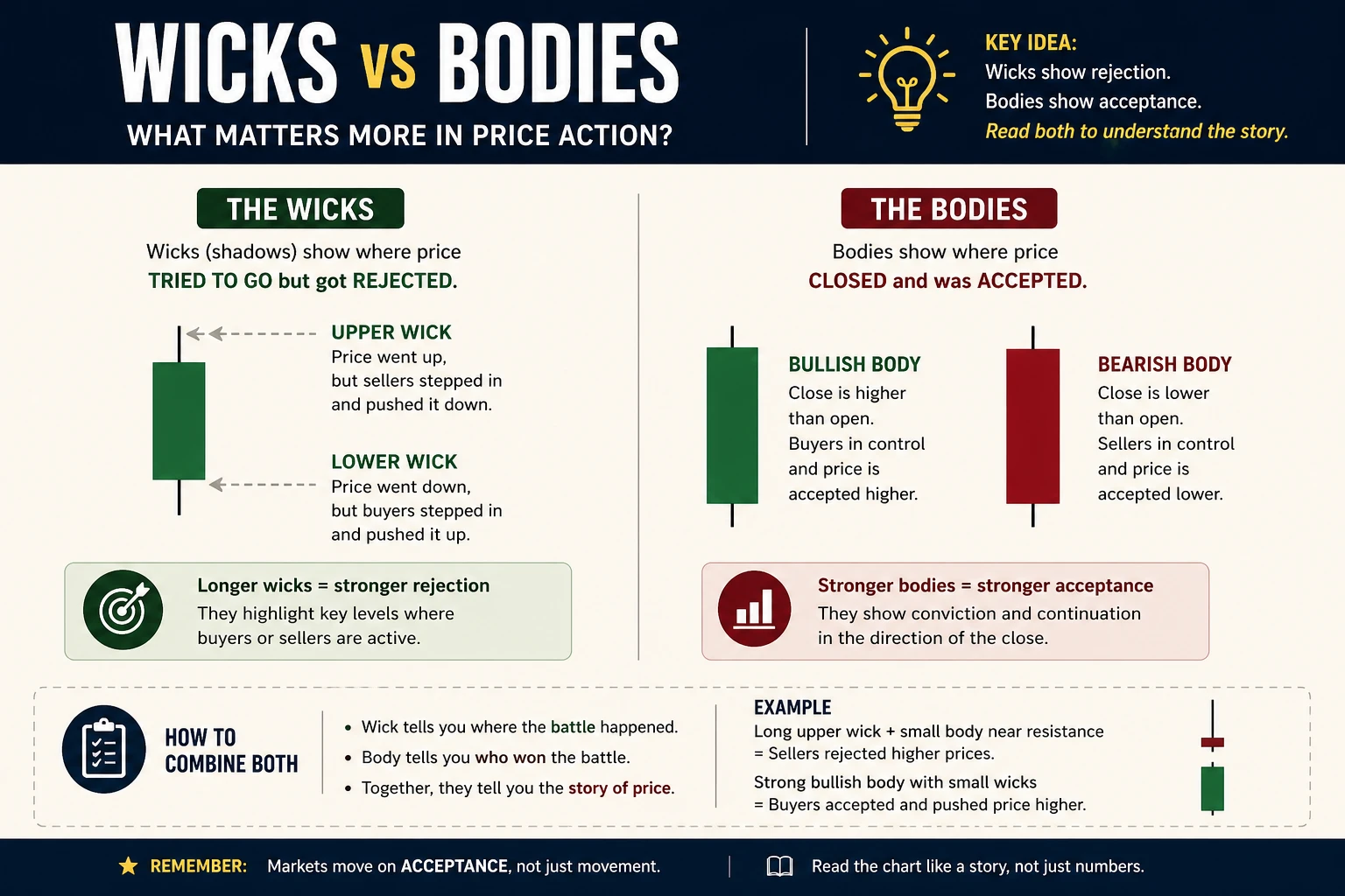
Every trader who has drawn support and resistance has faced this question: should the line touch the candle wicks (the extreme highs and lows) or the candle bodies (the opens and closes)?
The answer is neither. Here is the practical approach.
Bodies Show Where Conviction Lives
The candle body represents where the majority of trading occurred. If HDFC Bank closes at ₹1,752 after touching a low of ₹1,738, the body close at ₹1,752 tells traders that buyers were strong enough to push the price up from the wick low. The body is where the battle was won.
Wicks Show Where Panic Lives
The wick at ₹1,738 represents the momentary panic — a flush below the level designed to trigger stop losses before reversing. Wicks capture the extreme of fear (at support) or greed (at resistance).
The Practical Solution: Zone Captures Both
This is precisely why zones work better than lines. Draw the zone so that the lower boundary sits near the wick cluster and the upper boundary sits near the body cluster. This captures both the panic extreme and the conviction level.
For a support zone on HDFC Bank with wick lows at ₹1,738 and ₹1,742 and body closes at ₹1,750 and ₹1,755:
- Zone lower boundary: ₹1,735 (slightly below the lowest wick)
- Zone upper boundary: ₹1,755 (at the body cluster)
- Zone width: ₹20 (~1.1% of price)
This zone accounts for both the panic flush and the conviction close. Any price action within this zone is “at support.”
Zones vs Lines: Why Zones Win Every Time

Chart data: Evergreen reference · Last reviewed April 17, 2026
This is the single most important distinction in support and resistance drawing. Almost every beginner makes the mistake of drawing exact price lines — ₹1,750.00 as support, ₹1,850.00 as resistance. Then price bounces at ₹1,742 and the trader thinks the level “failed.”
It did not fail. The trader drew a line instead of a zone.
Here is why zones are more accurate than lines:
- Orders cluster in areas, not at single prices. Institutional traders place limit orders across a range, not at one exact tick. The buy wall at support is not a single price — it is spread across multiple price points.
- Wicks and shadows extend beyond the “line.” Price frequently dips below or pokes above a level before reversing. A zone captures these wicks. A line does not.
- Different chart timeframes show slightly different levels. The exact low on a daily candle differs from the exact low on a 4-hour candle. A zone accommodates this discrepancy.
Practical rule for zone width:
| Price Range | Zone Width |
|---|---|
| Below ₹500 | 1-1.5% (₹5-₹7.50) |
| ₹500-₹2,000 | 1-1.5% (₹5-₹30) |
| ₹2,000-₹5,000 | 0.75-1% (₹15-₹50) |
| Nifty 50 (22,000+) | 0.5-1% (110-220 points) |
| Bank Nifty (48,000+) | 0.5-0.75% (240-360 points) |
The percentages decrease as the absolute price increases because large-cap stocks and indices have tighter price action relative to their levels.
The Multi-Touch Rule: How Many Touches Validate a Level
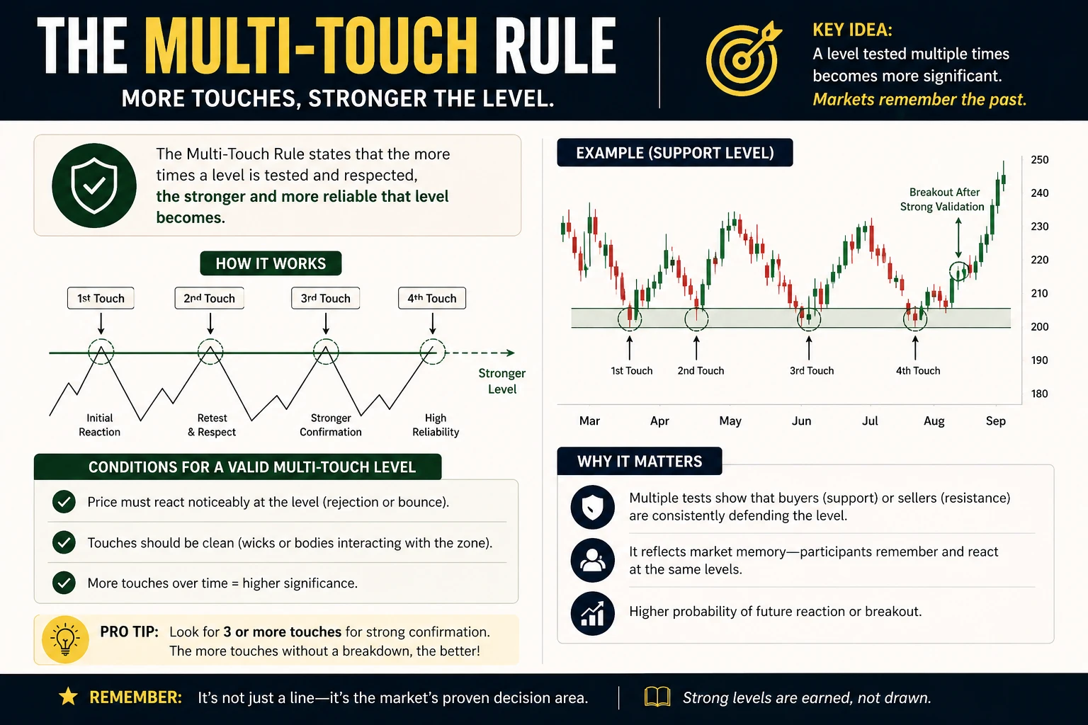
Not all support and resistance zones are equal. A zone where price has reversed three times is far more reliable than a zone with only one touch. Here is the practical hierarchy:
One Touch
A single swing high or swing low at a price level is not yet support or resistance. It is a data point. One touch establishes a potential level, but confirmation is needed.
Do not draw a horizontal line after one touch. Mark it mentally and wait.
Two Touches
When price returns to the same zone and reverses again, the level becomes tentative. Two touches mean that there is genuine buying or selling interest at that price, not just a random bounce.
Draw a thin dashed line at this stage. The level is worth watching but not worth betting heavily on.
Three or More Touches
This is the gold standard. Three reversals at the same zone confirm that institutional traders have standing orders there. The level is high-probability.
Draw a solid zone with labeling (S1, R1, etc.) and treat it as a key decision point for entries, exits, and stop placement.
Diminishing Returns
After 5-6 touches, a level is extremely well-known. Every trader on every screen sees it. This creates a crowded trade, which means the eventual breakout through the level can be violent. Paradoxically, the most tested levels sometimes break the hardest because everyone expects them to hold.
The practical takeaway: levels with 3-4 touches are the sweet spot. Enough to confirm validity, not so many that the breakout risk becomes extreme.
Volume Confirmation at Support and Resistance
A price bounce at a support zone is good. A price bounce at a support zone accompanied by a volume spike is significantly better.
Here is why volume matters at these levels:
- High volume at support = strong buying. Large players are accumulating at this price. The support is likely to hold.
- Low volume at support = weak bounce. Price bounced, but not because of conviction. The level may fail on the next test.
- High volume at resistance = strong selling. Institutions are distributing at this price. The resistance is likely to hold.
- Volume spike on breakout through resistance = confirmation. The breakout is real, not a false breakout.
When drawing support and resistance levels, overlay the volume histogram (available on all charting platforms). If a swing low coincides with a volume bar that is 2-3 times the 20-day average, that support zone gets extra weight.
On TradingView, volume is displayed by default at the bottom of the chart. On Zerodha Kite, enable volume from the Studies menu.
Multi-Timeframe Support and Resistance: Weekly for Major, Daily for Minor
One of the most common mistakes is drawing all levels on a single timeframe. A daily chart shows short-term swing levels. A weekly chart reveals the structural levels that institutions actually use for position sizing.
The Three-Layer System
Layer 1: Weekly Chart (Major Levels)
Open the weekly chart of the same stock. Identify swing highs and swing lows that have been tested multiple times across months or years. These are the structural levels — the ones where ₹500 crore worth of institutional orders sit. Draw these zones in a bold color (red or gold).
Layer 2: Daily Chart (Swing Levels)
Switch to the daily chart. The weekly levels will still be visible. Now identify additional swing highs and lows that are significant on the daily timeframe but invisible on the weekly. Draw these in a lighter color (grey or blue).
Layer 3: Intraday (15-Min or 5-Min) for Precision
If trading intraday, zoom into the 15-minute or 5-minute chart. The weekly and daily levels provide the structure. The intraday levels provide the exact entry and exit prices within those zones.
Practical Example on HDFC Bank
On the weekly chart, HDFC Bank might show a major support zone at ₹1,650-₹1,680 (tested in June 2024 and October 2024). This zone is unlikely to appear on a daily chart that only shows the last 6 months.
On the daily chart, a more recent support at ₹1,740-₹1,760 (tested three times in the past two months) provides a tighter level for swing trading.
For an intraday trade, the 15-minute chart might show an even tighter zone at ₹1,752-₹1,758 within the broader daily support.
The weekly level is the safety net. The daily level is the primary trade zone. The intraday level is the sniper entry.
Tools on TradingView for Drawing Support and Resistance
TradingView provides several tools specifically designed for support and resistance. Here is a practical guide to the most useful ones, which builds on the setup from How to Set Up Your First Chart on TradingView.
Horizontal Line
The most basic tool. Click on “Horizontal Line” in the left toolbar (or press the shortcut key), then click on the chart at the desired price level. Use this for initial level identification.
Settings to adjust: Change the color to green for support and red for resistance. Set line style to “Dashed” for tentative levels (two touches) and “Solid” for confirmed levels (three+ touches). Extend the line to the right so it remains visible as new candles appear.
Horizontal Ray
Similar to a horizontal line, but extends only to the right from the point of origin. This is cleaner for levels drawn from specific swing points because it does not extend backward into irrelevant price history.
Price Range (Rectangle)
The best tool for drawing zones. Select the “Rectangle” tool, draw a thin horizontal rectangle spanning the zone width. Set the fill to semi-transparent (opacity around 20-30%) and the border to the same color as the fill.
Color coding convention:
| Zone Type | Fill Color | Opacity |
|---|---|---|
| Support zone | Green | 20% |
| Resistance zone | Red | 20% |
| Untested / tentative | Grey | 15% |
| Broken S/R (flipped) | Yellow/Gold | 15% |
Anchored VWAP
While not a traditional support/resistance tool, the anchored VWAP (Volume Weighted Average Price) can be used to draw dynamic support from a specific swing low. Anchor it to a major swing low or the start of the current trend, and it provides a volume-adjusted support level that moves with time.
Common S&R Drawing Mistakes (and How to Fix Them)
Drawing Too Many Lines
The most common mistake. A chart with 15-20 horizontal lines is worse than a chart with zero lines because it creates analysis paralysis. At any price, there are multiple “levels” nearby, which means none of them are useful for decision-making.
Fix: Limit to 3 support zones and 3 resistance zones on a single timeframe. Maximum 6 total. If a new level needs to be added, remove the weakest existing level.
Using Exact Prices Instead of Zones
Drawing a line at exactly ₹1,750.00 and then watching price reverse at ₹1,743 creates unnecessary confusion.
Fix: Always use zones. The process is described in the “Zones vs Lines” section above.
Ignoring Timeframe Context
A support level on a 5-minute chart is completely irrelevant for a swing trader holding positions for 2-3 weeks. Conversely, a weekly support zone is too wide for a scalper who needs precision to the nearest ₹5.
Fix: Match the timeframe of the drawn levels to the trading timeframe. Scalpers focus on 5-minute and 15-minute levels. Swing traders focus on daily levels. Position traders focus on weekly levels.
Anchoring to Round Numbers
Round numbers (₹1,000, ₹1,500, ₹2,000, Nifty 50 at 22,000) do have psychological significance. But they are not automatically support or resistance. The level must be confirmed by actual price reversals. Many traders draw resistance at ₹2,000 on a stock that has never traded near ₹2,000 — that is not resistance, that is a guess.
Fix: Let the chart speak. Draw levels based on swing highs and swing lows, not on what “feels like” a round number. If a round number happens to align with a swing point cluster, great — that adds confluence. But the swing points come first.
Not Refreshing Old Levels
A support level from 18 months ago that has not been tested in 12 months may no longer be relevant. Market conditions change. The traders who originally placed orders at that level may have closed those positions.
Fix: Review and refresh support and resistance levels every 2-4 weeks. Remove levels where price has moved significantly away and has not returned. Add new levels based on recent price action.
When Old Levels Lose Relevance

Chart data refreshed on April 17, 2026 · Source: NSE (daily OHLC)
Not every historical level matters forever. Here is a practical framework for deciding when to keep and when to remove old levels:
Keep the Level If:
- Price tested it within the last 3 months
- It aligns with a major swing high/low on the weekly chart
- It aligns with other technical factors (EMA, trendline, Fibonacci level)
- The overall market structure has not fundamentally changed
Remove the Level If:
- Price has moved more than 15-20% away from the level and has not returned
- The level has not been tested in over 6 months
- A major fundamental event (earnings surprise, sector rotation, regulatory change) has shifted the stock’s trading range
- The stock has consolidated in a new range, making the old level irrelevant to current price action
A clean chart with 4-6 fresh, relevant zones is always more useful than a cluttered chart with 15 historical levels that may or may not matter.
S&R Confluence: When Everything Lines Up

Chart data refreshed on April 17, 2026 · Source: NSE (daily OHLC)
The most powerful support and resistance zones are not standalone — they are areas where multiple technical factors converge. When a horizontal support zone aligns with a rising trendline, a moving average, and a Fibonacci retracement level, that zone is not just support. It is a fortress.
What Creates Confluence
- Horizontal S&R + Moving Average: If the 200-day EMA sits right at a horizontal support zone, the combined buying pressure from both technical factors strengthens the level
- Horizontal S&R + Trendline: A trendline rising from a series of higher lows that intersects a horizontal support zone creates a double barrier
- Horizontal S&R + Fibonacci: When a Fibonacci retracement level (especially the 38.2% or 61.8% level) coincides with a horizontal support zone, the probability of a bounce increases significantly
- Horizontal S&R + Round Number: If the support zone happens to sit at a psychologically significant round number, institutional order flow at that level tends to be heavier
How to Trade Confluence Zones
When two or more factors align at a single zone, treat it as a higher-probability setup. This means:
- Larger position size compared to a non-confluence level (within risk management rules)
- Tighter stop loss (placed just below the bottom of the confluence zone)
- Higher confidence in the expected bounce
Not every trade needs confluence. But when it appears, take note — these are the setups that professional traders wait for patiently.
Role Reversal: When Broken Support Becomes Resistance
One of the most powerful patterns in support and resistance trading is ROLE REVERSAL (also called polarity). When a support level breaks, it frequently becomes resistance on the next rally attempt. The reverse is also true — broken resistance becomes support on the next pullback.
Why Role Reversal Happens
Consider a support zone at ₹1,750 on HDFC Bank. Thousands of traders bought at this level because “support held.” When the stock breaks below ₹1,750 to ₹1,700, all those buyers are now at a loss.
When price rallies back to ₹1,750, those trapped buyers do not celebrate. They panic-sell to breakeven. “Just get me out at my entry price” — this collective behavior creates selling pressure at the old support zone, converting it into resistance.
How to Draw Role Reversal Levels
After a support level breaks:
- Keep the zone on the chart (do not delete it)
- Change the color from green (support) to red (resistance)
- Watch for price to rally back to this zone — the first test of the old support as new resistance is a high-probability short entry or profit-booking opportunity
After a resistance level breaks:
- Keep the zone on the chart
- Change the color from red to green
- Watch for a pullback to this zone — the first test of old resistance as new support is a high-probability buy entry
Role reversal levels are some of the most reliable in all of technical analysis because they have a clear behavioral explanation: trapped traders exiting at breakeven.
Real-World Application: HDFC Bank S&R Walkthrough
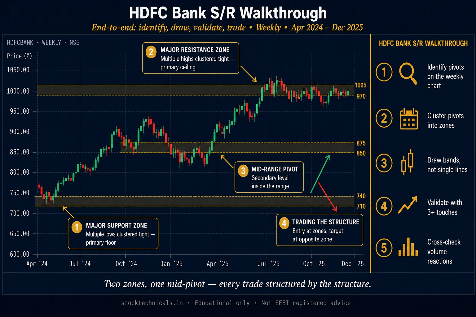
Here is a complete walkthrough of drawing support and resistance on HDFC Bank using the steps from this article. Every level is drawn from actual swing points visible on the daily chart.
The Setup
Open HDFC Bank on the daily timeframe. Zoom to show 6 months of price history. The stock has been trading between approximately ₹1,650 and ₹1,850.
Levels Identified
After scanning swing highs and lows, the following zones emerge:
- S1 (₹1,730-₹1,755): Three swing lows in this zone over the past 4 months. High-volume bounces on two of the three tests. Strong support.
- S2 (₹1,660-₹1,685): Two swing lows from 5 and 3 months ago. The deeper structural support. Weekly chart confirms this zone.
- R1 (₹1,820-₹1,840): Two swing highs and one failed breakout attempt. Clean resistance.
- R2 (₹1,860-₹1,880): The all-time high zone. Only tested once, so this is tentative resistance.
With these four zones drawn and labeled, a trader knows:
- Buy entries make sense near S1 (₹1,730-₹1,755) with a stop below S2
- Profit targets from a long entry sit at R1 (₹1,820-₹1,840)
- A break above R1 with volume targets R2 as the next objective
- A break below S1 with volume targets S2 as the next support
This is a complete trading roadmap in four zones.
Practice Exercise: Draw S&R on a Nifty 50 Chart
Theory without practice is useless. Open a Nifty 50 daily chart on TradingView and follow these exact steps:
Step One: Set Up the Chart
Open the Nifty 50 chart (symbol: NIFTY on TradingView, NIFTY 50 on Zerodha Kite). Switch to the daily timeframe. Zoom to show the last 6 months of data. Hide all indicators — this exercise is about reading the chart with clean price action.
Step Two: Mark All Swing Lows
Scan from left to right. Place a small arrow or dot at every significant swing low (valley). There should be 4-8 swing lows in 6 months of data.
Step Three: Find Support Clusters
Look for two or more swing lows at similar prices. Draw horizontal zones through each cluster using the rectangle tool (green, 20% opacity).
Step Four: Mark All Swing Highs
Repeat the process for swing highs (peaks). Place markers at each significant peak.
Step Five: Find Resistance Clusters
Draw horizontal zones through clusters of swing highs (red, 20% opacity).
Step Six: Label and Prioritize
Label each zone (S1, S2, R1, R2, etc.). Remove any zone with only one touch — it is not yet confirmed. Keep zones with 2+ touches.
Step Seven: Add Volume Check
Turn on the volume histogram. Check if each remaining zone has a corresponding volume spike. Mark zones with high-volume confirmation as higher priority.
Expected Result
After following these seven steps, the chart should have 3-5 clean support and resistance zones, each labeled and color-coded. This is the foundation for every trade decision on that chart.
S&R Drawing Checklist: The Complete Process in Under 15 Minutes
Here is the complete process distilled into a repeatable checklist. Bookmark this section and run through it every time a new chart is analyzed.
- Open the weekly chart first. Identify 1-2 major structural levels (support and resistance). Draw as gold or bold zones.
- Switch to the daily chart. The weekly levels remain visible. Identify 2-3 additional swing levels on the daily timeframe. Draw as standard colored zones (green for support, red for resistance).
- Verify each zone has at least 2 touches. Remove any zone with only 1 touch.
- Widen each line into a zone (1-1.5% width for stocks, 0.5-1% for indices).
- Check volume at each zone. Mark zones with high-volume confirmation as higher priority.
- Look for confluence. Does any zone align with a moving average, trendline, or Fibonacci level? If yes, mark it as a high-probability zone.
- Label zones: S1, S2, S3 (nearest to farthest support below price) and R1, R2, R3 (nearest to farthest resistance above price).
- Remove stale levels. If any zone has not been tested in 6+ months and is more than 15% away from current price, delete it.
- Save the template. On TradingView, save the chart layout so that drawn levels persist across sessions.
This 9-step process takes 10-15 minutes per chart. Run it once a week for the stocks in the watchlist. Run it whenever a significant price move (5%+) shifts the trading landscape.
The Bottom Line
Drawing support and resistance looks simple. Two lines on a chart. Anyone can do it in 30 seconds.
But drawing them *well* — with zones instead of lines, volume confirmation, multi-timeframe alignment, and regular refreshing — that is the difference between a chart that generates profitable trade ideas and a chart that generates confusion.
The traders who lose money on support and resistance are not the ones who do not know the concept. They are the ones who draw a single line at a round number, ignore volume, never check the weekly chart, and wonder why their levels “do not work.”
The process in this article takes 10-15 minutes per chart. That upfront time investment pays for itself on every trade that follows.
No one gets rich from drawing lines. But no one trades profitably without them.
*Markets will always have uncertainty, but preparation removes most of it. Apply this process to every chart, every timeframe, every trade.*
Real Talk: No chart pattern, indicator, or strategy works 100% of the time. The SEBI study showing 93% of F&O traders lose money is not a scare tactic — it is a filter. Most of that 93% traded without a stop-loss, sized positions too large, or chased signals without understanding context. Risk no more than 1-2% of capital per trade. Keep a trading journal. The market rewards patience and discipline — not speed or boldness.
OrsLeo — Six blown accounts. Started with NTPC IPO in 2004, then a stock market website in 2007, made ₹50,000 in a single day on futures in 2017, and lost it all in the same day. A lot of hard-earned lessons between then and now.
I started StockTechnicals.in to be the resource I wish existed when I was figuring this out. Everything here — from indicators to strategies — is built on one principle: capital protection first. I don't share theories; I share actionable setups that traders can apply on Monday morning.
Risk management shows up at the start and end of every article on this site, because if a trader can't stay in the game, they can't win it.
Test Yourself: Drawing Support & Resistance
Q1: How wide should a support zone be for a stock trading near Rs 1,800?
Q2: How many touches are needed to confirm a support or resistance zone?
Q3: What does a volume spike at a support zone indicate?
Q4: When should old support and resistance levels be removed from the chart?
Q5: Which timeframe should be checked FIRST when drawing support and resistance?
How many support and resistance levels should a chart have?
A clean chart should have 3-5 levels maximum on a single timeframe. Too many levels create analysis paralysis. Keep a maximum of 3 support and 3 resistance zones.
Should traders use candle wicks or candle bodies to draw support and resistance?
Use both. Draw zones that encompass the body cluster and extend slightly beyond to capture wicks. Bodies show where conviction lives, wicks show where panic lives. A zone captures both.
How often should support and resistance levels be redrawn?
Review every 2-4 weeks or after a significant price move (5%+ in either direction). Remove levels untested for 6+ months. Add new levels from recent swing points.
What is the difference between support/resistance zones and trendlines?
Support and resistance zones are horizontal at fixed price levels. Trendlines are diagonal, connecting rising lows or falling highs. Both are valid but serve different purposes.
Can old support become new resistance after a breakdown?
Yes. This is called role reversal. When price breaks below support, trapped buyers sell at breakeven when price returns, creating selling pressure that converts old support into new resistance.
Which timeframe is best for drawing support and resistance?
Match the timeframe to trading style. Intraday traders use 15-minute with daily reference. Swing traders use daily with weekly reference. Position traders use weekly with monthly reference.
The Bottom Line on Drawing S/R
Drawing support and resistance is less about precision and more about intent. A clean chart with 4-5 zones marked on the daily timeframe is worth more than a chart with 20 wavy trendlines that look like modern art. The job is to identify the levels where the market has shown its hand — not to predict every wiggle.
Most traders fail at S/R because they redraw levels to fit the current trade. If you drew a zone at ₹1,500 yesterday, the zone stays at ₹1,500 today regardless of whether your trade is winning or losing. Confirmation bias will make you erase levels that go against your position; resist it.
My own rule: draw levels on the weekend from the daily chart, write them down in a trading log, and don’t move them intraday. If Monday’s price action violates the level, let it play out — don’t rationalise. That single habit has saved me more capital than any indicator.
Continue Learning
- For beginners: Support and Resistance: Complete Guide — the concept, now the execution
- For advanced drawing: Supply and Demand Zones and Trendlines
- For confirmation: Volume in Trading and Role Reversal
Markets are brutal, capital is finite, and no single trade should risk more than 2 percent of the account.
Drawing too many levels is the same as drawing none. If you can’t count your S/R zones on one hand per stock, you’re curve-fitting. Focus on the 3-4 zones closest to current price and let the rest sit in the back of the chart.