
Open any stock chart on Zerodha Kite, TradingView, or any trading platform, and the first thing you see is a series of colourful rectangular blocks — some green, some red — marching across the screen. Those are candlesticks, and they are the most popular way traders worldwide read price action. On April 7, 2025, when the Nifty 50 (NSE: NIFTY 50) opened at 21,758.40, plunged to a low of 21,743.65, then rallied to close at 22,161.60, that single daily candlestick told the entire story — a green body with a short lower wick showing that buyers fought back aggressively after the early selloff. A line chart would have shown only the closing price. A candlestick showed the battle.
Quick Answer: Candlestick charts are the most popular way to read price action because each candle packs four data points — open, high, low, close — into a single visual bar. The body colour shows whether buyers or sellers won the session; the wicks show where price was rejected. On NSE, candlestick charts work identically across intraday, swing, and positional timeframes, and they make reversal signals like doji, hammer, and engulfing patterns visible at a glance.
This guide teaches you everything a beginner needs to know about candlestick charts: what each candle represents, how to read the body and wicks, what the colours mean, and how candlestick charts compare to other chart types. Every example uses real price data from NSE-listed stocks so you can verify the numbers yourself.
Key Takeaways
- Every candlestick shows four prices: Open, High, Low, and Close (OHLC) for a specific time period — this is more information than any other chart type provides at a glance
- The body colour tells you who won: a green (bullish) candle means the close was higher than the open; a red (bearish) candle means the close was lower than the open
- Wicks reveal the battle: a long lower wick means buyers rejected lower prices; a long upper wick means sellers rejected higher prices — these signals are invisible on line charts
- Candlestick charts are the global standard: they replaced line and bar charts because they combine complete data with instant visual clarity
- Never trade a single candle in isolation: candlestick signals only become meaningful in context — the trend, the location relative to support or resistance, and volume confirmation all matter
What Are Candlestick Charts and Why They Matter
A candlestick chart displays price movement using individual candles, where each candle represents a specific time period — one minute, one hour, one day, one week, or any other interval. Unlike a line chart that connects only closing prices, each candlestick shows all four price data points: where the price opened, the highest price reached, the lowest price reached, and where it closed.
This matters because the relationship between these four prices tells you something that a single closing price never can: it tells you whether buyers or sellers controlled the session, how much conviction they had, and where the other side pushed back.
When Reliance Industries opened at ₹1,241.10 on April 4, 2025 and closed at ₹1,204.70 after touching a low of ₹1,193.15, the daily candlestick showed a large red body (strong selling) with a short lower wick (minimal buying defence). Any trader glancing at that candle would immediately understand: sellers dominated, and buyers offered almost no resistance. A line chart would have shown only the ₹1,204.70 closing price — you would have no idea that the stock opened ₹36.40 higher and that sellers controlled every hour of the session.
This is why the vast majority of retail and institutional traders use candlestick charts as their primary chart type. On every platform — Zerodha Kite, TradingView, Angel One, Groww, Dhan, Upstox — candlestick charts are the default setting.
A Brief History of Candlestick Charts
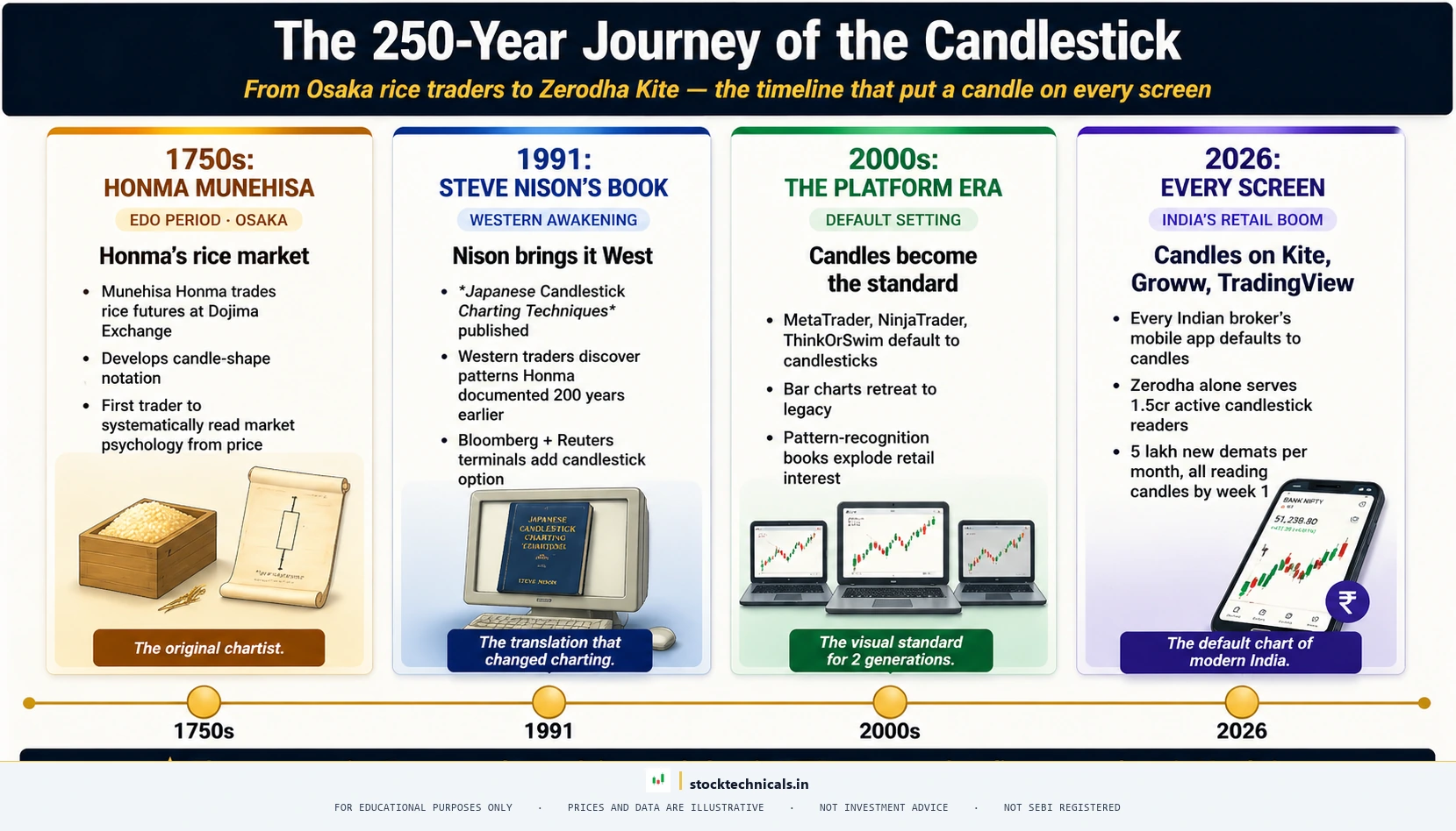
Candlestick charting originated with 18th century Japanese rice traders who used visual price records to track patterns in the Dojima Rice Exchange in Osaka. These merchants developed a system of recording the opening, highest, lowest, and closing prices of rice futures for each trading session — creating the earliest form of what we now call candlestick charts.
The method remained largely unknown outside Japan until 1991, when Steve Nison published Japanese Candlestick Charting Techniques, introducing Western traders to the system. Nison’s work demonstrated that candlestick patterns — many with centuries of observational history — provided reliable signals when combined with other technical analysis tools.
Within a decade of Nison’s book, candlestick charts replaced bar charts as the default on virtually every major trading platform worldwide. The reason was simple: candlesticks show the same information as bar charts but in a format that the human eye processes faster. The coloured body instantly communicates direction, while the wick lengths communicate the intensity of the battle between buyers and sellers.
Anatomy of a Single Candlestick
Every candlestick — whether on a one-minute chart or a monthly chart — is built from exactly four data points and three visual components.
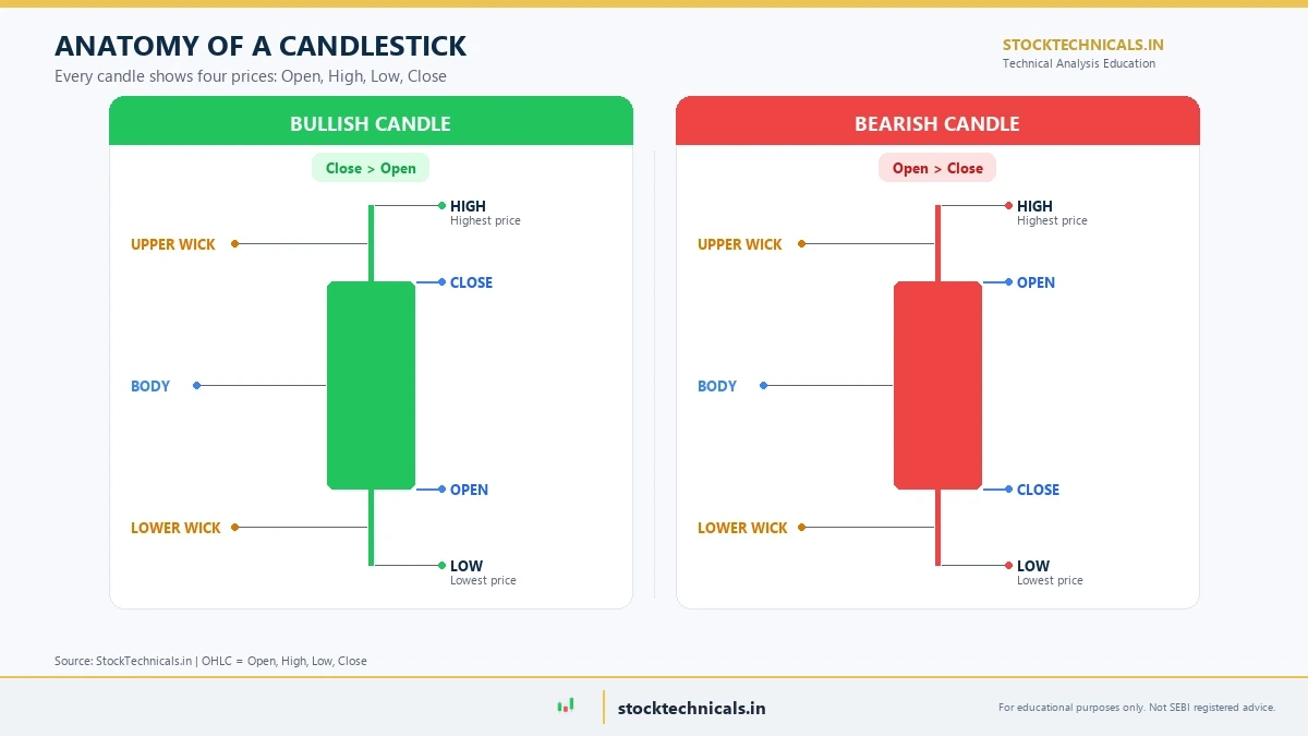
The Four Price Points (OHLC)
Open: The price at which the first trade occurred when the candle’s time period began. On a daily NSE chart, this is the opening price at 9:15 AM IST.
High: The highest price traded during the entire candle period. This is the absolute peak — even if the price touched it for only a moment.
Low: The lowest price traded during the candle period. This is the absolute bottom that price reached.
Close: The price at which the last trade occurred when the candle’s time period ended. For a daily NSE candle, this is the closing price at 3:30 PM IST.
Body, Wicks, and Shadows
The body (real body): The thick rectangular portion between the open and close prices. The colour of the body immediately tells you the direction:
- Green body = Close higher than Open (bullish — buyers won)
- Red body = Close lower than Open (bearish — sellers won)
- The size of the body shows the magnitude of the move. A large body means strong conviction. A tiny body means indecision.
The upper wick (upper shadow): The thin line extending from the top of the body to the high. A long upper wick means the price was pushed higher during the session but could not stay there — sellers pushed it back down. This signals selling pressure at higher levels.
The lower wick (lower shadow): The thin line extending from the bottom of the body to the low. A long lower wick means the price was pushed lower but could not stay there — buyers stepped in and pushed it back up. This signals buying pressure at lower levels.
No wick at all (a flat edge) means the open or close was also the high or low of the session. This shows extreme one-sided control — zero pushback from the other side.
Bullish vs Bearish Candles: The Colour Code
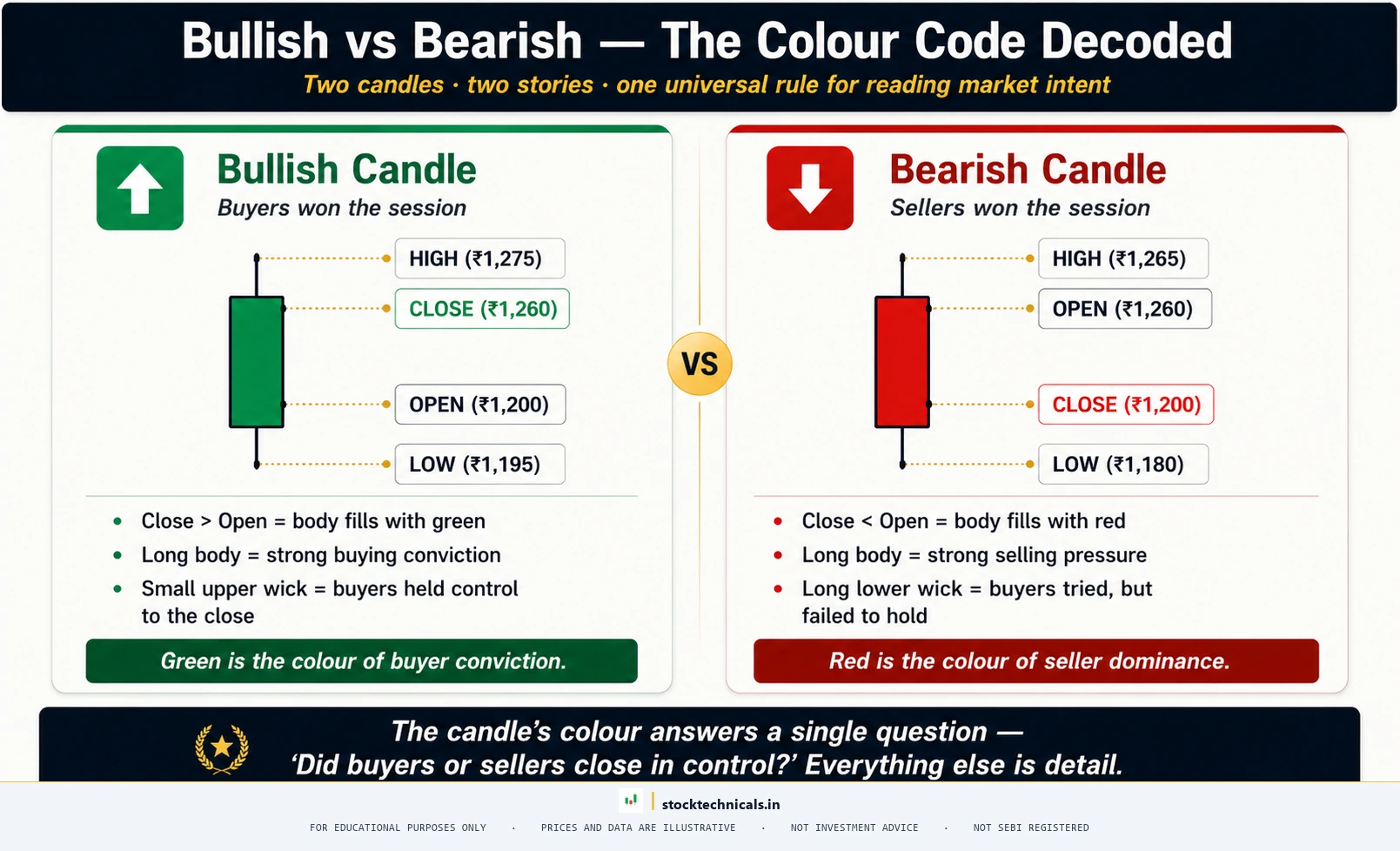
The two most fundamental candle types are bullish (green) and bearish (red). Every other candlestick pattern is built from variations of these two.
Bullish (Green) Candle
A bullish candle forms when the close is higher than the open. Buyers were stronger than sellers and pushed the price upward during the session.
Example: HDFC Bank on November 26, 2025 — opened at ₹981.30 and rallied to close at ₹1,003.90 (high: ₹1,006.95, low: ₹981.30). The green body spans ₹22.60 (from open at 981.30 to close at 1,003.90). The open was also the day’s low — zero lower wick means buyers controlled from the very first trade. The small upper wick (₹3.05) shows the close was near the day’s high. This candle appeared during an uptrend, and prices continued higher over the following days.
Bearish (Red) Candle
A bearish candle forms when the close is lower than the open. Sellers were stronger and pushed the price downward.
Example: HDFC Bank on January 5, 2026 — opened at ₹1,005.75, barely reached a high of ₹1,006.40, then fell to close at ₹977.50 (low: ₹976.30). The red body spans ₹28.25 (from open at 1,005.75 to close at 977.50). The tiny upper wick (₹0.65) shows sellers took control immediately. The short lower wick (₹1.20) shows almost no buying defence. This candle appeared at the peak of an uptrend — it marked the start of a reversal, and prices declined sharply over the following weeks.
What the Body Size Tells You
A large body — whether green or red — means one side dominated the session with strong conviction. A small body means the open and close were close together — the session ended in near-stalemate. When you see a series of large green candles, buyers are firmly in control. When you see alternating small candles, the market is undecided.
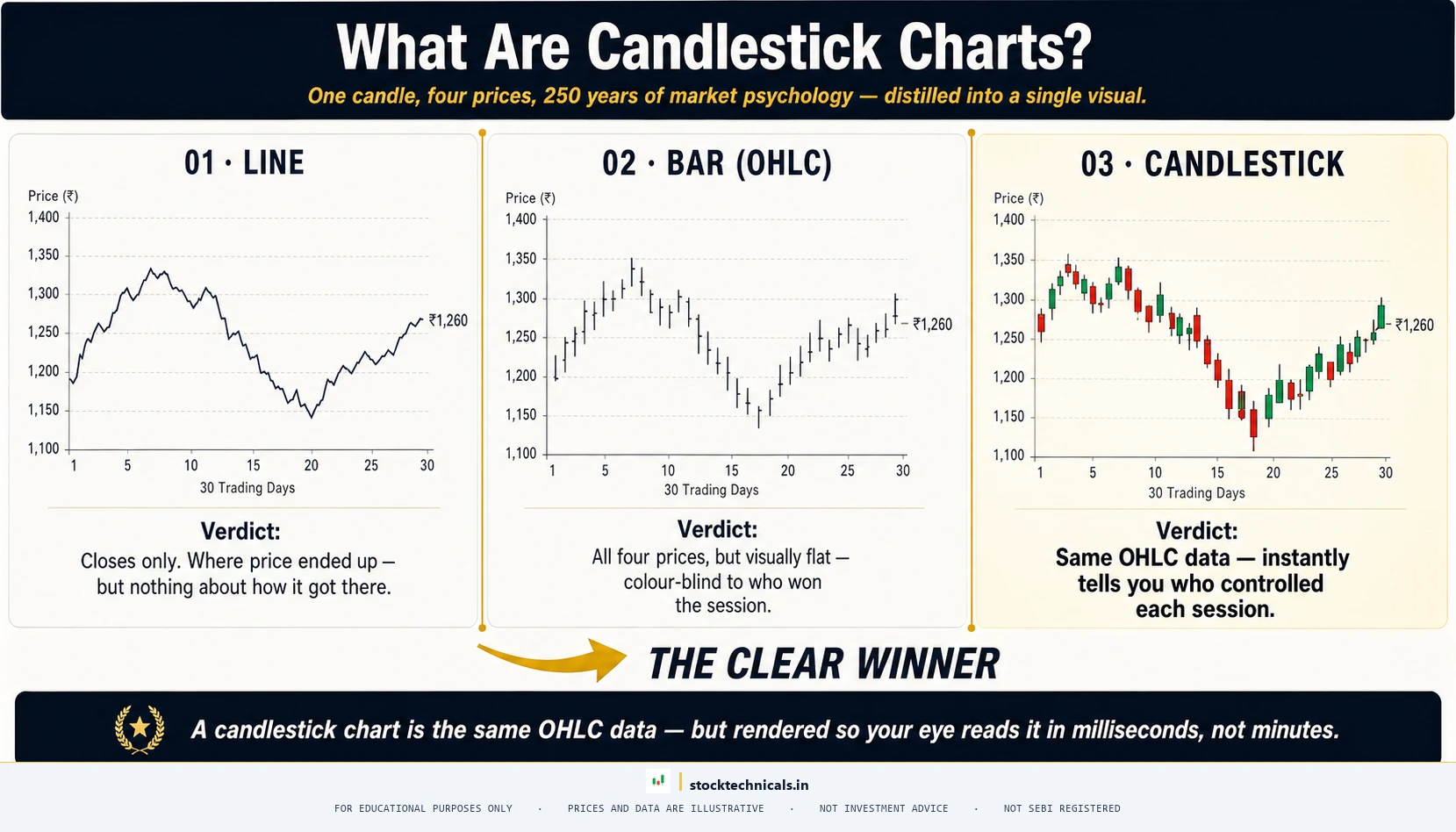
How Candlestick Charts Compare to Other Chart Types
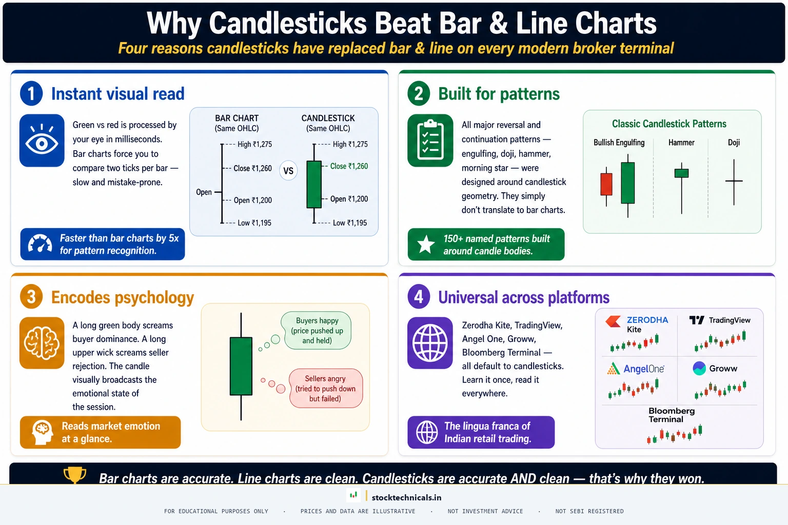
There are three main chart types used in technical analysis. Each shows the same underlying price data but in different visual formats.
| Feature | Line Chart | Bar Chart (OHLC) | Candlestick Chart |
|---|---|---|---|
| Shows Close | Yes | Yes | Yes |
| Shows Open | No | Yes | Yes |
| Shows High/Low | No | Yes | Yes |
| Shows buying vs selling pressure | No | Partially | Yes (body colour) |
| Visual clarity | High (simple) | Low (dense) | High (intuitive) |
| Pattern recognition | Limited | Moderate | Excellent |
| Best for | Quick trend overview | Data-heavy analysis | Active trading |
Line charts connect only closing prices. They create a clean, simple curve that is excellent for seeing the overall trend direction at a glance. But they hide everything that happened during the session — you cannot see where the price opened, how far it moved in either direction, or whether buyers or sellers won.
Bar charts (OHLC) show all four price points using a vertical line (from low to high) with small horizontal ticks marking the open (left tick) and close (right tick). They carry complete information but are visually dense and harder to read quickly, especially with many bars on screen.
Candlestick charts display the same four data points as bar charts but replace the horizontal ticks with a coloured body between open and close. This single change — adding a filled, coloured rectangle — transforms readability. The body colour instantly communicates direction, and the body size communicates conviction. This is why candlestick charts became the global standard for traders.
For a deeper understanding of all three chart types, see the types of stock charts guide.
Reading Your First Candlestick Chart: A Step-by-Step Walkthrough
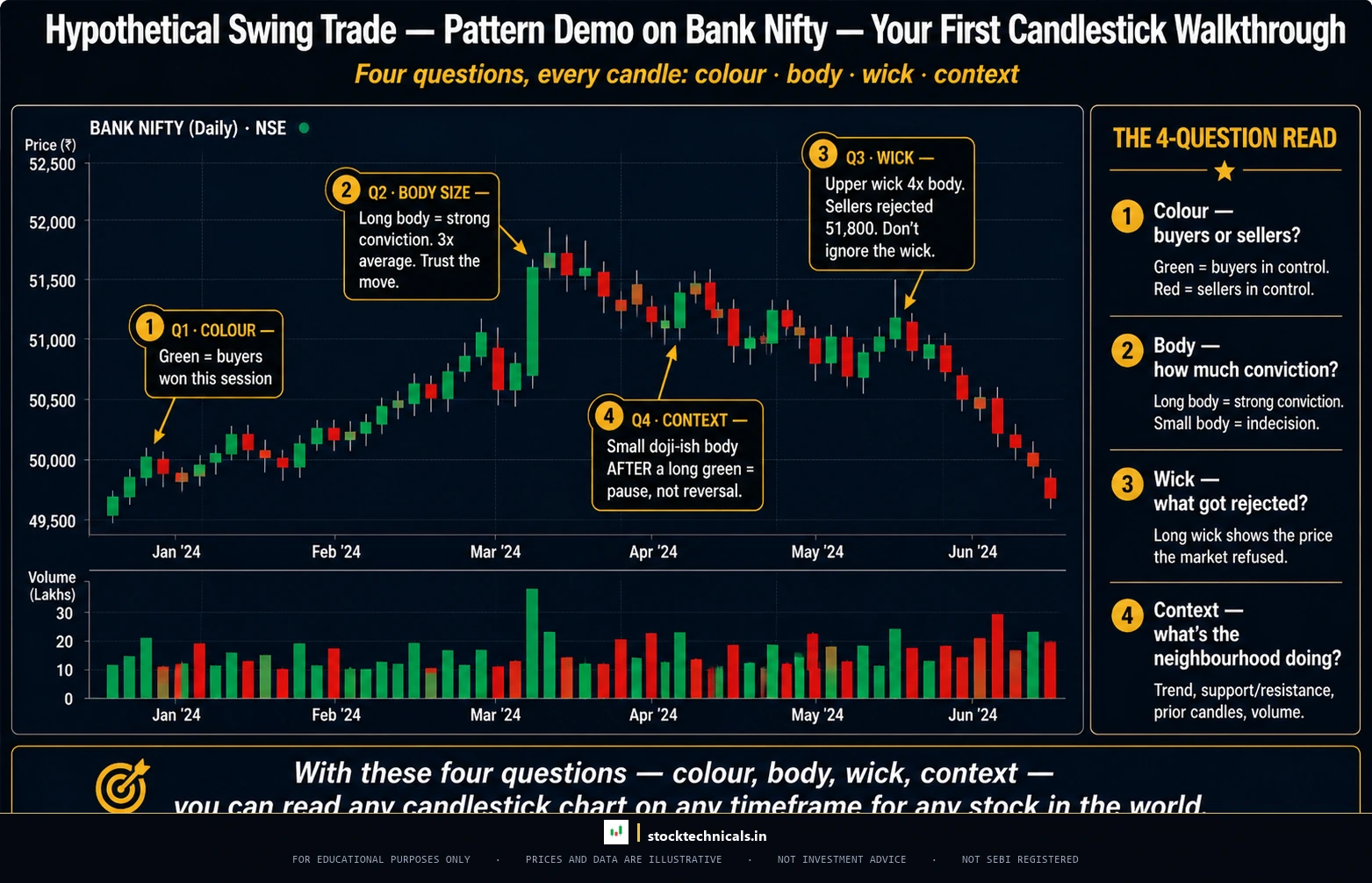
Let us walk through reading a real candlestick chart, candle by candle, so you can practise the skill.
Look at any 10-day window of Reliance Industries on the daily chart. For each candle, ask yourself these four questions:
- What colour is the body? Green = buyers won. Red = sellers won.
- How large is the body? Large = strong conviction. Small = indecision.
- How long are the wicks? Long lower wick = buyers defended. Long upper wick = sellers defended.
- Where does this candle sit relative to the previous candle? Higher = upward momentum. Lower = downward momentum. Overlapping = consolidation.
That is the entire framework. Colour tells you direction. Body size tells you conviction. Wick length tells you the intensity of the battle. Position relative to previous candles tells you momentum. With these four questions, you can read any candlestick chart on any timeframe for any stock in the world.
What Candle Size and Shape Tell You
Not all candles are created equal. The size of the body and the length of the wicks carry specific information about market sentiment.
Long Bodies vs Short Bodies
A long body (whether green or red) means the price moved significantly between open and close. This shows strong conviction — either buyers or sellers controlled the session decisively.
A short body means the open and close prices were very close together. This indicates indecision — neither buyers nor sellers managed to gain a meaningful advantage.
When long bullish (green) candles appear in sequence, the market is in a strong uptrend. When long bearish (red) candles appear in sequence, the market is in a strong downtrend. When short-bodied candles appear after a trend, they often signal that the trend is losing momentum.
Long Wicks vs Short Wicks
A candle with a long lower wick and a small body at the top is called a hammer (in an uptrend context) or a pin bar. It shows that sellers pushed the price down significantly during the session, but buyers fought back and pushed it nearly all the way back up. This is a bullish rejection signal.
A candle with a long upper wick and a small body at the bottom is the opposite — a shooting star. Buyers pushed the price up, but sellers rejected the move and pushed it back down. This is a bearish rejection signal.
When you see a candle with very long wicks on both sides and a tiny body in the middle, this is a doji — the ultimate indecision signal. The open and close were nearly identical, and both buyers and sellers extended the price in their direction but could not hold.
For detailed coverage of specific candlestick patterns, explore the anatomy of a candlestick, bullish patterns, bearish patterns, and doji candle explained.
Candlestick Charts on Different Timeframes
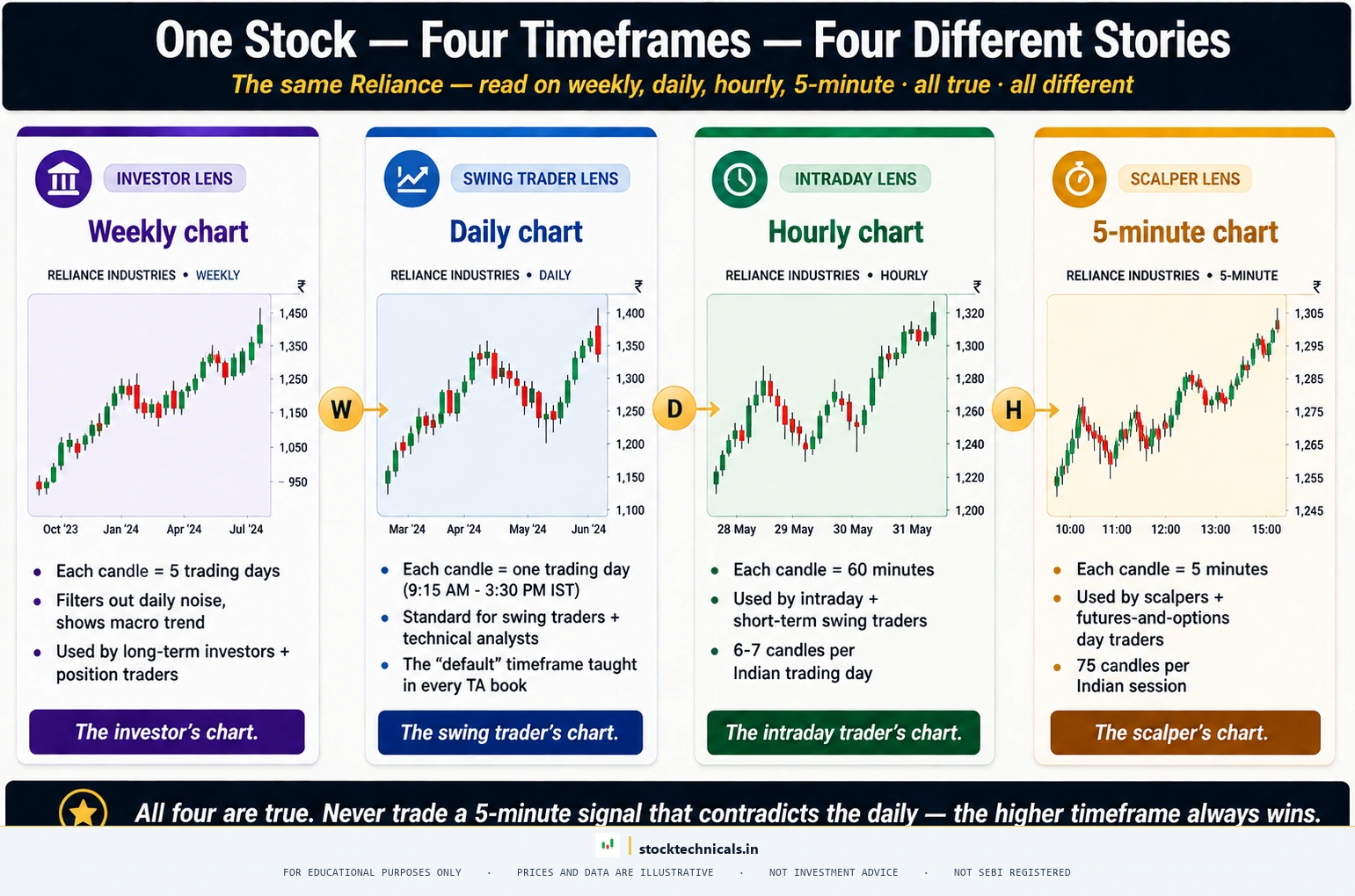
The same stock produces very different candlestick charts depending on the timeframe you choose. A daily chart shows one candle per trading day. A weekly chart compresses five trading days into a single candle. A 15-minute chart shows one candle every 15 minutes.
Why this matters: Daily charts may show a series of small, choppy candles with no clear direction — noise that makes it difficult to see the bigger picture. Switching to the weekly chart, those same five days compress into a single candle that reveals the true weekly direction. Conversely, if the daily chart shows a strong trend, the 15-minute chart may show dozens of small candles within each daily move — useful for timing entries but easy to overtrade.
Practical rule: Start with the higher timeframe (weekly or daily) to understand the trend direction, then drop to the lower timeframe (daily or hourly) for entry timing. Never trade a lower timeframe signal that contradicts the higher timeframe direction.
For more on selecting the right timeframe, see the timeframes in trading guide.
Common Mistakes When Reading Candlestick Charts
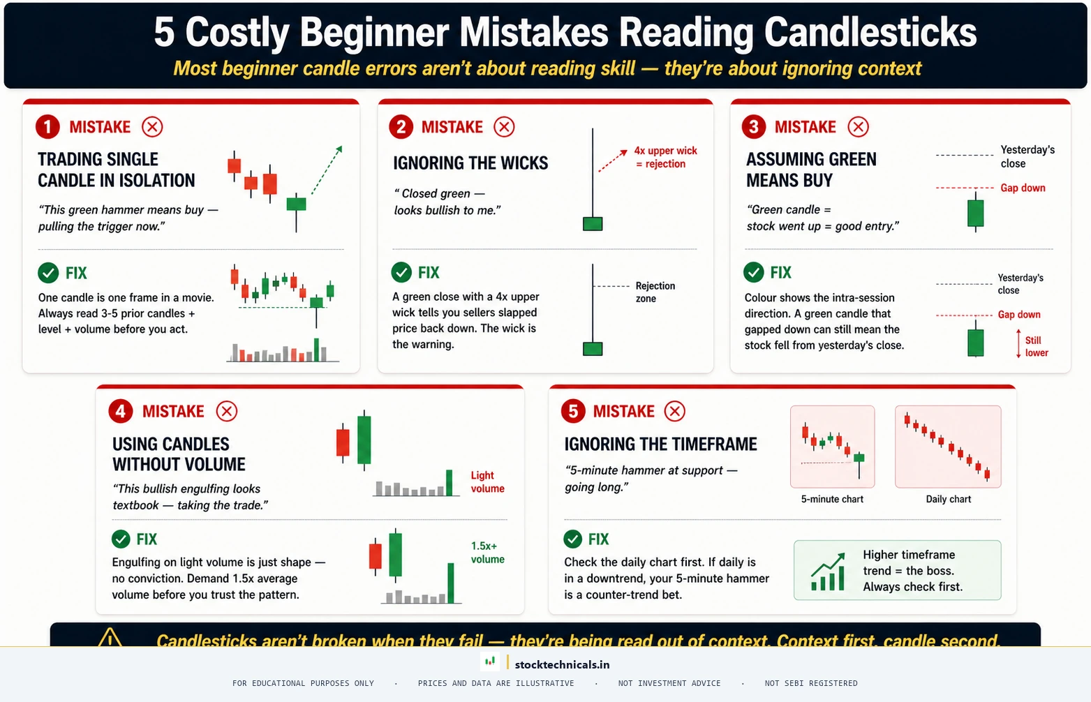
Trading a single candle in isolation
One bullish candle does not mean the stock will rise. A hammer after a downtrend is meaningful. A hammer in the middle of a range is noise. Always consider where the candle appears — near support or resistance, within a trend, or at a key level.
Ignoring the wicks
Beginners often focus only on the body colour and ignore the wicks entirely. A green candle with a very long upper wick is not bullish — it means buyers tried to push higher but were firmly rejected. The wick tells you about the rejection force that the body alone does not show.
Assuming green always means buy
A small green candle in a strong downtrend is not a buy signal. It is likely just a brief pause before selling resumes. Context matters more than colour. Check the prevailing trend direction before interpreting any individual candle.
Using candlesticks without confirmation
Candlestick patterns are more reliable when confirmed by volume. A bullish engulfing candle on above-average volume is significantly more trustworthy than one on low volume. Always check volume as a confirmation tool.
Ignoring the timeframe
A bullish pattern on a 5-minute chart is nearly meaningless if the daily chart shows a strong downtrend. Higher timeframe signals carry more weight than lower timeframe signals. Always check at least two timeframes before acting on any candlestick signal.
How to Set Up Candlestick Charts on Your Platform
Most trading platforms default to candlestick charts, but here is how to ensure your setup is correct:
On TradingView: Click the chart type icon in the top toolbar (it looks like a small candlestick). Select “Candles” from the dropdown. TradingView uses green and red by default. You can customise colours under Chart Settings, but the standard green/red convention is recommended for consistency.
On Zerodha Kite: Candlestick charts are the default chart type. If you have switched to a different type, click the chart type dropdown in the toolbar and select “Candle.” Kite uses green for bullish and red for bearish by default.
On Angel One / Groww / Dhan / Upstox: All of these platforms default to candlestick charts. Look for the chart type selector in the charting toolbar if you need to switch back from a line or bar chart.
Recommended settings for beginners:
- Chart type: Candlestick (not Heikin-Ashi, which smooths the data)
- Timeframe: Daily for swing trading, 15-minute for intraday
- Colours: Green for bullish, red for bearish (the global standard)
- Grid lines: On (helps visually track price levels)
For a detailed platform setup walkthrough, see how to read stock charts.
Interactive Tool: Candlestick Reader
Quick Quiz
Test your understanding of candlestick charts:
Q1. What does a green candlestick mean?
Q2. What do the wicks on a candlestick show?
Q3. Which chart type shows the most information?
Q4. A long lower wick signals what?
Q5. Should you trade based on a single candlestick?
The Bottom Line
Candlestick charts are not complicated. Each candle shows four prices — open, high, low, close — displayed as a coloured body with wicks. Green means buyers won. Red means sellers won. Long body means conviction. Long wick means rejection. That is all you need to know to start.
The difficulty is not in reading individual candles — it is in reading them in context. A green candle means nothing by itself. A green candle at a support level, after a downtrend, with above-average volume, confirmed by a bullish pattern — that is a signal. Learning to read that context is what separates traders from spectators.
Start by opening any daily chart on TradingView and identifying the four questions for each candle: colour, body size, wick length, and position relative to the previous candle. Do this for ten minutes a day, and within a week, candlestick reading will become second nature.
Real Talk
If you have read this article and want to immediately start trading based on candlestick patterns — stop. Candlestick charts are a reading tool, not a trading system. They tell you what happened. They do not tell you what will happen next. The patterns that form on candlestick charts become useful only when combined with trend analysis, support and resistance levels, volume confirmation, and proper risk management. Master reading candles first. Learn the patterns in the articles that follow this one. Then — and only then — start applying them in a live market with small positions and strict stop-losses.
The Bottom Line on Candlestick Charts
Candlestick charts became the global standard for a reason — each bar tells a complete story of buyer-seller conflict in one glance. Learning to read the body, the wicks, and the sequence of candles gives traders on Nifty 50, Bank Nifty, or any NSE stock a way to spot reversals, continuations, and indecision zones without waiting for indicators to confirm. Beginners often overload on every pattern name at once — the smarter path is to master five or six high-conviction patterns (doji, hammer, engulfing, shooting star, morning star) before adding more.
Use candlesticks as the primary read, then bring in volume and moving averages to confirm what the candles are showing. Traders who rely only on indicators miss the conviction signal that candles carry. Traders who rely only on candles miss the broader trend context. The blend is where consistent edge lives — on Zerodha Kite, TradingView, or any platform a trader uses to read NSE price action.
Risk Mantra
Trading involves substantial risk. According to SEBI’s FY2024-25 study, 91 percent of individual equity F&O traders in India incurred net losses. Always trade with a defined risk management plan and never risk more than you can afford to lose.
Frequently Asked Questions
What are candlestick charts?
Candlestick charts are a type of financial chart that displays price movement using individual candles. Each candle shows four data points for a specific time period: the opening price, the highest price, the lowest price, and the closing price. The coloured body between open and close immediately shows whether buyers (green) or sellers (red) controlled that period.
Who invented candlestick charts?
Candlestick charting originated with 18th century Japanese rice traders who tracked price patterns at the Dojima Rice Exchange in Osaka. The system was introduced to Western traders in 1991 by Steve Nison through his book Japanese Candlestick Charting Techniques.
What is the difference between a bullish and a bearish candle?
A bullish candle (green) has a close price higher than its open price — buyers pushed the price up. A bearish candle (red) has a close price lower than its open price — sellers pushed the price down. The size of the body shows the magnitude of the move.
What do the wicks on a candlestick mean?
The upper wick shows the highest price reached during the period — a long upper wick means sellers rejected higher prices. The lower wick shows the lowest price reached — a long lower wick means buyers rejected lower prices. Short or absent wicks mean one side had complete control with minimal opposition.
Can I use candlestick charts for intraday trading?
Yes. Candlestick charts work on any timeframe. Intraday traders commonly use 5-minute, 15-minute, or hourly candles. Each candle represents that specific time interval. The reading principles are identical regardless of timeframe — only the time horizon of the trade changes.
Are candlestick charts better than line charts?
For active trading, yes. Candlestick charts show open, high, low, and close prices in a single visual, while line charts show only the closing price. However, line charts are useful for quickly identifying the overall trend direction without the visual complexity of individual candles.
What is the first candlestick pattern a beginner should learn?
Start with the hammer and the engulfing pattern. The hammer is easy to identify (small body, long lower wick) and provides a clear bullish reversal signal at support levels. The engulfing pattern shows a decisive shift in control from one side to the other.
A candlestick is not a prediction, it is a snapshot of the last battle between buyers and sellers. Read the battle, not the forecast. Per the SEBI FY24-25 study, 91 percent of individual equity F&O traders lost money.
Continue Learning
- Anatomy of a Candlestick — detailed look into every component of a candlestick with detailed OHLC analysis
- Bullish Candlestick Patterns — the most reliable reversal and continuation patterns for buyers
- Bearish Candlestick Patterns — patterns that signal selling pressure and potential reversals downward
- Doji Candle Explained — the indecision candle and what it means at different chart locations
- How to Read Stock Charts — the complete foundation for reading any type of stock chart
- What is a Trend? — understanding the bigger picture that gives candlestick patterns their context
Happy charting!